methtourney2 - City Heat (Submitted)

Discussion for Level editing, modeling, programming, or any of the other technical aspects of Quake
Method
Posts: 222
Joined: Thu Feb 28, 2002 8:00 am

methtourney2 - City Heat (Submitted)

Post by Method »

---------------------------------------------------------------------

30-JAN-07

Well thanks for all your feedback guys. The map has been submitted. I figured it's better if it'll be seen with the rest of the CMP maps rather than releasing final version right now. I hope you understand. Just for those who are interested, final version changes are:

Code: Select all

- Optimization
- Visual Tweaks
- Retexturing some buildings
- Adding more color
- Additional clipping for smoother movement
- Sounds (ambient + misc)
- Teleport exits were lifted 32 units above the floor
- Teleporters are more visible
- Added some MG ammo for long distance fights
There's some other stuff that I forgot to mention probably. Btw I updated screenshots with recent shots.

---------------------------------------------------------------------

I worked over night, so you guys would have the time to playtest the level over the weekend. Usually it takes me two months to make a quality level, but with deadline of only one month, I had to sweat. What can I say, the lighting is not fully optimized yet and I still want to tweak textures in some areas, but overall I'm very pleased with map. Still there work to be done.

Screenshots:

Image

Image

Image

Image

Image

Image

Before you download though, I'd like to ask you to play/run around the level without the pro config which kills the visuals at least once. I spent quite some time working on visuals. Also please post FPS you were getting. I'm looking for any kind of feedback.

http://www.methodonline.com/release/met ... _beta4.zip

I need to get some sleep. Hope you guys will like it,

-Method
Last edited by Method on Tue Jan 30, 2007 8:58 pm, edited 11 times in total.
wviperw
Posts: 334
Joined: Sat Mar 17, 2001 8:00 am

Post by wviperw »

Aesthetics: It's amazing you can achieve this just using the baseq4 textures! Overall I really like the splashes of color amongst all the monochromaticity. However, I'd say it could probably use just a little bit more splashes of color. The glowing signage is very cool, maybe you could throw a few more brightly colored version of those in. Also, you could maybe color-code the level to go with the item layout so that the blue signage/glow effects would be near the MH, yellow w/ YA, red w/ RA (I noticed red is already w/ RA). Only other thing that I feel probably needs a change is the floor. The shiny metal texture just doesn't really seem to fit in with the grunge look of the rest of the level.

Gameplay: Haven't had a chance to play against any actual opponents, just ran around the map thinking about the layout for quite awhile (btw, if this map gets up on any NA servers for beta testing, let us know!) Overall I feel like the map has some very strong potential for duel-atrium style play but that there are a lot of little design decisions that you're going to have to make to reach that potential. I'd like to see the map maybe shrunk just a little bit by way of streamlining paths, cutting out sections, and maybe adding a couple teleporters to speed things up. See below for screenshots detailing the specifics of this...


This is one of the sections that feels pretty dead right now. There's not much reason to go down here other than to get trapped. First time I saw this area I thought there'd be a teleporter taking you here or something. So my idea is to actually put a teleporter down here at the red circle and make it take you up to near the GL. This would of course replace the JP as a means of getting to the top floor. Also, I'd lower the platform w/ the +5h's down to the floor, right now they are just annoying to get and not worth it.
Image


Here's another view of the previous idea. Again, you'd be removing that awkward JP and putting a tele_dest up here. Also, you'd want to make sure to carve out the wall to the left of the tele_dest so that there is a line-of-sight (LOS) to the teleporter below.
Image


Another possible idea for an RA position... put it on the end of the "plank" and remove the special RA platform you had to make. This would give you more options after grabbing the RA (right now you can only go to your right, or jump down). Of course, it may be good the way it is now. Also, I crossed off that corner section in blue because it just seems really clunky and useless. I'd either put a section of wall there (like a building jutting out), or make more floor there that is level with the floor holding the HB ammo.
Image


Not so sure this JP works as is. Seems kind of tight and restrictive. And if your opponent is on the top floor, it pretty much makes this JP a deathtrap if you actually tried using it. Not sure what the alternative is though.
Image


Maybe remove this wall here so you expose the LG a little bit more than just having that hole there. You'd get more interesting battles here and RJ'ing off the JP to get to the top floor would be more feasible.
Image


Not so sure about the JP platform stuck in the middle. It seems a little bit forced and contrived. What if you put it in the middle there (where the blue dot is and extend the plat just a little bit to expose it. Then you add crates on the left side there to give you another option to get to it. You could also cut away the wall near the LG ammo so that you could drop down from the top floor easily. Of course all of this would make a really big open space on the bottom floor without having a MH island any more so I'm not sure what you'd do with that... just leave it open I guess?
Image


This whole corner of the map feels like another sorta dead part of the map. Especially the ammo part that I scribbled out. I could see players like fatal1ty camping there with 2 minutes to go in the WT. ;) So I'd say at the very least get rid of the ammo section. But I'm not really sure what to do with the rest. It just seems like a pretty long out of the way route. Maybe try to make it more direct?
Image


Not a big fan of the Z-shaped hallway here. It slows down movement more than it has to. I'd turn it in to a long L-shaped hallway (in red) or an angled hallway (in blue).
Image


The two bottom-floor connection to get from RA atrium to MH atrium seemed to make that whole path a little too circular and boring. Here's kind of a crazy idea: you could have some stairs going to a sort of pit with a teleporter in it. On the left side of where the tele is you could put some "jail bars" so you could see from the MH room when somebody was running to tele. That tele could take you all the way up to where the LG/RL ammo is on the top floor of the MH atrium. I dunno, might be too powerful of a tele. Just an idea. :)
Image


Bump your head on this doorway (i'm at the MH side of the Z-shaped hallway mentioned previously)
Image


The way this connection is setup currently just slows things down, if anything. I'd just put a normal staircase here that connects the two areas rather than trying to be fancy with the metal piping. :)
Image


Again, like I said earlier, the level layout feels like it has quite a bit of potential, but there's a lot of weaknesses in it now that need to be addressed. My ideas are only one possible solution, and they might not even work in practice.
[url=http://www.goodstuffmaynard.com]Good Stuff, Maynard![/url]
wviperw
Posts: 334
Joined: Sat Mar 17, 2001 8:00 am

Post by wviperw »

Oh, forgot one thing: the level could use another RL. :P
[url=http://www.goodstuffmaynard.com]Good Stuff, Maynard![/url]
spookmineer
Posts: 506
Joined: Fri Nov 29, 2002 8:00 am

Post by spookmineer »

That has got to be one of the most elaborate reviews of a beta ever :icon25:
Method
Posts: 222
Joined: Thu Feb 28, 2002 8:00 am

Post by Method »

Thanks for your time wviperw. I will look into some of this stuff. Not big on teleporters. I always felt that teleporters are used when you can't make the map flow. The strange thing though is every map that has been chosen to be played competitively has a teleporter.

-Method
Method
Posts: 222
Joined: Thu Feb 28, 2002 8:00 am

Post by Method »

Map is running on 195.13.62.5:27015 (Password: angelic).

Please redownload the map from the link in the above post.

-Method
Last edited by Method on Mon Jan 22, 2007 12:09 am, edited 1 time in total.
o'dium
Posts: 11712
Joined: Sun Mar 25, 2001 8:00 am

Post by o'dium »

A few things...

1) Map is great, fantastic, love it! The actual FPS on my current rig (with bust GPU, my 6800 is still fucked so im running a (lol) 5200, getting a 7950GT wednesday) is FANTASTIC. REally good that it runs in decent res with max textures on this POS card.

2) Textures. While your theme is great, there are a few areas I feel could do with a bit of polish. Some of your seams and trims are stretched badly, almost twice as bad as they should be in some areas. Nothign a little texture tweaking wont fix.

3) Your base pads for items, the square outline decal... Its just not sitting with me, almost as if something is missing...? Maybe thats just me :p

4) The jumppad near the shotgun, I swear I just walked over it, and it never actualy launched me. Its only when i jumped dead center into it that it launched me...? It seems like its off a bit here.

5) Yellow armour area, just byt the JAX sign... It really dips in the FPS here, pretty much the worst spot of the map for it. Reason is because (looking from the yellow armor to the grenades), you have a huge long way of sight, so vis is drawing a lot.

Fantastic map, really, really pleased with how its turned out. Impressive! A sure fire hit for the contest IMHO.
User avatar
hemostick
Posts: 203
Joined: Wed Feb 14, 2001 8:00 am

Post by hemostick »

I've run around a few times, especially with some dev options on.
You've done a great job of detailing with the stock textures. I really like your use of flares. :) The only problem I have with the visuals is that the lighting does not look much different from having a single ambient light, I hope you can improve on it.

It seems your scenes batch pretty well.
You've done good damage control on textures/terminal/floor_mp usage - it only impacts my framerate about 5-10 fps (athlon xp 2700+, 768 mb, fx 5600 128mb - arb2 path). Unfortunately, even without the env pass on this, I get about 35 (that's in the large areas) - 55 fps.
Turning forceambient on doesn't give much headway most of the time either since the abundant geometry on your map seems to put a heavier load on the cpu. (I suspect that would be the reason o'dium runs it smoother on a worse card, with him having a much better cpu afaik).
I don't think there's too much gain on wasted geometry processing to be had through portalling (maybe except for o'dium's 5th point), although I've seen a few places where extra portals can cut on overdraw. I'll try to have some screenshots soon.
User avatar
hemostick
Posts: 203
Joined: Wed Feb 14, 2001 8:00 am

Post by hemostick »

Alright, here I go...

1) The RA room
Image
Looking at the RA from across, we've got all the lower room not only processed, but rendered too as there is no separation with the bottom part of the room. I'll take care of that in my second point, but if we assume it's done, adding a portal in the ra room roughly where the blue polygon is will make sure we don't process the bottom half of that open air room until we can peek into it. From the bottom levels, it spares us the processing of everything that's above that portal's level.

2) continued
Image
The first thing to do would be portalling inbetween the two floors.

After that, if we can still peek too much into the upper/lower level accidently you may push it further by building a rough U of caulk inside the curved wall : that will allow you to seal the two "exhausts" of that jump pad tube with portals. (caulk tube not pictured). Of course, as usual, non touching portal edges etc. :)
Image

3)Looking down the ra room.
Remember the "to 3" spot on the first picture ? When we get there we see we could use a little extra portal.
Image

4)The MH Room
As o'dium pointed out, this is rather nasty, coming from this side :
Image
If you really wanna use a bigass vertical portal to split this room, you might wanna try something like this :
Image
eventually combined with the original portal. That will at least put a healthy cut on processed geometry coming from the first screenshot. Coming from the other low entrance, I'm not sure there is too much done with this kind of portalling.
Ettore
Posts: 11
Joined: Sat Jan 20, 2007 3:10 pm

Post by Ettore »

Impressive! :icon28:
xgo
Posts: 35
Joined: Sun Nov 19, 2006 9:17 am

Post by xgo »

good work wviperw and hemostick :)
Method
Posts: 222
Joined: Thu Feb 28, 2002 8:00 am

Post by Method »

Thanks hemostick. Gonna work on optimizing and changing some things today.

-Method
Method
Posts: 222
Joined: Thu Feb 28, 2002 8:00 am

Post by Method »

Beta 2 changes:

- Changed floor texture
- Unclipped steps
- Removed HB hallway
- Added teleporter
- Added second RL
- Optimization tweaks

Please do not pay attention to not fully textured areas. Simply testing ideas before adding visuals there.

Download:

http://www.methodonline.com/release/met ... _beta2.zip

-Method
Method
Posts: 222
Joined: Thu Feb 28, 2002 8:00 am

Post by Method »

23-JAN-07

Beta 3 changes:

- Fixed low ceiling in some areas
- Added a teleporter by MH
- Added pipes to the side for RA rocketjumping
- Moved YA and RL for better pickup
- Optimization tweaks

Please do not pay attention to not fully textured areas. Simply testing ideas before adding visuals there.

Download:

http://www.methodonline.com/release/met ... _beta3.zip

http://q4files.escapedturkey.net/quake4 ... _beta3.pk4

Looking forward to your feedback.

-Method
User avatar
hemostick
Posts: 203
Joined: Wed Feb 14, 2001 8:00 am

Post by hemostick »

I kinda miss the hb corridor, but I like the added teleporter in the MH room : looking at the wall and floor that used to be in that spot, it looked like the right spot for an elevator.
I'll start with commented screenshots again. :)
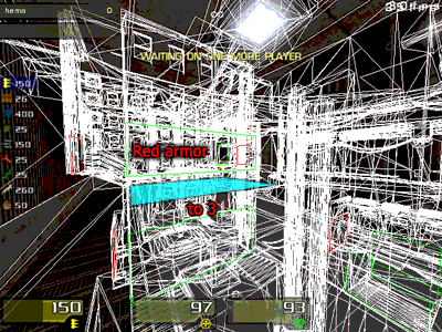
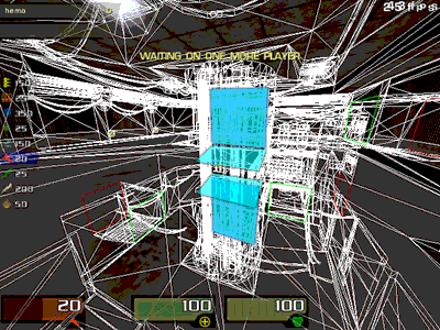
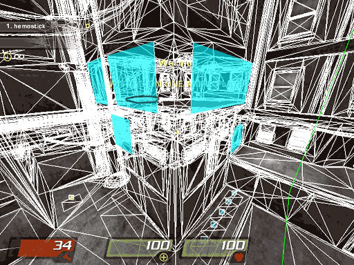
1) MH room
Image
This wall block highlighted in red is too thin for a player to fit, so I'm not sure a window there would be useful :)

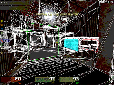
2) RA /jumppad tube Room
The two levels are now separated - most of the time. If we get too close to the jumppad "tube", we can still render the bottom level without even looking into it. So I suggest again that you try the two vertical portals from this :
Image
Not only will it help in this case, but standing from the outside It'll also spare us rendering the inside of it when we don't see it, thus saving a bit on overdraw.

Regarding the outside : the added horizontal portal does help. But I think that you might want to try adding another one higher...
Image
... for a more progressive transition when we come from lower levels but also for slightly better vis from the MH room..

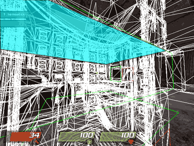
If we go from the upper level in the shaft "bunker" to the upper RA level, we start seeing the latter room quite early on. There's a small area from which we can see both upper RA and the FULL Mh room :
[lvlshot]http://hemostick.free.fr/quake/q4/method/frommhtop.jpg[/lvlshot]
Highlighted in yellow is the actual gap through which we can see to the RA room (you can enlarge that screenie to see better, although the image is quite lossy).
That's a pretty small gap. I think you can fix this by modifying the L shaped connection between where the screenshot's been taken and the jump pad tube room. You might need axial portals as well.

3)VIS between shotgun and LG

Here's a case where you should use axial portals. As it stands, from either end of that line, looking towards the other weapon, we're processing useless bits of the following room.
From LG to SG :
[lvlshot]http://hemostick.free.fr/quake/q4/method/lgtosg.jpg[/lvlshot]
From SG to LG :
[lvlshot]http://hemostick.free.fr/quake/q4/method/sgtolg.jpg[/lvlshot]
Suggested portal changes :
[lvlshot]http://hemostick.free.fr/quake/q4/method/sgtolgfix.gif[/lvlshot]
The change on the SG side portal should take care of the second issue. However it seems the change on the LG side portal might not be the most effective with the portal in that position. You might have to keep it axial like shown, but maybe move it a little forward inside the YA room. Either way, I'm sure you can sort it out. :)

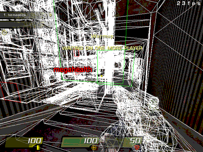
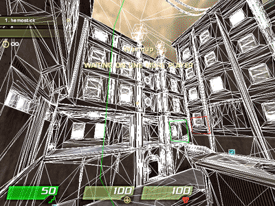
4)Back to the MH room

There's quite a bit of overdraw to be gotten rid looking out/in the LG bunker.
Image
Starting with these should help a bunch when we're inside the bunker looking out. Notice the portal on the opening in the higher floor.
You might have to add an extra portal inside the lower level.

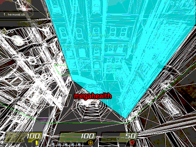
Let's pan back to the entire MH room... I still think you should really do the axial portal I suggested in my first post.
I now think you should also try this out :
Image
-Angle and shrink the big portal to reach that long pillar.
-Add a small portal in the hallway in order to get something roughly equivalent to the original large portal (i.e cuts the entire room, catwalk included).
-Block the remaining "windows".

Finally, I think that overall you might be able to make transitions to big rooms a bit less hard with a bit of func_static grouping of columns of windows. That way each column would pop into view only when it's visible. Might be tricky though, but probably quite a bit useful in the MH room.
Lukin
Posts: 349
Joined: Sat Jan 29, 2000 8:00 am

Post by Lukin »

I have to admit that I was disappointed with the 1st beta. Fortunately wviperw said what I wanted to say and now the map is way better. I don't have any suggestions regarding the gameplay right now (I didn't tested it yet, but it looks fine) - I just would like to second what hemostick posted. The performance is quite bad in some places, especially in MH room where my fps counter drops to 30 (my setup: AMD 4000+, GeForce 6600 GT, though only 512 MB RAM). I'm not sure visportals can help a lot there but you can also do something with lighting... The light count is fine but still could be a little bit better (this green neon doesn't need to emit light at all - I doubt anyone would notice the difference). And the shadows. They are the real problem - consider disabling the shadow in the biggest light for this area, maybe add another light source over the MH with casting shadows enabled, that would not affect all the windows and window sills around. Sort of a dirty trick, but it would do the job :P

Oh, yet I've got some suggestions about the gameplay. First one is about the teleport destination near the RA. I don't think this death spot is needed there - instead of this I would place the tele dest over the glass-ledge, somewhere in the air (like one of the teleporters on the Aerowalk). BTW this aformetioned ledge works strange - the decals flicker when seen trough it. GL could go to a place where HB ammo now lies.
The second suggestion is about another teleporter, the one in MH room. I would move it from the wall where it currently is to a wall in front of. In the current state of the map I often jump accidentaly into the tele, and the wall behind the MH is kinda empty.
[size=75][url=http://www.lukinonline.com]lukinonline.com[/url][/size]
Method
Posts: 222
Joined: Thu Feb 28, 2002 8:00 am

Post by Method »

Thanks for the suggestion guys. Will try them out in a new beta. The thing with the first beta is that I'm shooting for more of a commercial type of map and not competitive.

-Method
Lukin
Posts: 349
Joined: Sat Jan 29, 2000 8:00 am

Post by Lukin »

Commercial equals to not playable? Oh, that's why AAA games suck ;) ;)

BTW, I've got another concept how to improve the frame rate. You can make windows sills flat - after all that is what bumpmaps are for. Would be cool to see some more colors on the map - the red lines on the levelshot are so promising, yet the level is almost monochromatic.
[size=75][url=http://www.lukinonline.com]lukinonline.com[/url][/size]
Method
Posts: 222
Joined: Thu Feb 28, 2002 8:00 am

Post by Method »

Well, commercial games are oriented on general audience, which is bigger than competitive community. Most of them do not bunny-hop or time items. If levels were designed with hardcore competition in mind, they might not be as fun. Do you see my point?

Hey the level is not done yet. What about your flat walls in your map :P Hehe.

Not sure your idea about tele will work, I talked to son! and wviperw about it and it's most likely stay where it is.

-Method
Method
Posts: 222
Joined: Thu Feb 28, 2002 8:00 am

Post by Method »

26-JAN-07

Beta 4 changes:

- Moved SG and GL to a different location
- Removed second RL
- Textured teleporter room
- Removed hiding spots in tele rooms
- Added a pipe for a drop down route to MH near RA
- Performance tweaks
- Visual tweaks

Please do not pay attention to not fully textured areas. Simply testing ideas before adding visuals there.

Download:

http://www.methodonline.com/release/met ... _beta4.zip

Looking forward to your feedback.

-Method
pjw
Posts: 860
Joined: Sun May 07, 2000 7:00 am

Post by pjw »

I was able to finally take a quick look at this tonight, and I'm glad I did--it's looking cool. :)

Suggestions/Observations:

1. I also noticed the flickery decals through the glass--not sure what to do about it without further investigation of the glass shader and/or experimentation.

2. The changes you've made so far seem good--you've had some good feedback, and I think the layout and weapon/item placement seems very solid right now. I like the slope jump up from +50--nice--and distances on everything seem good.

3. The jumppad trigger below GL seems way too small. I can stand dead center on the jumppad model and still not be on the trigger. I realize that you're worried about launching the player too soon which = head-banging, but it just seems really weird. Can you tuck the model back farther under the trigger--make a little nook or something? Not sure how thick that tube wall is there...

4. I like the teles. I'm glad you added them. But, like Lukin, I'm not crazy about the dest for the RA tele. Also, that nook on the ground floor below RA (kinda below and to the side of the tele dest hall above) seems odd somehow...like something should be there or else flatten it off.

5. Biggest thing: I would also like to see more color worked in before you're finished--this map has a whole lotta brown...too much, IMO. One thing that makes this worse is that the shadows have been mostly killed as well. I'm guessing that you're using a pretty strong ambient--is this really necessary? Most pro configs pretty much kill all the shadows and brighten things up nicely anyway, so I'd like to see a bit more contrast and atmosphere thrown into the mix. Darker shadows would be cool, and maybe give your lights a bit (not a lot) of color here and there--the level lighting is very drab right now. I realize that you're going for a very city-grunge thing, but...eh...okay, I'll shut up.
A1yssa
Posts: 387
Joined: Thu Apr 12, 2001 7:00 am

Post by A1yssa »

I wonder how much of this cool maps will be in the cmp!
Method
Posts: 222
Joined: Thu Feb 28, 2002 8:00 am

Post by Method »

Pjw, I'm working on adding some more color. More neon lines on the buildings along with more signs. Not sure what to do with he glass shader.

-Method
zanpy
Posts: 1
Joined: Sat Jan 13, 2007 6:32 am

Post by zanpy »

Method wrote:Pjw, I'm working on adding some more color. More neon lines on the buildings along with more signs.
awesome. I've been playing this a bit and the layout is quite fun, but yeah, definately needs some spice.

I'd love to see you make a cyberpunk themed city level someday... I think you'd do it really well
Method
Posts: 222
Joined: Thu Feb 28, 2002 8:00 am

Post by Method »

Well thanks for all your feedback guys. The map has been submitted. I figured it's better if it'll be seen with the rest of the CMP maps rather than releasing final version right now. I hope you understand. Just for those who are interested, final version changes are:

Code: Select all

- Optimization
- Visual Tweaks
- Retexturing some buildings
- Adding more color
- Additional clipping for smoother movement
- Sounds (ambient + misc)
- Teleport exits were lifted 32 units above the floor
- Teleporters are more visible
- Added some MG ammo for long distance fights
There's some other stuff that I forgot to mention probably. Here are new screenshots:

Image
Image
Image
Image
Image
Image

Thanks again and I hope you like it,

-Method
Post Reply