Page 12 of 18
Re: Shared Map
Posted: Wed Aug 22, 2007 11:49 am
by Magnus
Thanks, The model was a13n's work and idea. I just used another of his rooms/areas and repositioned it to fit in where it is now and added a hot rock texture to the arch. I left everything kind of raw in this version so anyone on the team that wanted to pick it up and make changes could do so without having to deal with a lot of complicated brushwork.
I intend to create and place a scrolling lava shader today to apply to that arch so it will actually seem to have lava spewing out; and I am going to place some triger_hurt brushwork around it to make things a bit more realistic.
Anyway kudos to a13n for coming up with the face and arch. I just took the next step and added a lava texture to the arch.
There are still some areas I dont care for because they are a bit bland, but I wanted to get something to address the halls issue out kinda quickly. Guess this is a pre-alpha and that is kind of the idea anyway.
Re: Shared Map
Posted: Wed Aug 22, 2007 1:10 pm
by wattro
a13n wrote:
I agree to your scaling.(identical to wattro's?)
close - i'm still working on the version sitting locally on my machine - i've been delayed a bit. what i have is a bit bigger than what Mazor posted and I'm still concerned about it's size. good flow helps, but maybe not enough. i'm still trying to finish up what i got and post that, so hopefully that'll help a bit more. i've been kind of doing stuff all over so it's quite cluster-fucked =)
There are a lot of good ideas that have been posted around so it looks like this brainstorming method is quite useful for getting a lot of interpretations of the map. feels like art.
Re: Shared Map
Posted: Wed Aug 22, 2007 1:21 pm
by obsidian
BTW, I edited the last few download links orange since they are getting lost in the sea of text. You guys might like to continue with that.
Initially, I had the central room rotated 90° from the way the rest of you had it for two reasons: to extend the central path to make running distances more or less equal with the two side paths; it naturally vis'ed better since there were no straight lines of sight and every hallway leading from the central room had a 90° turn, perfect for hints.
Though seeing as how you all have already rotated it and built around it, I'm not sure about the pros/cons of rotating it back.
I see you guys have done quite a lot with regards to horizontal gameplay (no more room-hallway-hallway-room) but I still think the connecting areas need a bit more vertical gameplay. I'll see what I can do.
I'll see if I have some free time later during the week and early next week to toss around some of the other ideas I've been having.
Re: Shared Map
Posted: Wed Aug 22, 2007 2:16 pm
by maz0r
Great post obisidian. Didn't know your center was rotated in the beginning. But it makes sense, since the high platforms won't make an easy short cut then. Otherwise the distance the players have to travel is too long then IMO, which not enough space to dodge. Would be VERY hard to pull the flag through that I guess.
Ah and btw, can't anyone who has access to q3w web server change the css, so that links stand out? I'm really annoyed about the colors at the moment.
Will check magnus last version now.
Re: Shared Map
Posted: Wed Aug 22, 2007 3:00 pm
by obsidian
maz0r wrote:Otherwise the distance the players have to travel is too long then IMO, which not enough space to dodge. Would be VERY hard to pull the flag through that I guess.
Ah and btw, can't anyone who has access to q3w web server change the css, so that links stand out? I'm really annoyed about the colors at the moment.
I was trying to promote the use of the side entrances rather than the straight through route. So if you take the middle and fastest route, there's an element of risk where you have to travel down the long stretch of ramp without much cover or make the jump over the pit (and risk tripping

). If you take the slower side entrance routes, it takes longer but is safer. Overall, there shouldn't be any stagnant routes that no one takes because there is a shorter, safer route elsewhere. The player has to decide to balance between speed and safety of cover.
I have it all worked out in my head somewhere, but the problem is getting it all out in brush form. Sometimes it's so easy dropping out a layout from my head, sometimes it takes a lot more work since the brushes have space constraints that my inner mind seems to neglect. So maybe someone will come up with some other solution in the meantime.
Re: Shared Map
Posted: Wed Aug 22, 2007 4:20 pm
by Magnus
Actually if you guys are going to check out my latest version it would be best to use this one.
magnus_ctfptm5d
I created the shader for the lava fountian I was talking about. I also added some bot roams.
I made an attempt at fixing the issue I created in the meddle area obsidian created when I added the jumps with the yellow armor.
I left the jumps but moved their destination to take you up to the ledge above and not across the mid feild. This alows for the jumps and yellow armors that some of you seemed to like and slows movement through the middle as obsidian intended.
BTW, It was me that rotated that middle area into place. I was looking at it and noticed that the entry and exit points on the north and south perfecly matched the positioning of the existing entry and exit halls comeing from the east and west. So I thought maybe obsidian built that middle from a different starting point of view and never got around to rotating it. Oops!
Anyway if that is an issue sorry about that. It just seemed to fit the way it is so well I made an assumption. Should pay more attention to warnings about making assumptions.

I do feel that several of the areas as they are in my latest version could use some spiffing up. Mostly in the regen room and the pre-mid area with the hole in the floor between the lava fountian room and RG room, but I guess a lot of that will be done in the alpha stage.
I would like to see what someone could do with that pre-mid area with the hole in the floor though. I like the way it connects up with the RG room and the lava fountian room, but it needs some more interesting and functional structuring I think.
Gonna work on that later.
Re: Shared Map
Posted: Wed Aug 22, 2007 10:06 pm
by maz0r
Have you read my post and checked my version Magnus? Since many problems I spoke of and tried to adress still exists in the current version. And nothing happend about the overall size yet, the greatest issue besides the flow/'corridorness' at the moment if you ask me.
Just want to know if my work was/is helpful, else I would spend my time on something else (e.g. finishing my 1on1 map *sigh*

). Maybe my post just went down in the complexity of this thread
Re: Shared Map
Posted: Wed Aug 22, 2007 11:52 pm
by a13n
Magnus wrote:I intend to create and place a scrolling lava shader today to apply to that arch so it will actually seem to have lava spewing out; and I am going to place some triger_hurt brushwork around it to make things a bit more realistic.
Thank you!
Actually that model is a dummy and should be replaced with a new original model(such as barking skull)... at a later phase.
@obsidian
I see.
There were some important concepts behind your brushwork.
@all
I'm currently experimenting with a hallway next to the haste room.
Re: Shared Map
Posted: Thu Aug 23, 2007 12:15 am
by Magnus
I thought that was just an image you posted maz0r. Now that obsidian set all the links to be colored orange I went back and saw your link under the image right away. lol sorry about that.
Nice. I really like what you did with the large pillar room a13n created. Nice way to connect that area with that upper deck in the flag room.
I say that is something we need to make as a keeper.
WOW. massive LOS man...hehe. That hall between the fog telep room and the turn to the side entrance to the mid room is like 3072 units long and straight as an arrow. *runs around hiding the RGs*..lol.
As far as the overall size of the map not being changed in the latest version I managed to make the map 25% smaller than it was. That is a pretty big size reduction.
I agree the flow just dosent feel completely right in several areas even that latest version. In fact though the total map size has been reduced a fair bit and almost all of the halls have been converted into rooms as most people have suggested the flow feels worse than it did with all the halls and such. This really bothers me as I am a great deal about the flow of gameplay.
Just from the glance I got I like the way you filtered the walls down to a JP you put at the end of what used to be the X hall. That would really fit in well with and help fix some flow issues in that area in the latest version.
Now that I know there was a link and downloaded your version I am going to go in and try to patch in some of the areas we all like into your version and see how it feels/works.
Oh, and yes your input has been very helpful and this version you made may solve several issues we have had so far.
Well back to work.

@a13n:
Your welcome. That was a great idea and nice room to go with it. Fits in with the cave feel really well. Have you had a look at the shader I added to your model yet? The whole thing looks friggin sweet.
I would suggest to the rest of the team that we adopt a13n's room structure for all of our rooms, halls, ect. Using this style of blocking can be used to create any shapes and turns needed for any halls and rooms. It can also create a very organic feel without having to resort to hefty model work.
That kind of brush replacement may best be saved for the official alpha version though.
Re: Shared Map
Posted: Thu Aug 23, 2007 2:12 am
by wattro
re: organic geo
there are a couple of ways to do this that I'm familiar with - I'm not sure what a13n did
One is the way in which obsidian generated a fairly good organic feel to the middle room. It's simple to do if you use vertex dragging and a decent grid size (eg: 16). You can also use the clipper to make the cuts, but it's easy to select brushes that share a plane and move a common vertex.
The second way is tri-souping. If you are familiar with terrain generation, it's the same method, just on a smaller scale. If you take a wall, and cut it up into smaller pieces (usually of equal size) and do the same style vertex manipulation, you can get some pretty good results.
I have a bit of both in the map that I will get up later tonight (finally found some time). Warning, it's chaotic in there with good and bad, but hopefully it spurns some good ideas. I don't really care what ends up with it.
As a word on models (especially for creating organic walls and floors, etc... I plan to do zero modelling. It's not my forte and I think it's overkill - both in terms of potentially damaging performance and being overly painful to get all connected up. I think models tend to work better as individual pieces to add to the levels atmosphere. Maybe I am reading the intention of why we want to use models incorrectly. In short, I'll leave models to those who can.
I think brushwork is the way to go; and definitely a post-alpha thing, but it doesn't hurt to demonstrate it in certain parts of the map in the before-alpha version. It's hard to go in a re-work an area that has been heavily organic-ified.
Re: Shared Map
Posted: Thu Aug 23, 2007 3:39 am
by obsidian
I agree with wattro and think that the organic brushwork should be left until beta. The alpha is making progress, but there is still a lot of changes that can still be done and we haven't even playtested it yet.
Re: Shared Map
Posted: Thu Aug 23, 2007 5:41 am
by a13n
@Magnus
My octagon-based geometry is not the final shape.
It's just a temporary manipulation, to be replaced with different brushes or models later.
Your shader is just great.

Its effect is exactly what I've intended.
@all
Below is my current progress.
a few modifications around haste
 merged maz0r's shortcut from spiral stair to flag room, plus added a func_button to trigger func_door
 ============================================================
[color=FF8000]a13n_ctfptm5cd(400kb)[/color]
============================================================
============================================================
[color=FF8000]a13n_ctfptm5cd(400kb)[/color]
============================================================
Re: Shared Map
Posted: Thu Aug 23, 2007 6:58 am
by ix-ir
Had a look around al13n's latest version - some nice areas but this map is getting way too big for 5v5 and needs some heavy vis blocking. Railgun is going to make this into snipe wars.
Re: Shared Map
Posted: Thu Aug 23, 2007 6:40 pm
by wattro
remember the map file i posted up a ways back? i carried it through, connected it up to the midfield, added in some of the ideas i saw floating around, and made a shitload of changes. it's kinda chaotic, but hey...
check out the map here
-arena file & aas included, + lots of good and bad things in the map
have a look and let me know what works for ya and what doesn't. i'm not sure if it addresses the size issue, but i hope at the very least it helps with ideas and what-not.
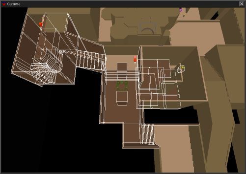
[lvlshot]http://www.robotrenegade.com/q3wptmctf1/source/wattro/q3ctfptmwattro.jpg[/lvlshot]
ps: obsidian, thanks for the host - very groovy! =)
Re: Shared Map
Posted: Thu Aug 23, 2007 6:52 pm
by wattro
well, that sucks...
anyone know why the message "couldn't find a spawnpoint" would pop-up? it seems it only started appearing when I added ctf_blueplayer/ctf_redplayer, but didn't happen with ctf_bluespawn/ctf_redspawn.
ideas?
Re: Shared Map
Posted: Thu Aug 23, 2007 7:47 pm
by ix-ir
From a gameplay perspective wattro's version is stronger at the moment, it feels like's a more logical flow between areas too. It still has a lot of lines of sight that are far too long - corridors happen to line up to you can shoot for a very long way and the two side areas on the flag rooms are open to view.
Re: Shared Map
Posted: Thu Aug 23, 2007 8:06 pm
by wattro
cool - i fixed the spawnpoint issue... seems that if you do weird things then weird things happen. the link above should(!) point to a fully working CTF version from the skirmish menu. 4v4 or 5v5 with bots on nightmare is about the most you'll get out of playing with bots. they play like bots...
ix-ir: thanks for the comments.
when you say the 2 side areas on the flag rooms are open to view, do you mean with each other, or with other parts of the map? i know there are a few places where you can see through a hallway and into one of the nearby rooms. a couple of those are my fault/intentional, but i'd definitely like to clear up the LOS with the 2 side rooms from the flag room, and also clear up the LOS between the lowest entrances to the midfield. if these are
far too long, how long is
not far too long?
Re: Shared Map
Posted: Thu Aug 23, 2007 8:50 pm
by maz0r
wattro: you need both entities in ctf maps. The blue/redplayer is only for the initial spawns at the start of the map (under normal circumstances these are all in the base), the bluespawn/redspawn are used whenever you die and respawn while a game is running.
Will check out the last versions now. But I think/fear that many issues I spoke of earlier are still existing.
Re: Shared Map
Posted: Thu Aug 23, 2007 9:00 pm
by wattro
the problem was caused by some glitch in the way radiant was handling entities. it seems that sometimes entities don't like being 'undone' in terms of being moved around within world. so after I closed and re-opened the map, i found the red/blue spawns were way out in the wilderness where i put them for temporary measures while i hacked away at some other stuff.
re: the occurance of some of the previous issues - i honestly haven't tried very hard to address them yet. it'd be cool if you could iterate them again with bullet points. i feel the map is still too large and i know there are a few LOS issues as ix-ir pointed out. am i missing any others?
thanks for your feedback
Re: Shared Map
Posted: Thu Aug 23, 2007 10:00 pm
by ix-ir
wattro the side rooms should not be visible from the main flag room, the flag room is huge as it is and may benefit from more of those nice rock columns as cover. This is a very rough rule but generally a long line of sight could be 1000 units or more but should be pretty rare, the majority of map areas should not be providing these kinds of ranges to avoid sniperville. I'd try to break things up to a nice and personal 512 to 700ish region, areas need to be small enough that combat is face to face. This is far more fun and skillful than lots of sniping (which there will still be plenty of room for). Basically each room needs to be vis blocked by the corridors or links.
I hope I don't come across as banging away at the same drum needlessly, just be aware how many players can hit 50%+ railgun these days and how quickly that bogs down a game. Railgun can and will just break a map in half if not carefully considered.
Re: Shared Map
Posted: Fri Aug 24, 2007 5:27 am
by wattro
bang away. i'm trying to figure out the best way to rectify. i'm not sure if i should rebuild the base entirely and/or hack in each of the areas to solve the identified issues, or start building a new map taking in the feedback from the get-go.
LOS issues aside, what about:
-how is the map size for 4v4 or 5v5?
-what stood out as good/bad?
-item placement, good/bad?
Re: Shared Map
Posted: Fri Aug 24, 2007 8:56 am
by a13n
wattro, nice map(looks like a lot of work)!
I played with default bots via skirmish menu and they gave me more fun time than expected. (3vs3)
Because I'm not a matured ctf player, I can't tell too much about the size and item placement.
But as far as I can tell, flag room(flag at the center and surrounding pillars) and MHealth room(clibming path instead of jump pad, road to MHealth...) are specially good to me.
Re: Shared Map
Posted: Fri Aug 24, 2007 1:03 pm
by maz0r
Ok, checked wattro's attempt now. Great map wattro, looks like much work was put in, indeed. Short list of likes and dislikes:
Likes:
- The new flag room, great flow, defendable AND attackable, good route variety.
- The center, again very good flow here, nice step to remove to second upper entrance, so the way which has to be crossed is longer now.
- The connectivity is great. Decent work here.
- Finally some vertical gameplay.
Dislikes:
- The size. Yeah IMO it's still to large. Especially some small side rooms just holding a weapon or 2 health bubbles are like giant halls. The surroundings of the base feel too big. There is just so much place where an enemy fc with your flag could hide and run.
- The outer ring(s) of the base could be a tiny bit smaller and less open.
- Item placement, needs still a lot of work (could make some suggestions if you want).
- Don't like the moved bouncepad in the midfield. Would prefer them at the place obsidian put them originally.
- The MH is too much out of the way. The room is great, but don't make it such a dead end trap.
- Some slopes are still too steep (stairs wouldnt change anything), for example when running up the way from base to the high platform in midfield.
Best alpha (yes that already is an alpha
) I saw here gameplay-wise. But still a lot of work to do. Not satisfied with the size yet, the never ending issue I guess. Keep it going!
Will check other versions also during the next days. Stay tuned!
Re: Shared Map
Posted: Fri Aug 24, 2007 1:40 pm
by maz0r
Okay back again, checked magnus' and a31n's last versions. Hmm where do I start. Sorry guys, but I fear these versions are a step in the wrong direction. Especially a13n is making this into a jump'n'run and not a fast paced ctf map. The switch for the port-med door is really an absolute no-go, so is the strange position of the haste. Also the setup of 1 regen AND haste per side is kind of uncommon. You get 4 PUs spawning simultaneously, resulting in less players fighting for them.
Dunno if you checked my version well, but important things I already mentioned earlier and even adressed are still there, like the main problem, the size again
Re: Shared Map
Posted: Fri Aug 24, 2007 3:25 pm
by a13n
@maz0r, ix-ir
That's right.
After comparing(looking down from the top) wattro's, maz0r's and magnus(+mine), I noticed that our size was too large at every section and there are some wasteful spaces.
1st of all I have to cut them down than anything else.
I'll try to shrink the whole layout based on magnus_ctfptm5d while referencing others' then post it later.