I just had a quick run-around and I really like the layout; lots of over-under and great connectivity. It's one of those levels that seems complicated for a bit, and then everything sort of clicks, and you suddenly know where everything is...
Observations/Suggestions:
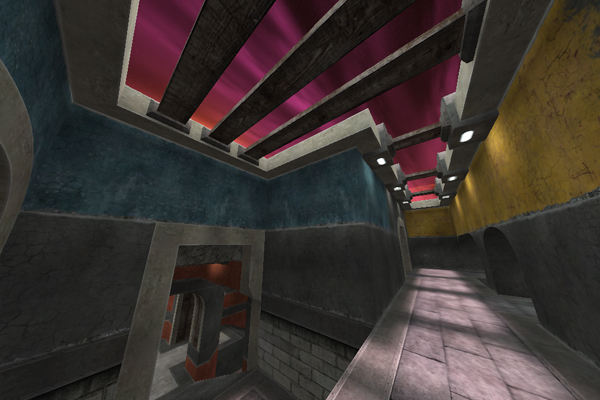
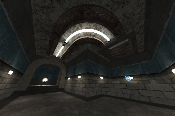
1) Something really iffy with the texturing on these:

The actual tube parts of the light look odd--those gray spots near the middle. Also you might want to vary the wooden beam texturing a bit to disguise the Ctrl-C/Ctrl-V. I actually like these lights quite a bit--maybe sprinkle them around a bit more, and make some flat (rather than arched) variations, like in places where there's currently unsourced lighting (e.g. near MH)?
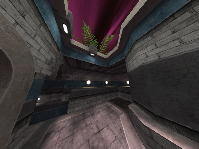
2) Whatever sky you decide on, please make it something bright and colorful, or at least something other than gray--there's enough gray in the map already.

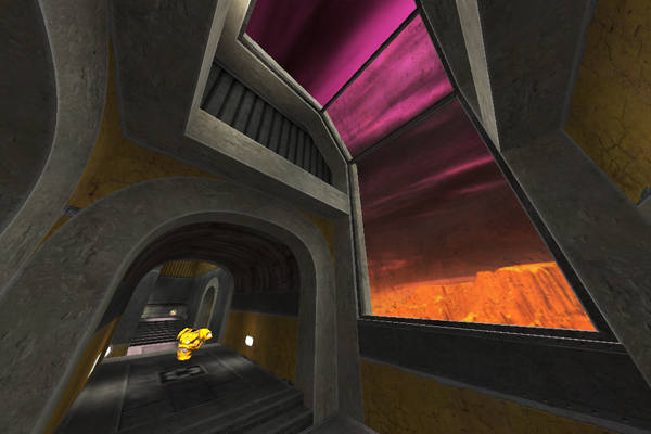
3) How about some windows? It would serve to break up the walls and give the level more of a sense of space, instead of it being a series of closed boxes. The skylights help, and I think you should do those wherever possible to make it feel more open, but windows would help even more. You wouldn't have to put much outside--just some simple building facades or a couple of walls blocking further sight, or a small square rooftop with something on it, or cliff face/top or...
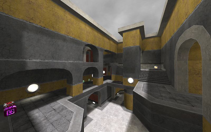
4) RA/MH seem a little close, and I'm not really crazy about the RA spot...just sorta stuck in a stairway corner there. I noclipped around for a while, and I don't really see a better place for RA. You could put it where GL is, but then you'd be even closer to MH, unless you blocked off that hall, and then MH would be in a serious dead end, sooo... yeah. I'll just leave it as "RA/MH seem a little close" and not offer anything useful otherwise. How's that?

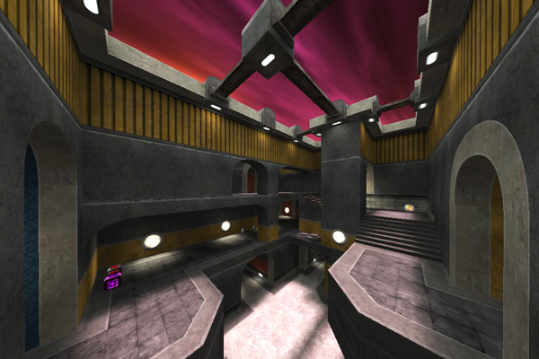
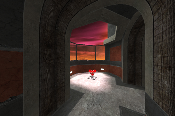
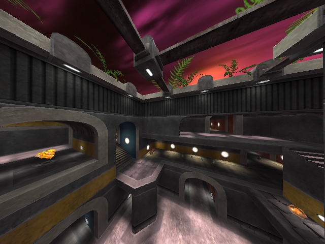
Edit: I agree with Jabberwock about that second shot. Maybe just lose the one middle archway with the shards behind it?