Finally I have got somewhere with this map. Its taken quite a while but I am very pleased to tell you that it has reached beta stage.
(probably add more text here but I am to tired now)
Download: http://www.g0th.se/files/map_g0thdm3beta1.pk4
pics:
[lvlshot]http://www.g0th.se/pics/g0thdm3/g0thdm3_01.jpg[/lvlshot]
[lvlshot]http://www.g0th.se/pics/g0thdm3/g0thdm3_02.jpg[/lvlshot]
[lvlshot]http://www.g0th.se/pics/g0thdm3/g0thdm3_03.jpg[/lvlshot]
[lvlshot]http://www.g0th.se/pics/g0thdm3/g0thdm3_04.jpg[/lvlshot]
[lvlshot]http://www.g0th.se/pics/g0thdm3/g0thdm3_05.jpg[/lvlshot]
[lvlshot]http://www.g0th.se/pics/g0thdm3/g0thdm3_06.jpg[/lvlshot]
[lvlshot]http://www.g0th.se/pics/g0thdm3/g0thdm3_07.jpg[/lvlshot]
[lvlshot]http://www.g0th.se/pics/g0thdm3/g0thdm3_09.jpg[/lvlshot]
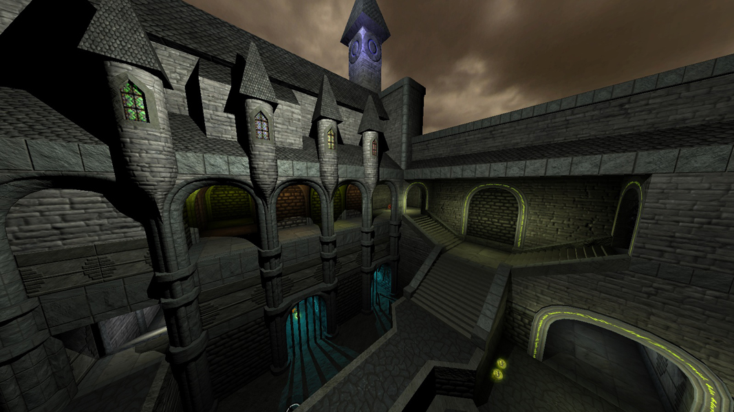
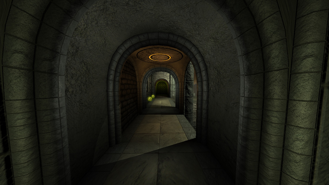
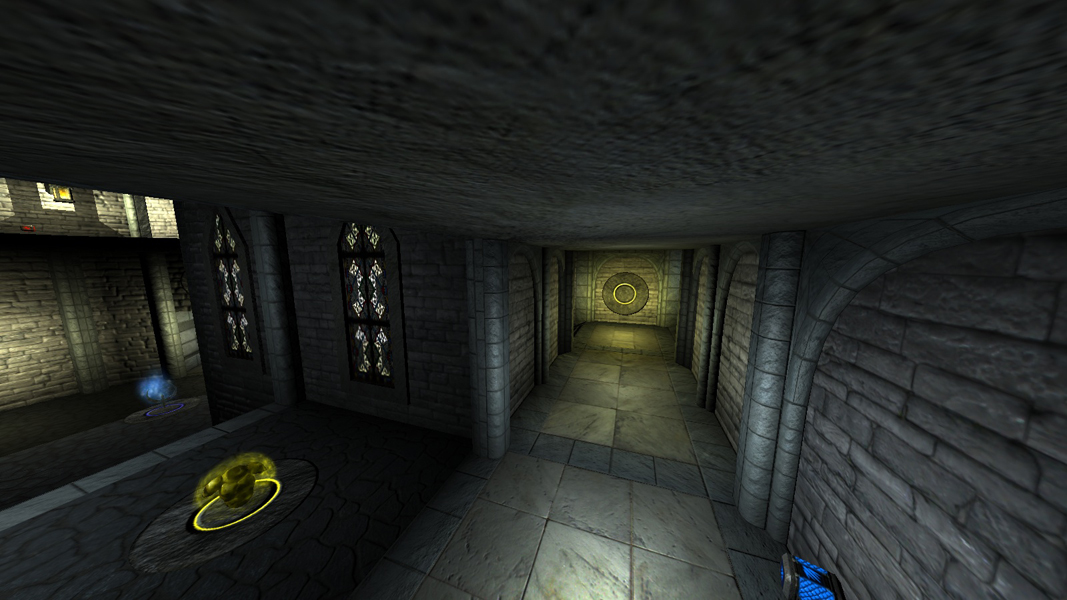
g0thdm3 - the castle map - beta1
g0thdm3 - the castle map - beta1
[url]http://www.g0th.se[/url]
Re: g0thdm3 - the castle map - beta1
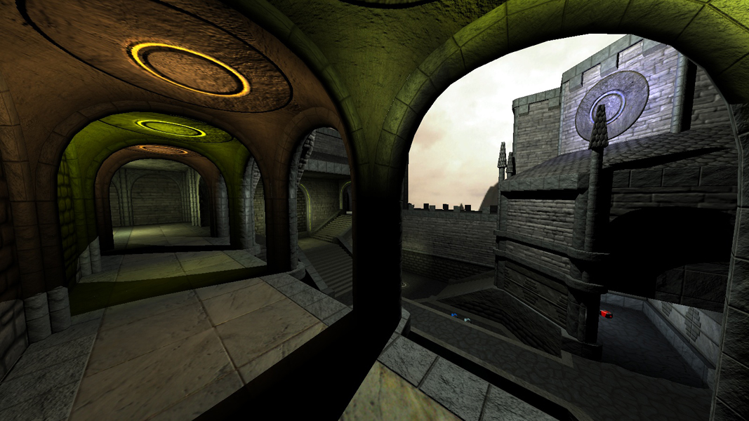
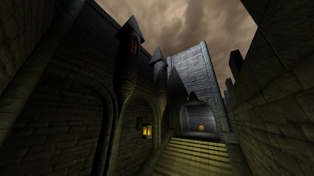
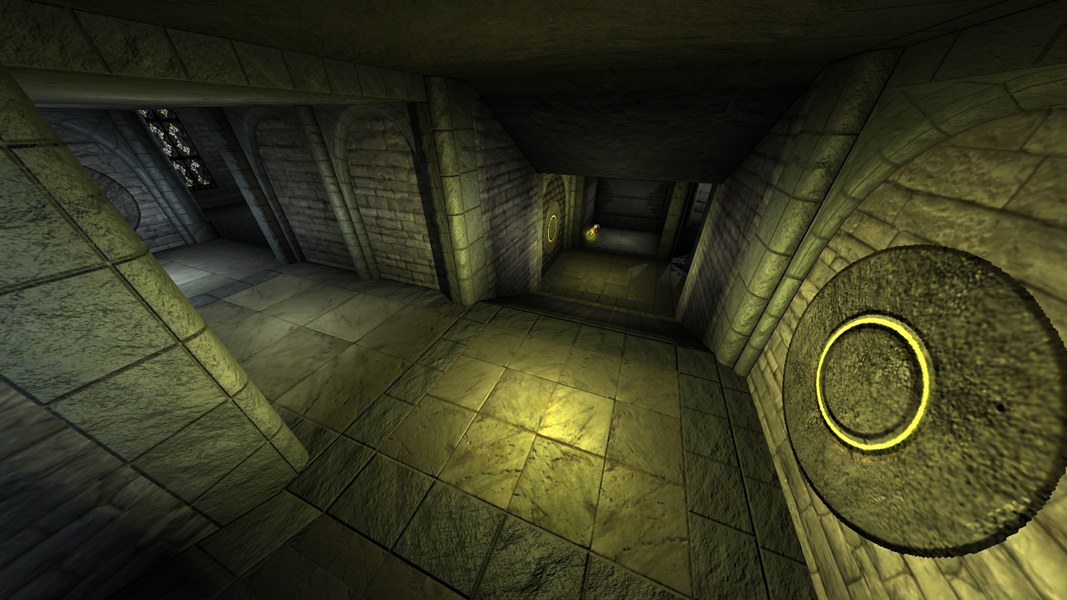
That looks very cool, architecture-wise, but I'd suggest consolidating your light colors a bit. 
Green + blue + yellow + purple light (all pretty saturated) is kinda all mixed together in one level.
The blue between the bars looks great to me, but (even though purple is my favorite color) the purple looks out of place. Maybe keep the blue and the yellow, and lose the green/purple? Just my $0.02.
Green + blue + yellow + purple light (all pretty saturated) is kinda
all mixed together in one level.The blue between the bars looks great to me, but (even though purple is my favorite color) the purple looks out of place. Maybe keep the blue and the yellow, and lose the green/purple? Just my $0.02.
Re: g0thdm3 - the castle map - beta1
I agree that the purple looks out of place. I acually thought off trashing the hole wizard model and the purple lightning with it but decided to keep it in for beta1. I am not really sure what you mean by the green lights? I don't have a single green light in the map but I do get the saturated part (nice smilies btw ) I and will look into that for the next beta.
edit: Forgot to say that I am glad you liked the blue parts between the bars
edit: Forgot to say that I am glad you liked the blue parts between the bars
[url]http://www.g0th.se[/url]
Re: g0thdm3 - the castle map - beta1
2nd shot looks green to me.
-
Dark Metal
- Posts: 5496
- Joined: Sun Feb 20, 2000 8:00 am
-
+JuggerNaut+
- Posts: 22175
- Joined: Sun Oct 14, 2001 7:00 am
Re: g0thdm3 - the castle map - beta1
other than the purple, i love the colors you used. that looks great.
Re: g0thdm3 - the castle map - beta1
Hmmn. The first and second shots? Looks like alternating green-yellow-green-yellow lights to me...?g0th- wrote:I am not really sure what you mean by the green lights? I don't have a single green light in the map
Re: g0thdm3 - the castle map - beta1
I always considered those lights to look yellow acually but I see now when all of you point it out that they do look a bit greenish compared to the other yellow lights in the map. Thanks a lot
+JuggerNaut+: Thanks man
+JuggerNaut+: Thanks man
[url]http://www.g0th.se[/url]
Re: g0thdm3 - the castle map - beta1
Yeah, the lighting is definately a little odd. Good lighting adds detail, and the lighting here changes so much, so drastically that it doesn't really work, for me.
Personally, I'd keep the warmer yellow-green lights for the castle-ledge areas, and only use the mystic blue/purple stuff in really particular areas.. Warm lights in an area or doorway make me want to go there, so it's good for advertising a route (or a spawn point, or anything else important).
Personally, I'd keep the warmer yellow-green lights for the castle-ledge areas, and only use the mystic blue/purple stuff in really particular areas.. Warm lights in an area or doorway make me want to go there, so it's good for advertising a route (or a spawn point, or anything else important).
Re: g0thdm3 - the castle map - beta1
Thanks Godlike I keep that in mind.
[url]http://www.g0th.se[/url]