Page 1 of 1
My Portfolio...
Posted: Mon Jan 18, 2010 10:53 am
by Silicone_Milk
Hey guys. I put together a quick-e-portfolio website today. I still have a lot to do but it's complete enough where I thought I'd ask for some impressions/feedback.
My portfolio can be found at
http://www.siliconemilk.com
I still need to put up my resume. Also, ignore the notice at the top of the Code section as I haven't split that page in to released and wip sections yet.
I'm mostly looking to see how the website fares on other peoples' browsers. Any images failing to load, links that are broken, etc. Also, is the design too simple (should I do something more with it (note that I've always been a huge fan of minimalism))?
I would appreciate to hear what you guys think of it and what could use improvement.
Thanks!
Re: My Portfolio...
Posted: Mon Jan 18, 2010 1:17 pm
by o'dium
Well, I like it, its basic enough to get the point over but not too basic that it distracts people.
My only real tip is to set a minimum width on the horizontal span of your site so that the index bar at the top doesnt break when you view it at lower resolutions.
Keep it up though

Re: My Portfolio...
Posted: Mon Jan 18, 2010 1:19 pm
by MKJ
the only windowsize it breaks at is 800x600 or lower, I wouldnt worry too much about it.
Re: My Portfolio...
Posted: Mon Jan 18, 2010 4:10 pm
by Pat Howard
Lookin' good. I wouldn't worry about the simplicity. The worst thing you can do is add too much flash (lame pun). Have you read this?
Your Portfolio Repels Jobs
Great list of what not to do. The guy who wrote it seems to be a bit of a curmudgeon but it has helped me a lot with my portfolio (working on it now) and I recommend you read it.
Also, is there a reason you've putting your work online? Looking for a job or is this just for kicks?
Re: My Portfolio...
Posted: Mon Jan 18, 2010 4:50 pm
by Silicone_Milk
Thanks for the replies guys.
O'dium - I thought I might have issues at 800x600 and lower. I reason that people viewing my portfolio won't be doing it on their mobile devices though so I'm not super worried about it breaking on super-low resolutions

Thanks for pointing that out though.
Pat Howard - Thanks. I avoided flash altogether since it annoys search engines. That was a pretty interesting read.
And yes, I'm looking for a job. The website will make that clear once I get it finalized later this week.
Re: My Portfolio...
Posted: Mon Jan 18, 2010 5:21 pm
by AEon
I also just read this, here some things from a "good" example mentioned in the comments:
- Main page has the most impressive images right at the top relatively large.
- Two rows of more impressive thumbnails.
- Name, email, short description of primary and secondary skills with examples, plus a list of used tools.
- Clicking on a thumbnail on a opens a new page with email and the larger image. Now the spiffy part, clicking on the image loads the next image... this lets you navigate the art very quickly. The way it should be.
- All images have a url in them.
I'd say this is pretty well done indeed. Lowest level of frustration in navigation, quick access to pertinent information.
Personally I'd also add a navigation to the top of the page... i.e. for a more detailed "splitting" of the art should that be of use, e.g. texturing, model design, level design, etc. But keep the eyecatchers on the main page.
Silicone_Milk,
pertaining to your present site:
- Put your pertinent resume (position you are going for, primary/secondary skills) info on your "Home" page (front page)... but name it differently, "Home" sounds weird... I'd move a compact version of Contact onto the "Home" page as well.
- Having to click on your other pages to find info is already a "distraction in navigation", IMO.
- Keeping it simple is good, but a simple mouse-over (hover, underline on mouse-over) effect on your main horizontal navigation would be nice just to same, to help make clear this *is* a navigation.
- "About" page... instead of a texture block use a bullet list making it easier to skim your info... maybe separating into into several bullet list blocks with section titles... sorting your info.
- Contact page... instead of the long-winding:
- If you would like to contact me, I can be best reached via email.
actually show the email address:
Or something like that... a blind "email" link name is not very confidence inspiring, IMO.
- IMO, it would be good to actually mention were you are located, i.e. for what country that phone number is.
- In your bottom line: "© Brandon "Silicone Milk" Haston" add something like this:
- Top of page "Brandon Haston"... something like...
- Brandon Haston - Programmer / Game Designer
or what you are looking for job-wise, should also help... maybe.
Just a few thoughts
Re: My Portfolio...
Posted: Mon Jan 18, 2010 10:55 pm
by AEon
Going through the complete Screenshots thread I noted this:
Very nice design, and "in your face presentation" (in a good way that is). Might give you -
Silicone_Milk - some additional inspiration.
If BJA does not have a job in gaming industry, the industry must be off their rocker (did not see any industry reference in the resume). Amazingly talented.
BJA,
only thing I would be wishing for are downloads for hires versions of your screenshots. I.e. 1680x or 1920x... many of your scenes would make *really* spiffy desktop wallpapers.
Re: My Portfolio...
Posted: Mon Jan 18, 2010 11:55 pm
by Silicone_Milk
AEon wrote:
only thing I would be wishing for are downloads for hires versions of your screenshots. I.e. 1680x or 1920x... many of your scenes would make *really* spiffy desktop wallpapers.
^

It could be a late christmas present to Q3W
Re: My Portfolio...
Posted: Tue Jan 19, 2010 12:25 am
by obsidian
I'll take them in dual widescreen 3840x1200 please!
SM, it'll help us judge it when you eventually add more content to it. A website without content isn't very interesting. Structure-wise, you've kept things simple with a minimum amount of pages to browse through, which is good. Basically, there isn't a whole lot to say about it.
Re: My Portfolio...
Posted: Tue Jan 19, 2010 1:47 am
by Silicone_Milk
obsidian wrote:I'll take them in dual widescreen 3840x1200 please!
SM, it'll help us judge it when you eventually add more content to it. A website without content isn't very interesting. Structure-wise, you've kept things simple with a minimum amount of pages to browse through, which is good. Basically, there isn't a whole lot to say about it.
Yep, I know
I mainly wanted feedback on the structure since that's extremely important to me for the arrangement of the content that will be posted. Wanted to know if I had any "holes" that needed to be patched up before I continued working altering it.
Re: My Portfolio...
Posted: Wed Jan 20, 2010 11:44 am
by monaster
Agree with bja's "wallpaper compatibility": his "Into the sun" screenshot already stayed several months on my desktop for exactly this reason.
Re: My Portfolio...
Posted: Wed Jan 20, 2010 8:03 pm
by Silicone_Milk
Did some tweaking, added resume, still have some more things to tweak a bit (landing page specifically)
Re: My Portfolio...
Posted: Wed Jan 20, 2010 11:48 pm
by AEon
Please note these are just my impressions - putting on the "interested employer cap" (I never was one mind you) - trying to think along those lines, analyzing your resume pages.
- Bottom of page, squashing the email like that is a bit ugly. Might be better to place it at the top of the page... in the row with with "Brandon Haston", but flush right or in the row of "Game Designer and Programmer" flush right (same size).
- About page... IIRC the caps on "iD Software's idtech3" are actually: id Software's idTech3
- About page... "on a couple projects" - might be better to say "on several projects" - since "couple" sounds a bit too "chummy".
- About page... might be good to link those companies (not sure though).
- Code page... instead of "Code" (aka "I'm a hack"), IMO, "Programming" sounds more professional.
- Resume page... I'd *link* your email as well... anything that gets interested folks into contact quickly is a "good" thing... presently they have to copy/paste your email here, *plus* have to remove the space... this can annoy, IMO.
- Resume page... Education... I may be off, but it would be interesting if you mentioned your "majors" (is that the correct term?) in school and college. But only if they pertain to the job... i.e. if they are scientifically orientated (at least in Europe
 ) that would be a sign of a clear thinking, efficient, systematic problem solver, i.e. exactly what programmers should have/know... plus a creative edge?
- Resume page... Sorry to say this... but the preference for idTech may be a slight sign of limitation. E.g. any company using Unreal3 tech will skip your resume (game coding-wise), and I am not so sure there are that many companies out there that use idTech (any more).
- Resume page... Goal... again I may be wrong, but your "Goal" may be a nice thing to hang on your wall, but you don't really have such goals in a resume, you should actually try to make the accomplishments towards that goal apparent. So I'd drop that line... it sounds too much like "...and I would wish for world peace".
Re: My Portfolio...
Posted: Thu Jan 21, 2010 12:15 am
by Silicone_Milk
Interesting points.
I do believe you're right on the capitalization. For some reason I had always thought it was iD and not id. Hm.
I was considering linking the companies as I mentioned them but wasn't sure if that was necessary or not.
Good catch on the email on the resume page. It was originally a link but I was doing some editing in the html and must have accidentally screwed it up.
Yeah, Unreal3 tech is pretty big these days. I've actually downloaded UDK and started playing with it this week so I can learn the engine and be able to add that to my resume later.
I'm getting a mixed response on the goal part of the resume page. Some people I've talked to like it, others don't. I feel it's a bit of fluff that doesn't really add to the facts. I'm going to consider what to do with it after I finish moving in to my new place.
Thanks Aeon
Re: My Portfolio...
Posted: Thu Jan 21, 2010 1:41 am
by obsidian
Also, there are spaces... id Tech 3
And... Squirrel [1 month]... is probably better off not mentioning. It doesn't sound like "experience" and is just tinkering.
Re: My Portfolio...
Posted: Thu Jan 21, 2010 9:01 am
by sock
Your first page should be something graphical that straight away catches people's attention, a wall of text about yourself makes your web space feel like a blog. The colour scheme and layout is way too bright, I highly recommend a more subdued colour scheme so that your screenshots stand out from the background page.
I know you are going for a
minimal visual approach but this webspace is not minimalism, because it lacks a graphical design. I am sorry to be harsh but the layout feels like a web program template because you have plain text for buttons, no banner and hardly any framing of objects. I know artwork is not everyone's cup of tea but if you are stuck for ideas then visit other sites, work out how they are put together and create some test layouts. Your webspace should be a graphically pleasing to the eye with a slick layout and lots of gorgeous eye candy to look at.
If you are serious about job hunting an online graphical portfolio is never the first stop, it should be
Linkedin. This is where everyone stores there online CV/resume details and more importantly networks with people about getting jobs. Most company and external recruiters use this site for finding people and this is where you should start.
Good luck with your job hunting.
Re: My Portfolio...
Posted: Thu Jan 21, 2010 9:01 am
by wattro
always links, people are lazy and don't want to google
engineering sounds better than both programming and coding (also, Designer / Engineer or Engineer / Designer depending on which one is your [desired] strength)
just glazing over some snippets:
"first prototype of Encore! using the Torque 2D engine." -- would be cool to list out some of the significant features
"To consistently deliver a memorable and emotional experience through the utilization of
video games as a storytelling medium." -- get rid of the word consistently and the utilization of
The resume page essentially states the same information that should be or is found on other pages. I might consider breaking the details of the resume up into bite-sized chunks and sprinkle them into the other pages where appropriate and in a way that doesn't clutter. The resume page could become a contact page, with a link to your .pdf resume... and possible include some bio (what makes silicone interesting)
on a side note, the site doesn't showcase your work, at the moment.
hth
Re: My Portfolio...
Posted: Thu Jan 21, 2010 2:15 pm
by AEon
wattro wrote:engineering sounds better than both programming and coding (also, Designer / Engineer or Engineer / Designer depending on which one is your [desired] strength)
I'd be careful with the word Engineer... in Germany it actually means something (someone who actually has a degree from university related institution), in English speaking countries this seems to to be a completely misused term used to pimp the most trivial jobs (see "Sanitary Engineer").
Sock,
I'd agree if this was a resume for an artist... as a programmer presenting what you did is a bit tougher. Though the "game designer" bit would and should be visualized in some way, in that respect Sock is right, some art/gfx would be nice.
Re: My Portfolio...
Posted: Thu Jan 21, 2010 6:21 pm
by Silicone_Milk
Ah, interesting points all around.
@Sock - Those buttons *are* plain text, as you say, but behind the scenes they're set up for replacing the text with interesting graphic effects. I'm going to start adding small graphical bits I think when my wacom tablet gets to my door.
I use linkedin already, I would also like to have a personal website as well that I can tell people to visit rather than
http://www.linkedin.com/my_account_name since that really doesn't stand out from the other linkedin.com/other_account people.
@Wattro - Noted on the links.
Engineering is a bit much, I think. I've met many game programmers but never a game engineer
I'll have to re-rethink that resume page.
Thanks for the feedback guys
Re: My Portfolio...
Posted: Fri Jan 22, 2010 7:50 am
by wattro
software engineer is what we call them at my work
Re: My Portfolio...
Posted: Fri Jan 22, 2010 8:58 am
by Silicone_Milk
So I put a new layout together based on Evillair's EQ2 texture set as it's always been one of my favorite sets for Q3. I just love that gritty industrial look.
Haven't uploaded it to the server yet. Still need to tweak things. Designed for 800 x 600 resolution minimum in mind even though of the ~120 people who've visited my site, not a single one had a res less than 1024 x 768. Hm.
Re: My Portfolio...
Posted: Sat Jan 23, 2010 10:11 am
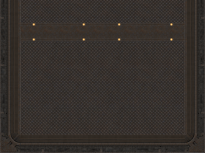
by Silicone_Milk
Almost there... divs are a bit fickle.
[lvlshot]http://i12.photobucket.com/albums/a242/caldiar/almost.png[/lvlshot]
Re: My Portfolio...
Posted: Sat Jan 23, 2010 10:12 am
by Hipshot
Wait, you worked with Irongrip? Love that game...
Re: My Portfolio...
Posted: Sat Jan 23, 2010 10:14 am
by Silicone_Milk
Hipshot wrote:Wait, you worked with Irongrip? Love that game...
Iron Grip: Warlord. irrc there's also the original Iron Grip: Oppression which was a mod while Warlord is a stand-alone built off of Q3.
But, yeah, I did some weapons programming for the Warlord project.