Page 1 of 1
Re: [Beta] pukka3tourney6
Posted: Sat May 23, 2009 11:08 am
by Jabberwock
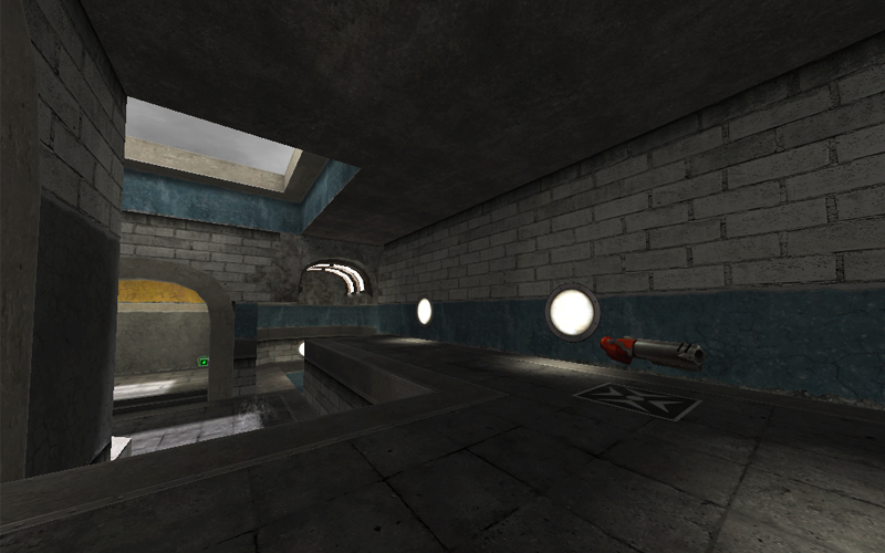
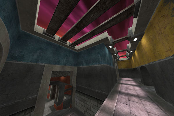
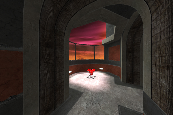
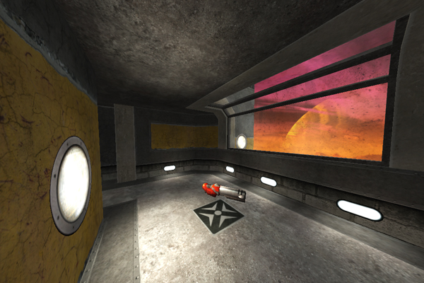
It looks great! I like the streamlined graphics a lot.
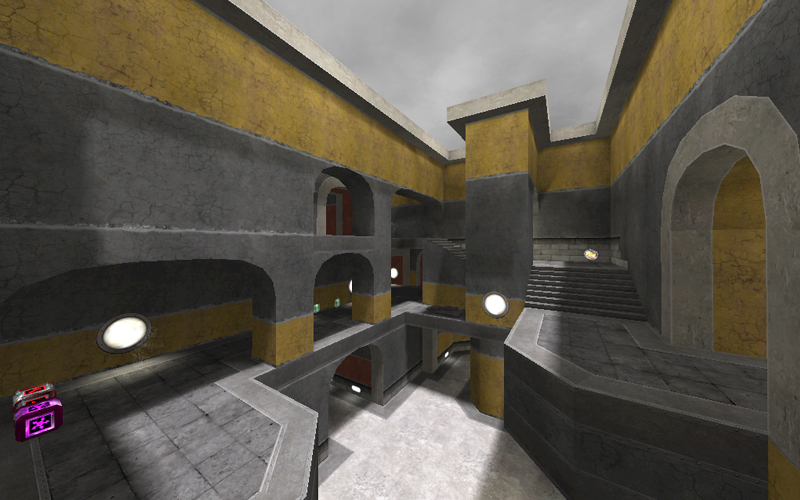
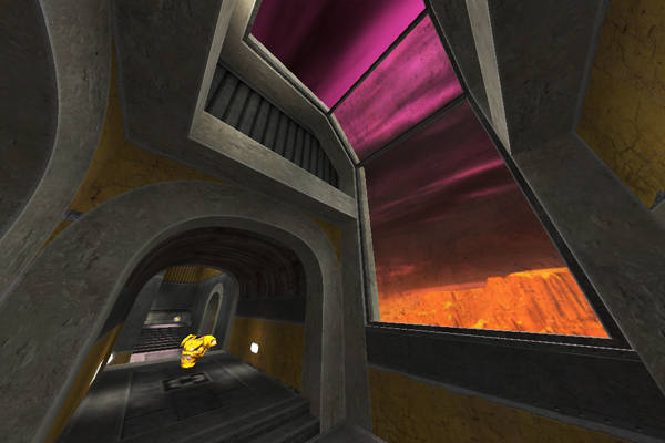
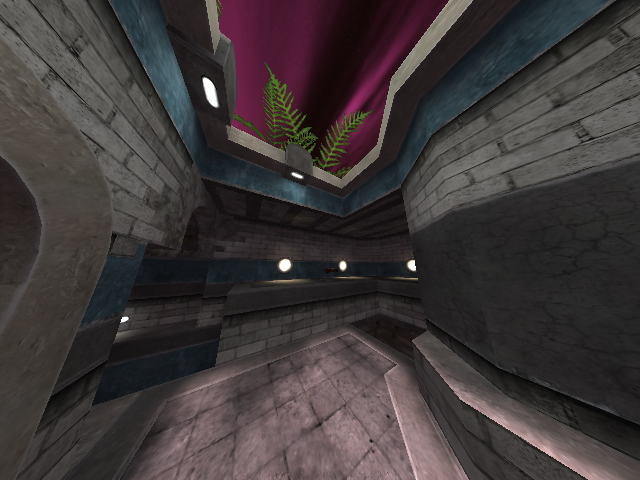
I think there might be a little too much swiss cheese going on in the area in the second shot though.
Re: [Beta] pukka3tourney6
Posted: Sat May 23, 2009 7:10 pm
by Rane2k
This map looks great!
I especially like the colored sections, helps to understand the layout very fast.
The layout promises some cool duels and you can move through the map pretty swiftly.
(Sorry for no screenshots, somehow they are really dark, despite in-game looking great. No point in posting screenshots where you cant see anything.)
A few comments:
1. Clipping:
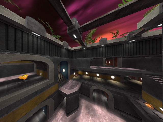
At the stair going from the yellow (PG and SG ammo) to the blue area (near upper RL), there are two round lamps in the wall that appear to be clipped off. When going up or down the stairs while hugging the wall you get stopped completely. might be a good idea to make the clipping brushes angled so that you can glide past. Or remove them, there dont seem to be ones on all other lamps.
2. Textures 1
In the lower yellow area there is a spawn marker texture (armor?) on the floor, but no item.
3. Textures 2
At the jumppad next to the MH area there is a black/white picture of a fan on the wall, which is kind of inconsistent with the rest of the map´s art style.
4. Textures 3
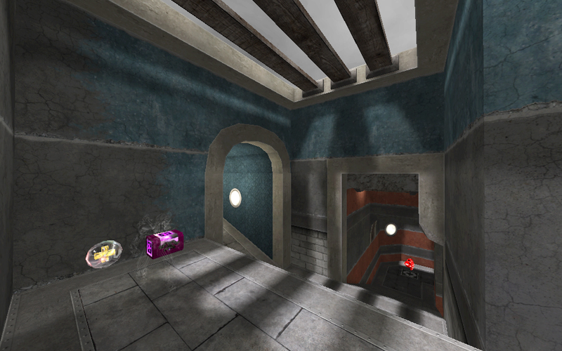
In the blue area, there is a ramp with an arch over it, leading up to the RL. The blue texture on that arch is different from all the other blue textures in the area (the chipped paint on concrete). I´m not sure i like it, maybe if it was used on more arches.
(It´s visible in your last screenshot)
Again, sorry for the lack of screenshots.
Cheers,
Rane2k
Re: [Beta] pukka3tourney6
Posted: Tue May 26, 2009 12:52 am
by pjw
I just had a quick run-around and I really like the layout; lots of over-under and great connectivity. It's one of those levels that seems complicated for a bit, and then everything sort of clicks, and you suddenly know where everything is...
Observations/Suggestions:
1) Something really iffy with the texturing on these:

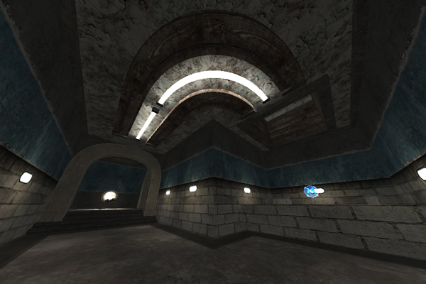
The actual tube parts of the light look odd--those gray spots near the middle. Also you might want to vary the wooden beam texturing a bit to disguise the Ctrl-C/Ctrl-V. I actually like these lights quite a bit--maybe sprinkle them around a bit more, and make some flat (rather than arched) variations, like in places where there's currently unsourced lighting (e.g. near MH)?
2) Whatever sky you decide on, please make it something bright and colorful, or at least something other than gray--there's enough gray in the map already.

3) How about some windows? It would serve to break up the walls and give the level more of a sense of space, instead of it being a series of closed boxes. The skylights help, and I think you should do those wherever possible to make it feel more open, but windows would help even more. You wouldn't have to put much outside--just some simple building facades or a couple of walls blocking further sight, or a small square rooftop with something on it, or cliff face/top or...
4) RA/MH seem a little close, and I'm not really crazy about the RA spot...just sorta stuck in a stairway corner there. I noclipped around for a while, and I don't really see a better place for RA. You could put it where GL is, but then you'd be even closer to MH, unless you blocked off that hall, and then MH would be in a serious dead end, sooo... yeah. I'll just leave it as "RA/MH seem a little close" and not offer anything useful otherwise. How's that?

Edit: I agree with Jabberwock about that second shot. Maybe just lose the one middle archway with the shards behind it?
Re: [Beta] pukka3tourney6
Posted: Wed May 27, 2009 4:53 pm
by sumatra
Thanks for your helpful thoughts and suggestions. I'll keep those in mind, when I go on with my work on this.
I'll lose the ventilator sign texture, it feels out of place, like rane2k already mentioned.
The armor-maker is for the Green Armor, I placed down there near second RL. So if you play standard vanilla q3, you might not see that one.
I'll fix the neontube shader. The grey lines were a bug. thanks for you sharp eyes, pjw  .
.
I also had a colorful sky in mind. Let's see what we get..
I'll think about the window question, but I think it distracts the player too much from the important structures.
I'll put some detail on top of the level though.
Hmm, I was really happy about the RA area. Dunno whats wrong with it, but I understand your concerns about the distance to the MH. Maybe you have some ideas in the future to improve that fact.
Keep them coming..
Re: [Beta] pukka3tourney6
Posted: Sat May 30, 2009 12:58 am
by scythe
Wow, that certainly mixes things up. Looking forward to the next beta.
Re: [Beta] pukka3tourney6
Posted: Sat May 30, 2009 1:48 am
by pjw
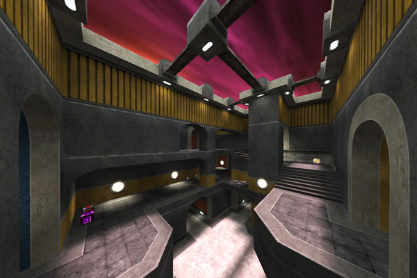
That's pretty much exactly what I was pulling for in my feedback (the cool sky and some windows/scenery). The new RA nook is kickass. Great improvement, judging from the screenies! That sky really pops.

Re: [Beta] pukka3tourney6
Posted: Sat May 30, 2009 2:44 am
by Captain a13n
Yep, I'm still banned.
I still need to communicate with an admin to get unbanned.
Re: [Beta] pukka3tourney6
Posted: Sat May 30, 2009 3:01 am
by Silicone_Milk
welcome to the arena a13n
personally I prefer the gray sky over the purple. I don't think the "complementary" colors work too well. That's just my own taste though.
[Release Candidate] pukka3tourney6
Posted: Sun May 31, 2009 6:07 pm
by sumatra
OK, now I finished the finalbeta. If you still find any small cosmetics or stuff you get stuck, please report.
I'm very satisfied with the result and want to get this thing finished already.
I think it's a fast, but larger duel map that works really well without railgun.
And it is fun as well with cpm as with vanilla gameplay.
Maybe I come up with a 2v2 itemlayout in the final version.
Any last appeals? 
Final Beta/Release Candidate
Re: [Beta] pukka3tourney6
Posted: Mon Jun 01, 2009 7:02 am
by v1l3
It's definitely a good gameplay map..good for cpm physics. It's been a while since a good promode layout map has popped out. It doesn't seem like a map you would put out though visually...it doesn't come anywhere near what your other maps possess looks-wise and other things. I guess you did say you were going to keep it simple..but it's simple simple

..I'm just surprised..sorry..time can be an issue I suppose. It's good to see that your still making maps!
Re: [Beta] pukka3tourney6
Posted: Tue Jun 02, 2009 11:35 am
by ShadoW_86
I agree with v1l3 totally. Great gameplay, but map could look much better :/ (lightning...).
Re: [Beta] pukka3tourney6
Posted: Wed Jun 03, 2009 2:15 am
by scythe
Well, there's certainly a unique look here. Personally, I wouldn't use the wood texture, it conflicts with the sort of high-tech look of the lights and such. I would also lean toward a less colorful sky - or - if you keep the "sunset" sky, I would use a stronger, more angled and colorful sun light value. Make it feel a little darker, like evening is coming on maybe. Just my two cents, I really like the architectural and gameplay changes you've made.
Re: [Beta] pukka3tourney6
Posted: Mon Jun 29, 2009 4:45 am
by xfoo
I haven't had a chance to actually play the map against an opponent (as I don't play CPMA that often anymore), but the layout and design look great. Keep up the great work, you are by far one of my favorite mappers.
Re: [Beta] pukka3tourney6
Posted: Thu Jul 09, 2009 9:47 am
by krekits
Had a go. Liked it. Missed the RG. Bots seem to have trouble and are easy to pick. Probably a better idea to play against a human opponent. MH area felt a bit off from where most of the action was. RL/JP room felt a bit cramped.
Re: [Beta] pukka3tourney6
Posted: Thu Jul 09, 2009 4:18 pm
by Fjoggs
o_O Long time no see Krekits!
Re: [Beta] pukka3tourney6
Posted: Thu Jul 09, 2009 10:53 pm
by 4days
aye, you missed making your annual post last year

Re: [Beta] pukka3tourney6
Posted: Sat Aug 22, 2009 4:25 pm
by sumatra
Hey, thanks for the nice feedback again.
I can come up with a second Release Candidate.
Download ~ 13 MB


Things I've done:
- tried to improve the lighting, make it more interesting
- fixed all errors
- removed some structural brushes
- improved the textures for "prosettings"
- little item changes
- added some more detail/plants (maybe I add some more before I release the map)
I think, thats it overall.
I would like to have some further feedback to the current state.
Thanks in advance.
sum
P.S. Nice to see the forum moving forward with modern improvements...
Re: [Beta] pukka3tourney6
Posted: Sat Aug 22, 2009 7:18 pm
by tehSandwich
You might want to check those plants, they are missing their shaders.
[lvlshot]http://img134.imageshack.us/img134/5720/ffffffffplants.jpg[/lvlshot]
Re: [Beta] pukka3tourney6
Posted: Sat Aug 22, 2009 7:40 pm
by sumatra
Yes. My fault. I'll put the shader file into the final release. Thanks.
If you want to test the map correctly, you can download the shaderfile (nateleaf.shader) here.
Just put it into the pk3-file in the scripts folder.
Re: [Beta] pukka3tourney6
Posted: Sun Aug 23, 2009 1:27 am
by tehSandwich
Some sparklies.
[lvlshot]http://img36.imageshack.us/img36/3999/p3t6sparklies.jpg[/lvlshot]
And missing surfaces.
[lvlshot]http://img40.imageshack.us/img40/2421/p3t6hole.jpg[/lvlshot]


 Still to do:
