Page 1 of 1
alm3dm5 - Inner Demise [Beta 1]
Posted: Thu Jun 12, 2008 3:40 pm
by ALMighty
Download:
http://alm.gamedesign.net/levels/alm3dm5_beta1.zip
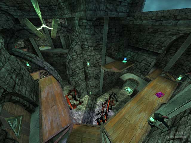
This is the first time I made basically everything myself, textures and models. It turned out better than I thought it would, and it was fun so I think I will be doing it more in the future.
I rebuilt the layout countless times. I think it turned out pretty good in the end, but let me know if you think it's got problems. I will probably start another map instead of rebuilding this one though.
[lvlshot]
http://alm.gamedesign.net/images/shot0265.jpg[/lvlshot]
[lvlshot]
http://alm.gamedesign.net/images/shot0266.jpg[/lvlshot]
[lvlshot]
http://alm.gamedesign.net/images/shot0267.jpg[/lvlshot]
Re: alm3dm5 - Inner Demise [Beta 1]
Posted: Thu Jun 12, 2008 4:23 pm
by o'dium
Cool atmosphere

Only thing I dont like is that stone texture, its just wrong... Now I'm not sure if its the texture itself, or if its the fact its used too much and isn't broke up enough... Or maybe its a lack of dirt decals?
Great job though, love it.
Re: alm3dm5 - Inner Demise [Beta 1]
Posted: Thu Jun 12, 2008 4:45 pm
by dichtfux
Only gave it a short try, will test more later. Playing the bots was fun in cpma and I didn't find any major flaws. The stone texture looks a bit boring on the screenshots but it felt better in-game. I like the lighting (though some ppl may consider it a bit dark, don't know) and atmosphere. The terrain is cool too cause it looks good but doesn't ruin gameplay.
There is z-fighting on the floor under a doorway, I marked the area in the image below.

Re: alm3dm5 - Inner Demise [Beta 1]
Posted: Thu Jun 12, 2008 6:51 pm
by g0th-
I can see where you are going with this and I like it but you can make this look much better with a couple of more textures, right know I could only count them to tree. I would suggest to make at least a trim texture to help break up the bricks (it will do wonders).
As I said before I like the atmosphere you got going here and you have a good foundation to build upon. So keep at it.
I also really like the broken parts.
Re: alm3dm5 - Inner Demise [Beta 1]
Posted: Fri Jun 13, 2008 12:43 am
by wattro
thirded (or is fourthed?) about the textures needing break-up and variety.
It seems *really* dark. It doesn't need to be much lighter, but some well-placed vertical and horizontal trim would really help, imo.
Re: alm3dm5 - Inner Demise [Beta 1]
Posted: Fri Jun 13, 2008 3:28 am
by obsidian
To keep it gloomy without being overly too dark, you can try playing around with -gamma and -compensate in the light stage of your compile. I'm sure it'll do wonders to brighten up the interiors while keeping the exterior close to what it is now.
Re: alm3dm5 - Inner Demise [Beta 1]
Posted: Fri Jun 13, 2008 6:00 am
by ALMighty
o'dium wrote:Cool atmosphere
Only thing I dont like is that stone texture, its just wrong... Now I'm not sure if its the texture itself, or if its the fact its used too much and isn't broke up enough... Or maybe its a lack of dirt decals?
Great job though, love it.
I'm really glad you liked the the atmosphere. I enjoy your work so it means a lot.
I still have much to learn about texturing, and think I know what you mean about the brick texture. I'll see if I can fix it.
Re: alm3dm5 - Inner Demise [Beta 1]
Posted: Fri Jun 13, 2008 6:13 am
by ALMighty
dichtfux: Thank you for pointing out those flaws.
obsidian: I'll try those out.
Thanks for the suggestions all. I'll see what I can do.
Re: alm3dm5 - Inner Demise [Beta 1]
Posted: Sun Jun 15, 2008 7:25 pm
by ALMighty
Playing around with q3map2. This is with -gamma 1.5 -compensate 2. I tried higher values before but it looked very washed out.
[lvlshot]http://alm.gamedesign.net/images/shot0279.jpg[/lvlshot]
[lvlshot]http://alm.gamedesign.net/images/shot0280.jpg[/lvlshot]
BTW, what was I thinking adding a clock?! It's supposed to be an medieval castle!

I think I have a clock fetish.
Re: alm3dm5 - Inner Demise [Beta 1]
Posted: Tue Jun 17, 2008 4:02 am
by bork[e]
o'dium wrote:Cool atmosphere
I thought the same, and once again I agree you need to chop some of the textures up a bit. If you were to add a bit of detail to some corners and other areas of the outside of your buildings I think you could fix that gripe fairly easy.
Maybe a large stone "out of place" would help in places?

The inside looked a bit dark in areas, but looks like you are already working on that anyway. The plasma room looks nice though, love the shadows falling down over the gun.
imo it could use a another 25 health bubble somewhere, but not sure where, couldn't really decide on the few runs I did. Maybe good as it, just seemed like I would run around until I was killed, may just need to learn the map a bit more though.
Re: alm3dm5 - Inner Demise [Beta 1]
Posted: Tue Jun 17, 2008 8:18 pm
by obsidian
Typical values are -gamma 2 -compensate 4. I suppose as a starting point you can try 3 and 4 respectively. Gamma increases your ermm... gamma (brightness) and compensate ermm... compensates, by bringing out of bound values back down to something reasonable. There's a bit of fine tweaking involved.
Nice little jumps all over the place that makes it enjoyable and fast movement.
I kind of liked that clock, gave it a bit more character and adds to the surreal look to it. Perhaps carry that further by adding twinkling stars, not realistic points of light, but actual five pointed stars. Also, toss a great big moon up there somewhere. Perhaps use a portal sky.
About the lighting, the shadows are a bit too sharp for night time, it needs a lot more penumbra.
See:
http://www.quake3world.com/ubb/Archives ... 27331.html?
http://www.robotrenegade.com/q3map2/doc ... l/apI.html
Also, are you compiling with radiosity (the -bounce switch)?
Re: alm3dm5 - Inner Demise [Beta 1]
Posted: Thu Jun 19, 2008 4:18 am
by v1l3
I've hung onto alpha3 version you put out quite sometime ago, and damn..I didn't expect to see this. Very Nice.

I'd agree that it does seem to be dark, but at the same time the darkness really makes things look a little more detailed in a way...as it makes the brick textures look more real.
Re: alm3dm5 - Inner Demise [Beta 1]
Posted: Fri Jun 20, 2008 5:06 am
by +JuggerNaut+
that atmosphere reminds me of Lucid Enigma by Dubillian
and a bit of Gloom by Stormshadow

which is a good thing... nice work.
Re: alm3dm5 - Inner Demise [Beta 1]
Posted: Fri Jun 20, 2008 3:22 pm
by ALMighty
"I kind of liked that clock, gave it a bit more character and adds to the surreal look to it. Perhaps carry that further by adding twinkling stars, not realistic points of light, but actual five pointed stars. Also, toss a great big moon up there somewhere. Perhaps use a portal sky."
Yeah, I liked it too. I don't think it fit the medieval theme though. I don't know how to paint skyboxes myself, but that would be cool to try out. I think this one works good enough though.
"About the lighting, the shadows are a bit too sharp for night time, it needs a lot more penumbra."
Also, are you compiling with radiosity (the -bounce switch)?"
I compiled this one with -fast and -filter only, I think. I've switched to -samples 3 now. No -bounce at all, maybe I should try that out.
Re: alm3dm5 - Inner Demise [Beta 1]
Posted: Fri Jun 20, 2008 3:30 pm
by ALMighty
JuggerNaut: That's a very good thing indeed. Both those guys are my idols. Thanks!

v1l3: Glad you like the transformation.

bork[e]: Nice reference picture, that's really helpful and inspiring. I'll look into what you suggested, thanks.
Re: alm3dm5 - Inner Demise [Beta 1]
Posted: Fri Jun 20, 2008 6:22 pm
by obsidian
Don't use -filter with -samples. Here's my default light compile settings (tweak as needed):
-light -fast -patchshadows -samples 3 -bounce 8 -gamma 2 -compensate 4 -dirty
Bounce takes a while, but it's worth it for a final compile.
Also make sure you update your sky shader as I pointed out above.
Re: alm3dm5 - Inner Demise [Beta 1]
Posted: Mon Jun 23, 2008 7:01 pm
by MackXX
The lighting looks excellent and shadows look really nice, what are you doing for lightmap res, 512x512?