Page 1 of 1
Foo3dm4 - Beta 1
Posted: Tue Jan 03, 2006 11:22 pm
by Foo
zOMG
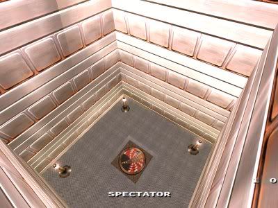
Looking for feedback on the layout/gameplay. Graphics look like shit, I know.


Useless overhead shot:

Download link:
http://www.zen84106.zen.co.uk/quake3/foo3dm4_beta1.pk3
Level is based loosely on an old Q1 level. Brownie points for those who can name the original

Posted: Tue Jan 03, 2006 11:30 pm
by primaltheory
qauke 3 map I assume?
Posted: Tue Jan 03, 2006 11:33 pm
by Foo
Yeah. You can tell by the textures and the 3 in the filename and the pink in the last shot and the megahealth and the lightning gun and the lava and the pk3 extension and stuff

Posted: Wed Jan 04, 2006 12:05 am
by primaltheory
Lol Jeeze! No need to get all hostile about it...I didn't know what the 3 as for, and I really didn't look that hard for differences
Posted: Wed Jan 04, 2006 12:34 am
by seremtan
lol, it's the most quake3-ish looking custom map i've seen in years. how could you mistake it?
Posted: Wed Jan 04, 2006 12:47 am
by primaltheory
Idk, It could have been another q3 based game or somthing...
Posted: Wed Jan 04, 2006 1:45 am
by pjw
Foo wrote:Yeah. You can tell by the...pink in the last shot
Q4 does that too.

I'll try to get around to reinstalling Q3 tomorrow night on my new rig and give this a look (disks are at work).
Posted: Wed Jan 04, 2006 7:36 am
by Oeloe
I think i like this.
For some reason it makes reminds me of cpm11 for a tiny bit (only the teleporter bit and the sloped walls i guess). If you'd add a bit more space/length here and there, it could be suited for cpm too i think. Were you thinking of the teleporters in this map when writing that thread about the 'new map design rule'?

Seems off like this.
If you end up texturing this as nice as Sumatra with his map it's gonna be nice.
Posted: Thu Jan 05, 2006 2:24 am
by pjw
Mostly I like the layout quite a bit--lots of cool over/under and interesting angles of attack, but a few parts of it confuse and/or frighten me...

This view here is one of the ones that's great! Shooting someone in the back of the head as they're trying to get to the tele will be fun. I'm not crazy about this tele going to half of the linked pair, rather than it's own destination though...that's always just felt weird to me...

Is it intentional to allow the player to lurk up here where I'm standing?

I agree with Kaz...that little ledge makes it pretty easy to get MH, and also looks weird without something on it...

I kept wanting to rocket-jump up on top of there. Maybe just take that on up flush with the ceiling and redo the sky-window dealie into an L-shape?

Target on that jumppad needs fixage
badly. You can get off up at the right if you really work it, but it feels really bad. Jumppads should never require english to get somewhere IMO...

This is really tight and clumsy when you're trying to jump down and head down the stairs. I didn't take time to noclip around, so don't know if it's possible, but it would be really nice to move that wall back off a bit so you don't bash into the wall trying to hop down into the stairway.

I'm not real crazy about the lift here--I think you could do something a bit more creative... (yep, that's vague)
Hope this helps. I'm looking forward to seeing this with a bit more coherent texture scheme--maybe something custom? If you're going to try to stick with mostly stock texures, I would at least get rid of the bright shiny metal bits--they clash badly with the more gothic stuff IMO.
Posted: Thu Jan 05, 2006 2:37 am
by corsair
I was gonna reply "Boxes, Pipes, Marijuana, Toiletseats!" on pjw's last picture and comment, and continued that with "cheese", which brought me to something totaly unfitting for this map, but a fine idea nonetheless; a piece (1/8th out of circle) of cheese as a ramp.
no, perhaps its just bedtime.
Posted: Thu Jan 05, 2006 2:39 am
by pjw
corsair wrote:"Boxes, Pipes, Marijuana, Toiletseats!"
That would be a good map name.
Posted: Thu Jan 05, 2006 2:41 am
by Foo
Hehe. Thanks for the nitpick stuff man, it's always useful.
I've taken a gamble in that I'm working on the graphics right now and some parts of the level have changed - your favorite bit now faces around in a different direction - you still get to shoot people in the back though!
As for the rest of it, it's simultaneously all-change, but keeping as much the same as possible.
Most of what I learned from multiplayer last night was that the basic layout/items works, but the level looks like a dog and has lots of small issues.
Which is cool. I'll post up a screenshot hopefully tonight just before I sleep (it's 3AM now!)
Posted: Thu Jan 05, 2006 2:48 am
by corsair
It'd make an even better theme, a map out of solely those 4 components - with cheesy ramps ofcourse!
It isnt bedtime apparently, Its maptime instead. (map editors should have timers, I'd really like to know how many hours, days, weeks, or some other defined timespan to make things a bit bearable, I have putt into this very .map that is not nearing completion at all)
(sry for the OT'ness Foo, I'll try commenting on this map later on this week in return for that)
Posted: Thu Jan 05, 2006 3:06 am
by Foo
I could always have this guy pop out of the ground and propel you skywards:

Posted: Thu Jan 05, 2006 3:34 am
by Foo
How about this tech look?

Posted: Thu Jan 05, 2006 3:43 am
by corsair
yeh ditch the red - or if you fancy having another hue in it, go for something like orange - much more harmonic
Posted: Thu Jan 05, 2006 3:51 am
by Foo
Kaziganthe wrote:Aside from the garrish colors it looks pretty sweet. Is that a reworked version of this beta or from that .map you sent me?
It's the upper RL area from the next beta of this. I've biased the RL to be a bit lower, easier to shoot from the ground floor area, and brought the LG teleporter up into the lower room (you can just make it out on the right below the RL.
Yeah the colours stink, no question.
Posted: Thu Jan 05, 2006 7:33 am
by wviperw
I'd go with that color of blue you have currently, and switch the red to a nice whitish-yellow. Would look teh sekseh.
Posted: Thu Jan 05, 2006 9:52 am
by Oeloe
Foo wrote:I could always have this guy pop out of the ground and propel you skywards:
BANZAIII!!
Betting endzz nowwww!

Posted: Thu Jan 05, 2006 11:40 am
by primaltheory
Foo wrote:How about this tech look?
That looks great! I was like woah that's quake 3!
If you don't mind once you're done, would you want this ported to quake 4?
Posted: Thu Jan 05, 2006 9:39 pm
by Foo
hehe, I dunno if it would work in the engine. I'm facing an awful lot of point lights to match the texture set up well, and you'd have to generate bump-maps for all those texs.
It might work though, who knows.
Posted: Fri Jan 06, 2006 5:18 am
by obsidian
Coming along nicely. I like the RL bridge in the new screenshot. Adds something that the lower level player can shoot back up at, like how we talked about.
Waits for next beta.
Posted: Sat Jan 07, 2006 1:00 am
by Hellfog
Waiting for the next version. Plays nice, but I like the new textures in the screenshots.
Posted: Sun Jan 08, 2006 5:17 am
by a13n
Posted: Sun Jan 08, 2006 5:31 am
by Foo
L.O.L