Page 262 of 295
Re: Screenshots
Posted: Thu Mar 27, 2014 9:29 pm
by cityy
Thanks for the feedback.
I agree on the battlesuit symbol.. I'd like to keep the thing in general so I need to find a way to make it fit. I have a simular thing at the quad damage which looks a bit out of place too.. it would be neat to make it work (
clicky).
Regarding the stone texture, I'd say that it's out of my sight at the moment. I just need to get this done, if there is time left I'll take care of it. An anvil would be a nice addition, thanks for the heads up. Unfortunately, for the map to be used in QL I need to create all content myself.

Today's progress:
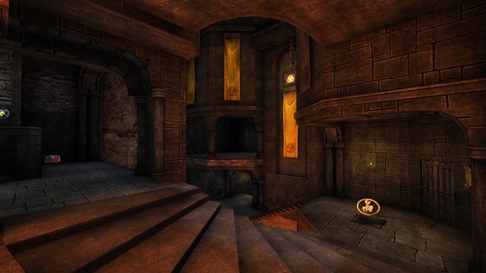
[lvlshot]https://dl.dropboxusercontent.com/u/15072710/Game%20Design/QL/ragnarok/shots/27.jpg[/lvlshot]
I know there are plenty of misalignments and that I should probably make those stairs look better - next time!
Re: Screenshots
Posted: Fri Mar 28, 2014 4:00 am
by obsidian
Well, I guess you can make the anvil with brushwork, or Rhino... I know how you love those NURBS.
As a side project, I decided to model a dwarven anvil and hammer anyway... it's more for fun, I'll post finished pics next week when it's done. Here's the hammer WIP, texture's not done.
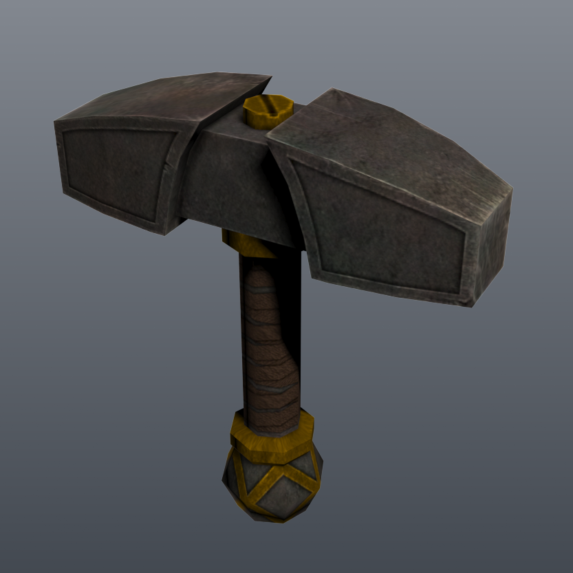
Maybe make the icons less Q3'ish and more glowy dwarven/Celtic, like the door frame by the quad... that fits in with the theme much better.
Re: Screenshots
Posted: Fri Mar 28, 2014 4:02 am
by SoM
Bacon wrote:Yep. As pathetic as it sounds, i'm still using ADSL that downloads at 600 kbps/70kbps upload. Canada is abysmal for ISPs. I refuse to pay 5 cents per mb over the cap (Sometimes more). Mabye some day i'll be able to experience internet from this millenium.


hey man, get off bell, it's pos, go with teksavvy like obsidian said or check out vmedia.ca they do both cable/dsl packages 25/2 $40 cable or 45/4 $53 DSL all unlimited and no contracts
Re: Screenshots
Posted: Mon Mar 31, 2014 10:37 pm
by neoplan
Re: Screenshots
Posted: Wed Apr 02, 2014 10:54 pm
by seremtan
Bacon wrote:bored
[lvlshot]http://img.bacon.ms/dwango5-q3_1.jpg[/lvlshot]
*compulsively hums Doom midi music*
Re: Screenshots
Posted: Fri Apr 04, 2014 1:23 am
by obsidian
[lvlshot]http://zero.robotrenegade.com/models/dwarven/eagle-anvil01.png[/lvlshot]
Re: Screenshots
Posted: Fri Apr 04, 2014 6:47 am
by Hipshot
obsidian wrote:[lvlshot]http://zero.robotrenegade.com/models/dwarven/eagle-anvil01.png[/lvlshot]
That's cool, what is it for? A hammer on top of one of those ledge eagles?
Re: Screenshots
Posted: Fri Apr 04, 2014 3:21 pm
by obsidian
It's an eagle shaped anvil. I had some trouble doing the feet. If it's made of metal the feet would have to look like it could support that kind of weight, so I modeled a bunch of rocks sitting under the eagle to support the structure. Next unwrap UV's and textures.
[lvlshot]http://zero.robotrenegade.com/models/dwarven/eagle-anvil02.png[/lvlshot]
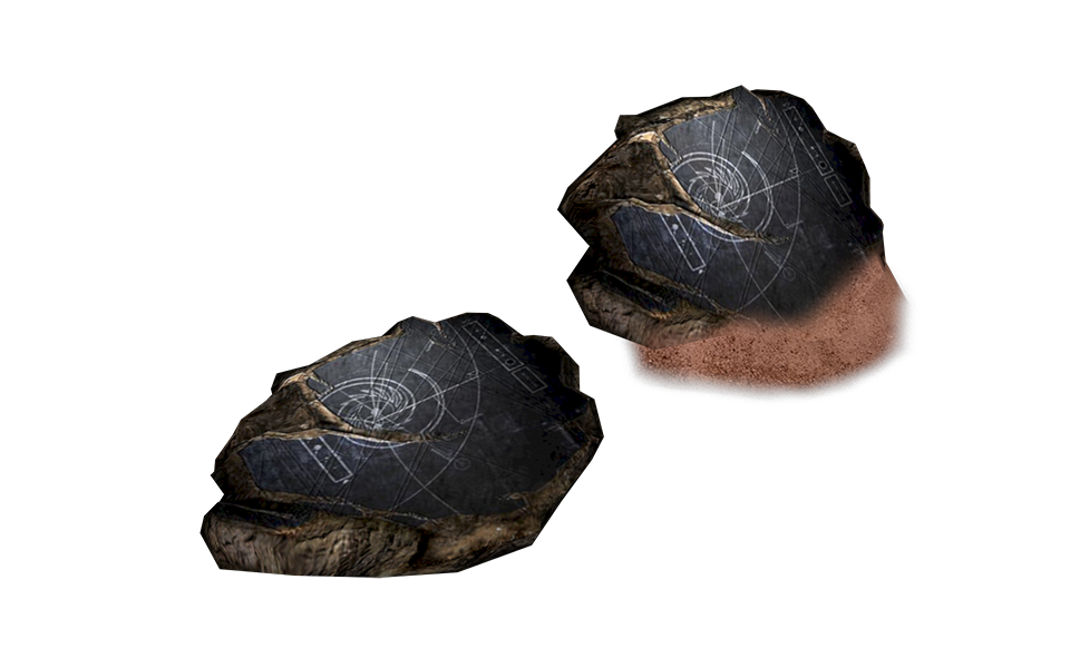
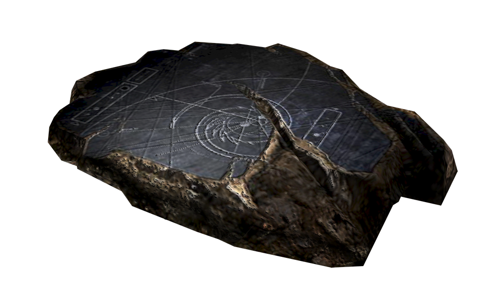
Oh, I also modeled this a while ago. It's the Guidestone from Homeworld. There's two versions, one by itself and the other one is sticking up in the sand. I was experimenting with Photoshop's 3D painting capabilities, it's a little awkward but seems to work OK. The advantage of this process is that you can easily paint over UV seams by rotating the model around in Photoshop and the pixels will still match up. It's just bumpmapped using the diffuse because I didn't make a normalmap for it yet, so the second image looks a bit aliased.
Re: Screenshots
Posted: Sat Apr 05, 2014 1:19 pm
by sst13
A CTF version of
Agony. Including some new rooms in the center area...

Re: Screenshots
Posted: Mon Apr 07, 2014 2:05 am
by Bacon
Almost finished Villa (Perfect Dark), need the windmill still and proper lighting instead of using _minlight:
[lvlshot]http://bacon.ms/shot0159.jpg[/lvlshot]
[lvlshot]http://bacon.ms/shot0160.jpg[/lvlshot]
Base:
[lvlshot]http://bacon.ms/shot0162.jpg[/lvlshot]
[lvlshot]http://bacon.ms/shot0163.jpg[/lvlshot]
Delphino Plaza from Mario Sunshine:
[lvlshot]http://img.bacon.ms/shot0167.jpg[/lvlshot]
[lvlshot]http://img.bacon.ms/shot0166.jpg[/lvlshot]
Re: Screenshots
Posted: Mon Apr 07, 2014 5:39 am
by Pext
cityy wrote:Today's progress:
[lvlshot]https://dl.dropboxusercontent.com/u/15072710/Game%20Design/QL/ragnarok/shots/27.jpg[/lvlshot]
I know there are plenty of misalignments and that I should probably make those stairs look better - next time!
This is amazing! The brushes are composed in a very balanced way. Just the right feeling of weight and distribution.
Have you considered adding a secondary/minor color to the room? For my taste, it feels a bit to plain red right now.
Re: Screenshots
Posted: Mon Apr 07, 2014 8:33 am
by cityy
@Obs: Good stuff, I could use something like that.. a pity I'm such a modeling noob.
@sst13: More please!

@Pext: Thanks, I have considered adding a complementary color but Im trying to not end up with an
"orange/blue-contrast" fashioned area, hehe.
The idea is to have the area stand out visually and to make clear it holds the battlesuit powerup so people will have an easy time learning the map.
I might just extend on the yellow accents and leave it be.
Edit: What I just realized I might do is use some more blue colored "ambient lights" to create a subtil contrast.
Re: Screenshots
Posted: Mon Apr 07, 2014 10:45 am
by Pext
cityy wrote:Edit: What I just realized I might do is use some more blue colored "ambient lights" to create a subtil contrast.
I was thinking of a dark teal/marble accent ~ this wont go so well with the battlesuit theme, though.

Another option might be to change to color of the lava and shift it towards an earthy orange; yellow highlights to mirror the battlesuit and some very dark violet background contrasts.
Re: Screenshots
Posted: Mon Apr 07, 2014 3:33 pm
by UglyFoot
Good job Bacon, I have good memories of Perfect Dark too. I guess it has been hard to port that levels?
Re: Screenshots
Posted: Mon Apr 07, 2014 4:30 pm
by Bacon
A lot of time has been saved now that I figured out how to use .ase models in q3, but getting the geometry itself is still a pain in the ass, yeah. Before using models i'd have to manually CSG merge all the brushes in the map because they were triangles, then re texture everything, THEN play the game beside radiant and count how many times each texture repeated, and try my best to make it look the same. At least that step is gone now, countless hours saved.
Re: Screenshots
Posted: Mon Apr 07, 2014 4:53 pm
by obsidian
I think the problem is that you've gone too harsh on the lighting. Move a bit away from primary colours and most importantly, tone down the saturation of your lighting.
I've toned down the overall saturation of the scene by about 25% while changing the lighting to a golden yellow-orange hue to match the battlesuit colour. The flags have been brightened and set to gold, I think they would look good with a slight envmap reflectiveness to them. The alcoves are lit with a heavily desaturated darkish blue/purple indigo ambient with yellow spotlights.
Edit: The idea is that you want the room to look overall warm, obvious for the lava and maybe because this is a forge where your dwarves hammer out axes, etc. But you want a bit of contrast so a bit of cooler colours in spots where there is no heat can balance the mood out.
 Here's the Photoshop file
, you can tweak a bit to experiment. With adjustment layers, you can use the sliders in the Properties palette to experiment with different hues and saturations. Use masks to maintain the colour of things you want to keep constant, like the battlesuit powerup. I recommend using similar paint-over techniques with your screenshots to fix other problem areas.
Re: Screenshots
Posted: Mon Apr 07, 2014 11:07 pm
by Shadowdane
obsidian wrote:I think the problem is that you've gone too harsh on the lighting. Move a bit away from primary colours and most importantly, tone down the saturation of your lighting.
I've toned down the overall saturation of the scene by about 25% while changing the lighting to a golden yellow-orange hue to match the battlesuit colour. The flags have been brightened and set to gold, I think they would look good with a slight envmap reflectiveness to them. The alcoves are lit with a heavily desaturated darkish blue/purple indigo ambient with yellow spotlights.
Here's the Photoshop file, you can tweak a bit to experiment. With adjustment layers, you can use the sliders in the Properties palette to experiment with different hues and saturations. Use masks to maintain the colour of things you want to keep constant, like the battlesuit powerup. I recommend using similar paint-over techniques with your screenshots to fix other problem areas.
agreed the lighting looked way too harsh in the original... i like the color scheme you worked up obsidian looks a lot better. But some accent lighting in spots could help break up the color palette a bit.
Re: Screenshots
Posted: Fri Apr 18, 2014 2:52 pm
by Bliccer
All the maps from my last movie "maze" have now been released in the map database as one mappack.
maybe you want to check 'em out... they are imo pretty unique in their style.
http://ws.q3df.org/map/revisit_runzlaugh2err5/
http://ws.q3df.org/map/revisit_rhv/
http://ws.q3df.org/map/revisit_sdc24/
Re: Screenshots
Posted: Sat Apr 19, 2014 8:23 pm
by Bacon
Outset island from LoZ:WW, ready for Q3
[lvlshot]http://img.bacon.ms/outsetislandq3.jpg[/lvlshot]
Dragon machinegun from Perfect Dark replacing the machinegun, 99% done:
[lvlshot]http://img.bacon.ms/zzdragon01.jpg[/lvlshot]
Re: Screenshots
Posted: Sun Apr 20, 2014 3:43 am
by obsidian
The scale of that gun looks a bit big (or maybe you like it big, Mr. Pornstar). I'd scale it down ~30%.
Re: Screenshots
Posted: Sun Apr 20, 2014 11:34 am
by cityy
Damn I miss playing the windwaker!
Re: Screenshots
Posted: Mon Apr 28, 2014 4:56 am
by Bacon
Just need to decide on a gametype and add some weapons in and this one's finished.
[lvlshot]http://img.bacon.ms/shot0181.jpg[/lvlshot]
[lvlshot]http://img.bacon.ms/shot0182.jpg[/lvlshot]
Re: Screenshots
Posted: Mon Apr 28, 2014 5:20 am
by Theftbot
Looks washed out too much!
Re: Screenshots
Posted: Mon Apr 28, 2014 8:10 pm
by Bacon
If you mean indoors, then yeah, I fully agree. I'm using _minlight right now for the inside because I don't have the time to properly place light entities yet/make light emitting shaders yet. I'm going to try and get that done, but probably last.
If you mean the textures themselves, then that can't be helped. They are only 16x16 and 16x32 textures, because they are ripped directly from the game. I don't plan on making them "hi-res" or anything, because the whole point is to make the map a 1:1 copy.
Re: Screenshots
Posted: Sat May 17, 2014 12:20 am
by surgeon62
obsidian wrote:Well, I guess you can make the anvil with brushwork, or Rhino... I know how you love those NURBS.
As a side project, I decided to model a dwarven anvil and hammer anyway... it's more for fun, I'll post finished pics next week when it's done. Here's the hammer WIP, texture's not done.
Maybe make the icons less Q3'ish and more glowy dwarven/Celtic, like the door frame by the quad... that fits in with the theme much better.
Mjölnir called... and said DO ME NEXT!
