Page 249 of 295
Re: Screenshots
Posted: Wed Jul 04, 2012 6:52 pm
by Bliccer
Where is the I like button?
Very nice, indeed. Although it's good for playing circumstances, I think the light is too bright. But I guess you will change that anyway later.
Re: Screenshots
Posted: Wed Jul 04, 2012 9:16 pm
by geX
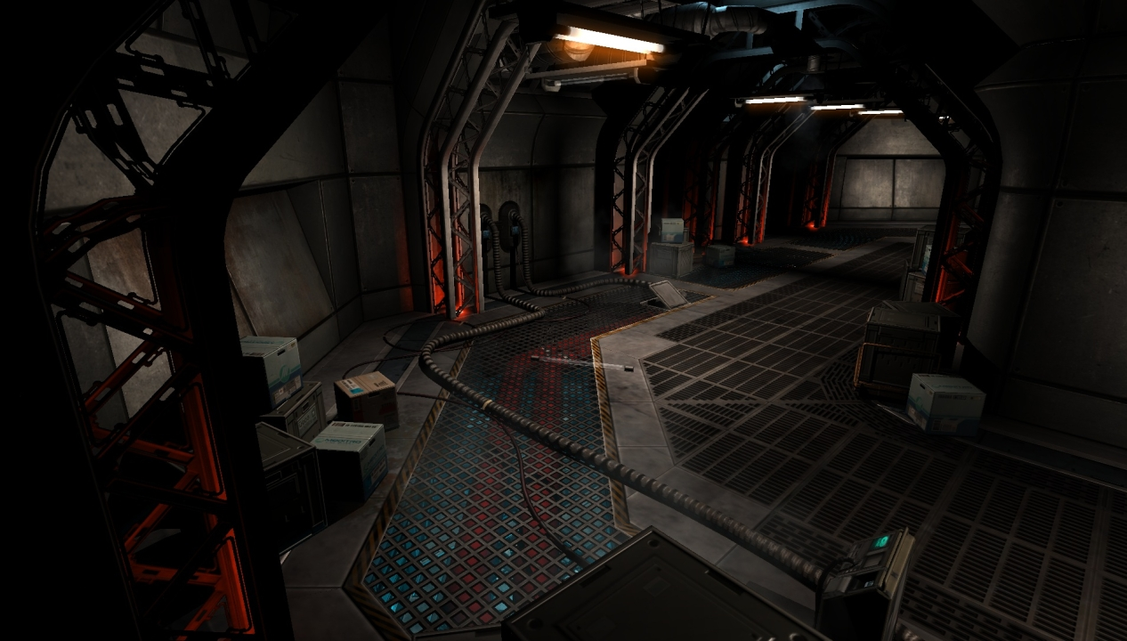
Some WIP from the same map as the last screenshot.

Re: Screenshots
Posted: Fri Jul 06, 2012 11:39 am
by g0th-
looks nice gex, colors are really great and makes the scene a lot more interesting.
it looks as the cable is floating in the air though
Re: Screenshots
Posted: Fri Jul 06, 2012 9:45 pm
by geX
Thanks! Yeah we tend to not be afraid about using some color and mixing it up. We are tired of the gray Gears of War look many games can have. Bring some color into it!
I can see what you mean about the cable, I guess its the angle and the shadow on it that does it. I assure you its on the floor

AEon's Run - 1 - Escape a Portal 2 map
Posted: Mon Jul 09, 2012 9:13 pm
by AEon
Been a long while, but recently I decided to look into
Portal 2's built-in level editor (the
Puzzle Maker). Though simple, and quite restricted it was interesting. You are working on a (guess: 256³ unit per cube) 25³ cube grid for geometry. But get some nifty objects that you can link...
Here is my first attempt to get as much out of the editor as possible. Not in the puzzle context, but more in the
single player exploration (with secret areas) and visual style department. I had a lot of fun building the map, and since the editor is so restricted the time it takes to build something is really nice and low. 26h build-time over 6 days.
For those who own
Portal 2 please give the map a spin over at my Steam Workshop:
AEon's Run - 1 - Escape (Portal 2).
(You might need to actually visit the
top level of my Workshop and click on the
green + in the icon of the map, to have Steam download the map for you and add it to Portal 2's map queue.)
Re: Screenshots
Posted: Fri Jul 13, 2012 7:00 am
by EmeraldTiger
@Nouren: The theme is developing nicely. The green lighting gives it it's own appearance and fashion without looking overdone or distasteful.
@GeX: The wire does look a tad strange, but other than that it's impressive work. And I agree about throwing in color to spice up bland environments - that's something a lot of games could use these days, and adds visual variety to scenes.
@AEon: Screenshots are neat and clean, and have that classic Portal-style to them which I see a lot. Shame I don't own the game though, it'd be interesting to try out if I did have it.
Not Quake 3, but just a showcase-thingy of some practice with UE3. Nothing too fancy, an attempt to make some kind of mining site by practicing with lighting, terrain, and static meshes. (ignore the arrows lol, it's an editor shot)

Re: Screenshots
Posted: Fri Jul 13, 2012 3:25 pm
by obsidian
Looks good. The specular on some of the walls looks much too high unless those rocks are supposed to be wet.
Re: Screenshots
Posted: Sun Jul 22, 2012 8:15 pm
by seremtan
nbohr1more wrote:
sexy
Re: Screenshots
Posted: Mon Jul 23, 2012 12:48 am
by cityy
Some shots of my entry for the MSG competition; gonna upload a beta soon.
[lvlshot]https://dl.dropbox.com/u/15072710/MSGcompetition2012/Screenshots/week7/3.jpg[/lvlshot]
[lvlshot]https://dl.dropbox.com/u/15072710/MSGcompetition2012/Screenshots/week7/4.jpg[/lvlshot]
[lvlshot]https://dl.dropbox.com/u/15072710/MSGcompetition2012/Screenshots/week7/5.jpg[/lvlshot]
[lvlshot]https://dl.dropbox.com/u/15072710/MSGcompetition2012/Screenshots/week7/6.jpg[/lvlshot]
Re: Screenshots
Posted: Mon Jul 23, 2012 4:31 am
by HomerJ
looks very cool. Apart from not looking cartoon-ish, the pics give me a strong TF2 feeling....which is a good thing 
Re: Screenshots
Posted: Mon Jul 23, 2012 8:29 am
by Delirium
Wow Cityy, looks pretty good man! Wd
Re: Screenshots
Posted: Sun Jul 29, 2012 6:37 pm
by geX
Re: Screenshots
Posted: Sun Jul 29, 2012 8:43 pm
by MrLego
Looks nice cityy - keep up the good work!
Re: Screenshots
Posted: Sun Jul 29, 2012 10:41 pm
by o'dium
Re: Screenshots
Posted: Sun Jul 29, 2012 11:30 pm
by phantazm11
cityy: Looks great as usual!
o'dium: Kick ass weapon model. That model alone makes me want to play the game!
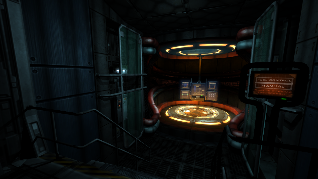
A shot from my map for the Maverick Servers Mapping Competition:
[lvlshot]http://i4.photobucket.com/albums/y138/phantazm11/Level%20Design/Solarium_1.jpg[/lvlshot]
Re: Screenshots
Posted: Mon Jul 30, 2012 9:57 pm
by Pext
@phantazm: nice coloring
i'm looking forward to see the competion maps
Re: Screenshots
Posted: Sun Aug 05, 2012 10:07 am
by CZghost
@phantazm: It looks like a Quake Live level... Will make QL verison of this map?
Re: Screenshots
Posted: Thu Aug 09, 2012 3:01 am
by phantazm11
Pext: Thanks man.
CZghost: I suppose if they want it I will make a QL version of it
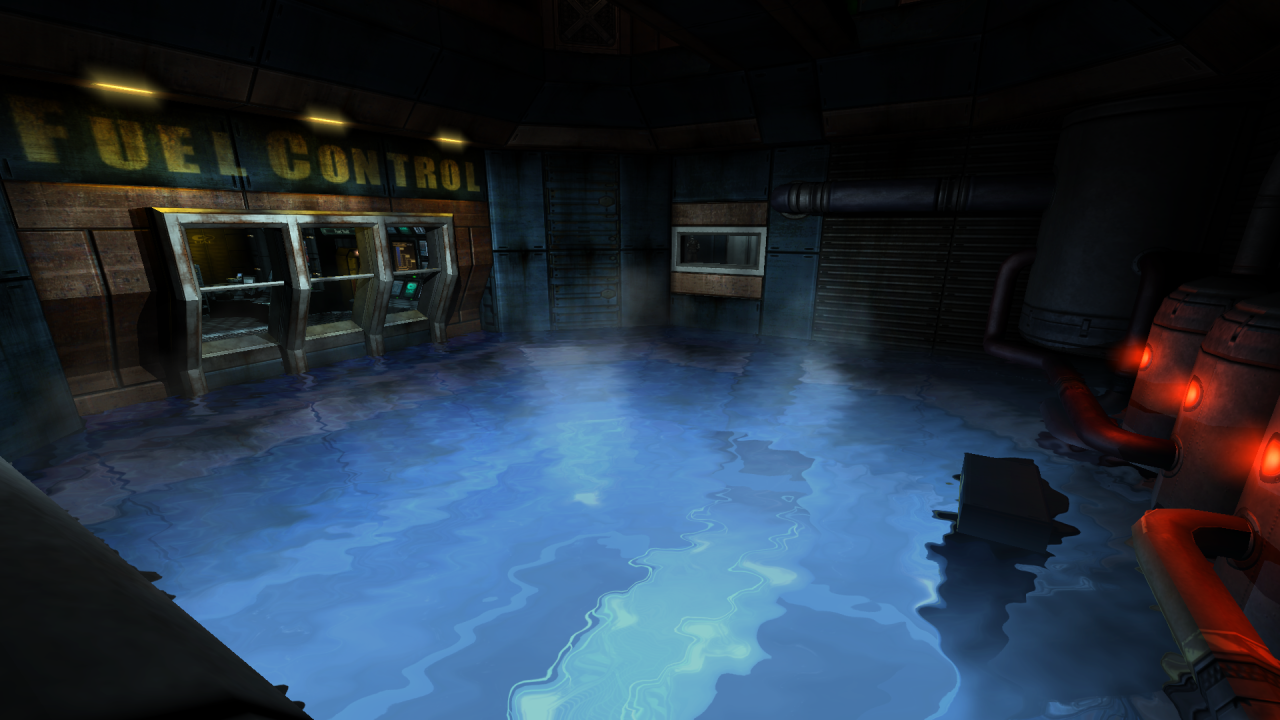
More progress on the competition map:
[lvlshot]http://i4.photobucket.com/albums/y138/phantazm11/Level%20Design/solarium_1-1.jpg[/lvlshot]
[lvlshot]http://i4.photobucket.com/albums/y138/phantazm11/Level%20Design/solarium_2.jpg[/lvlshot]
Re: Screenshots
Posted: Thu Aug 09, 2012 3:28 am
by GONNAFISTYA
Re: Screenshots
Posted: Thu Aug 09, 2012 7:42 am
by Kaz
GONNAFISTYA wrote:
I assume you'll get around to making those lights suitably grungified?
Re: Screenshots
Posted: Thu Aug 09, 2012 12:38 pm
by Fjoggs
Love it. My favourite map from the competition by far!
Re: Screenshots
Posted: Thu Aug 09, 2012 5:35 pm
by +JuggerNaut+
That's awesome.
Re: Screenshots
Posted: Mon Aug 20, 2012 5:53 pm
by ^Ghost
Map is for Defrag Mod
before
[lvlshot]http://i.imgur.com/csuRsh.jpg[/lvlshot]
after
[lvlshot]http://i.imgur.com/BZiYJh.jpg[/lvlshot]
before
[lvlshot]http://i.imgur.com/wnL2jh.jpg[/lvlshot]
after
[lvlshot]http://i.imgur.com/oTl4Uh.jpg[/lvlshot]
comments, complaints, suggestions?
ignore the plant/tree models.
Re: Screenshots
Posted: Mon Aug 20, 2012 10:17 pm
by Delirium
I like the new textures, but the light is a little boring, spice it up with a few spotlights or something
Re: Screenshots
Posted: Wed Aug 29, 2012 3:47 pm
by cityy
[lvlshot]https://dl.dropbox.com/u/15072710/XonoticCompetition2012/Screenshots/5.jpg[/lvlshot]
Here's the level I'm making for the Xonotic Competition; roughly 2 days of work. I got the initial layout sorted; looking to release a beta soon.
