Page 224 of 295
Re: Screenshots
Posted: Fri Jul 08, 2011 6:53 am
by Eraser
You actually might be wanting to turn that into an
Urban Terror map

Re: Screenshots
Posted: Fri Jul 08, 2011 7:10 am
by clownfart
Doesn't anyone remember that one guy who was arrested for making a Counter-Strike map of his school?
I actually played it, the brushwork was pretty sloppy, and it was the awful scale of that game.
story
Funny how they confiscate his "hammer" seeing as how you use Hammer World Editor for building CS maps.
Edit: btw Acid, Warsow misses your style.

Re: Screenshots
Posted: Fri Jul 08, 2011 7:37 am
by [acid]
I don't care too much, because I've already been interviewed by a newspaper and reactions were exclusively positive. My former headmaster once phoned me, I shall not release it, because there would be a copyright regarding the inside of the school and thieves might be able to train with the map

It is a public building, always open from 7am to 5pm. The current headmaster seems to be a lot more relaxed tho.
Re: Screenshots
Posted: Sat Jul 09, 2011 7:39 pm
by Kaz
Everyone's competition maps are starting to look really neat - glad I don't have to worry about it this go around

@fkd: try not to break q3map2 too badly

I might actually be able to release a beta of this sometime in the near future, it's nearing "presentable" as opposed to "really broken", and I'd like to have some folks inspect it again
:
[lvlshot]http://student.cs.appstate.edu/freemancw/junk/shot0325.jpg[/lvlshot]
Re: Screenshots
Posted: Sun Jul 10, 2011 11:01 am
by Bliccer
It seems that not only the competition maps look good... great job.
Only the texture in the doorway is misaligned.
Re: Screenshots
Posted: Sun Jul 10, 2011 7:53 pm
by clownfart
How long have you been showing that map for?
Re: Screenshots
Posted: Mon Jul 11, 2011 10:40 am
by Rav3n
Eraser is right, that map definitely looks like something for Urban Terror.
Tho i haven't really seen much "urban" maps been made lately.
Even I'm working on something more medieval looking that urban.
Re: Screenshots
Posted: Tue Jul 12, 2011 1:07 pm
by fKd
Re: Screenshots
Posted: Tue Jul 12, 2011 2:31 pm
by nitin77
is that now a ctf only map? Nooooo...
Re: Screenshots
Posted: Tue Jul 12, 2011 4:48 pm
by cityy
Looking cool fkd - I like it. A little dark on my screen though.
My stuff is slowly starting to take shape.
[lvlshot]http://dl.dropbox.com/u/15072710/MSGcompetition2011/week6_ingame%282%29.jpg[/lvlshot]
[lvlshot]http://dl.dropbox.com/u/15072710/MSGcompetition2011/week6_ingame%283%29.jpg[/lvlshot]
Re: Screenshots
Posted: Tue Jul 12, 2011 11:03 pm
by corsair
UDK, interesting and capable, but filthy >;V

this is WIP, and nearly final.
- horrible smooth-edges errors are horribly apparent and known.. any thoughts/feelings on the atmosphere/color tones? too this or too that? or ok?
- a glass shader's map isn't normalized - occasionally making the glass blue and/or interfere with the fog
- glass shader is fuct - distortion - opacity - light transmittance and whatnot need to be addressed
Re: Screenshots
Posted: Tue Jul 12, 2011 11:42 pm
by obsidian
Try with less fog, it seems strange with so much fog indoors. It should look like dust beams, not a Marlboro convention.
I take it most of it is modelled?
Re: Screenshots
Posted: Wed Jul 13, 2011 12:18 am
by Silicone_Milk
Interesting. I just started playing with the UDK a couple days ago, corsair.
Prototyping a brawler game and am learning how to make custom static meshes for it.
Re: Screenshots
Posted: Wed Jul 13, 2011 5:29 am
by tehSandwich
I have been working on trying something in Blender and NetRadiant, something that would look seamless in-game.
This is a case in me using the pk02 texture pack. Try to find the seam between the model and the game brushes.

Re: Screenshots
Posted: Wed Jul 13, 2011 6:53 am
by Eraser
corsair wrote:UDK, interesting and capable, but filthy >;V
this is WIP, and nearly final.
- horrible smooth-edges errors are horribly apparent and known.. any thoughts/feelings on the atmosphere/color tones? too this or too that? or ok?
- a glass shader's map isn't normalized - occasionally making the glass blue and/or interfere with the fog
- glass shader is fuct - distortion - opacity - light transmittance and whatnot need to be addressed
It looks like all the colour has been sucked out of it. There seems to e a lot of visual noise somehow. It kind of looks like this was rendered at 320x200 and then upscaled to 1080p.
Re: Screenshots
Posted: Wed Jul 13, 2011 2:20 pm
by corsair
thanks for the suggestions and critique - will definitely improve those bits
the scene´s geo is indeed all modeled; you'll probably wonder what the size of this is on the hdd then too. And that's a bummer indeed because the level and the content pack combined are 200mb!!
It is proceduraly modelled in houdini, which means every step taken in creation is stored (like chain), and every parameter from any action can be linked to another (which would connect multiple chains, more more or less).
What's left is a construction tree - or a multitude of them for the various types of geometry in this case - which allows for a very flexible way of working as well as a relatively small filesize (but with an increased loading time instead - as the end result still needs to be computed after the file is loaded).
The scene file for houdini is only around 8mb (300kb compressed) - the textures in the udk-pack account for much less. If I had exported smaller bits and copied them more often in udk I could make massive leaps with filesize reduction - but I'd prefer an engine which would accept procedural language instead of going trough the trouble ;p
The images probably feel resized because the materials are mostly setup for color only as of yet - but the contrast, normal mapping and resolution are still borked
have fun silicon_milk! there's a lot to explore :)
Re: Screenshots
Posted: Sun Jul 17, 2011 5:52 pm
by Strahlemann
fKd: i really like what i see! The screens have a great massive feel. Very nice detailing and architecture. I only wonder while half of the daemia-statue is buried (1st pic)
cityy:: looks super-slick

tehSandwich: looks seamless. But also doesn't look like modeled in Blender
Anyways i'd like to know what workflow you used if you don't mind
Re: Screenshots
Posted: Mon Jul 18, 2011 12:00 am
by tehSandwich
tehSandwich: looks seamless. But also doesn't look like modeled in Blender
Anyways i'd like to know what workflow you used if you don't mind
It's really just some careful UV-Unwrapping and the forcemeta spawnflag. A thing to note is that it is impossible to make such a thing directly in GTK-Radiant; Brushes are too crude, curves are imprecise.
Here's a picture of the "ring" used. For some reason, the ASE exporter I used triangulates in-Blender and not in-plugin. I ended up saving the triangulated mesh.

Re: Screenshots
Posted: Mon Jul 18, 2011 4:14 am
by fKd
cheers Strahlemann. its going well so far.
Re: Screenshots
Posted: Mon Jul 18, 2011 6:00 pm
by cityy
[lvlshot]http://dl.dropbox.com/u/15072710/MSGcompetition2011/week7_ingame%281%29.jpg[/lvlshot]
Beta soon!
Re: Screenshots
Posted: Tue Jul 19, 2011 7:46 am
by Eraser
Awesome lighting. Has a bit of a Blade Runner feel to it.
Re: Screenshots
Posted: Tue Jul 19, 2011 3:43 pm
by ShadoW_86
Good work cityy, looks classy.
Small preview of my own map, abmient lighting only and no details
:

Re: Screenshots
Posted: Tue Jul 19, 2011 4:24 pm
by fKd
very nice!
Re: Screenshots
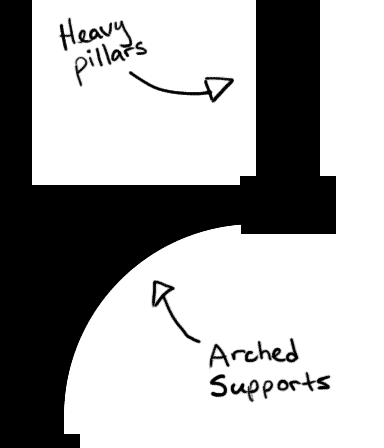
Posted: Tue Jul 19, 2011 4:26 pm
by obsidian
Arches look to large and heavy to support themselves, suggest arches below:
Re: Screenshots
Posted: Tue Jul 19, 2011 5:40 pm
by ShadoW_86
Hehe, actually I'm thinking about something like that.


