Page 202 of 295
Re: Screenshots
Posted: Fri Oct 01, 2010 7:50 am
by Kaz
I agree with the "great work" sentiment for both obs and odium. I'll also agree with the "more color" sentiment, however, as you say, splashes would probably be the best route.
Doing a little work here and there on kazdm4 when I find time, it will be finished one day........
How do the barrels look? Any suggestions?
Teaser Images:
[lvlshot]http://student.cs.appstate.edu/freemancw/wp-content/uploads/2010/10/dm4_2.jpg[/lvlshot]
[lvlshot]http://student.cs.appstate.edu/freemancw/wp-content/uploads/2010/10/dm4_5.jpg[/lvlshot]
Link to full post (more hits FTW):
http://student.cs.appstate.edu/freemancw/archives/182
Re: Screenshots
Posted: Fri Oct 01, 2010 1:20 pm
by fKd
nasty seam on that curved doorway in the second shot. but fully solid
Re: Screenshots
Posted: Fri Oct 01, 2010 4:52 pm
by Plan B
Barrels look fine, although there's not much you can comment on with such a simplistic object, except the texture looks sufficiently weathered

Might be nice to have two models; one with the lid on, and one with the lid off, lying nearby. Barrel (liquid) content optional.
Second shot looks sweet. Very Bioshocky

Yeah, bit harsh seam on those curves (and worse: abnormal shadow inducing

)
Wouldn't fuck about with extending the curve down, though. You wouldn't get the neighboring faces to perfectly match up with the patch texture anyway, because that's stretched.
Rather, just move the curve from the wall a bit, comme ca =>

I have to admit that might be getting a bit too anal, particularly since you're mapping a realistic, "real-life" scene, where shit just isn't
supposed to be too perfect.
I find myself frequently hindered in mapping progress, exactly by this obsessive perfectionism, btw.
So maybe just let it slide, hehe.
Re: Screenshots
Posted: Sat Oct 02, 2010 5:20 pm
by seremtan
it's weird, but the rocks/foliage in the first pic look really tiny, like they're part of a rock garden. i assume they're supposed to be taller than the player in-game
maybe it's just a lighting or POV thing

Re: Screenshots
Posted: Sat Oct 02, 2010 5:22 pm
by seremtan
dichtfux wrote:central area
you owe me new retinas, sir

Re: Screenshots
Posted: Sat Oct 02, 2010 6:44 pm
by dichtfux
No, hipshot does. He made the sky, I just (ab)used it.

Re: Screenshots
Posted: Sat Oct 02, 2010 11:28 pm
by obsidian
seremtan wrote:you owe me new retinas, sir
That's just you being old.
Re: Screenshots
Posted: Sun Oct 03, 2010 9:54 pm
by monaster
Kaz wrote: kazdm4 teaser images
It's alive! And that's good to hear/see.

@dichtux posting pics of his
award-winning maps: Stunning pictures, if only I had the right Quake to play them.

Re: Screenshots
Posted: Fri Oct 15, 2010 12:43 pm
by dichtfux
Some screenshots of
spirit1dm3 -- Zeal & Fury for Quake.
MH area
[lvlshot]http://maps.rcmd.org/quake1/spirit1dm3/screenshots/spirit1dm3_shot01.jpg[/lvlshot]
RA area
[lvlshot]http://maps.rcmd.org/quake1/spirit1dm3/screenshots/spirit1dm3_shot02.jpg[/lvlshot]
LG / lower GA area
[lvlshot]http://maps.rcmd.org/quake1/spirit1dm3/screenshots/spirit1dm3_shot03.jpg[/lvlshot]
GL / YA area
[lvlshot]http://maps.rcmd.org/quake1/spirit1dm3/screenshots/spirit1dm3_shot04.jpg[/lvlshot]
Re: Screenshots
Posted: Sun Oct 17, 2010 2:40 pm
by o'dium
I was a little bored, so I made a quick promo background for you. Nothing fancy, I'm waiting for the next model to be done before I can get some nicer ones out

Re: Screenshots
Posted: Sun Oct 17, 2010 3:23 pm
by neoplan
this guy seems to have a good dentist!
Re: Screenshots
Posted: Sun Oct 17, 2010 4:59 pm
by dichtfux
Looks good, o'dium!
@neoplan: He stole those teeth after eating the last owner I guess. Can't blame him for being choosy.
Re: Screenshots
Posted: Sun Oct 17, 2010 6:22 pm
by Hipshot
Edward Tattsyrup
Re: Screenshots
Posted: Sun Oct 17, 2010 10:44 pm
by fKd
yup good stuff o'dium, but how about a few new map locals for us to drool over.
models are lookin good, but im betting the animations will really add that extra wow... ack, all this waiting. gg team blur
Re: Screenshots
Posted: Sun Oct 17, 2010 10:56 pm
by Lunaran
fKd, those are some surprisingly metallic looking textures for an engine with no speculars. nice.
A little color makes a big difference:
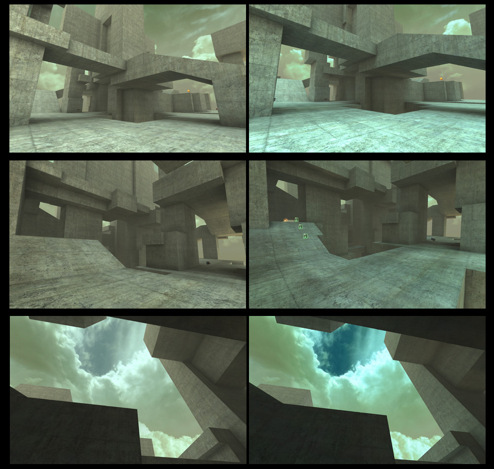
oh yeah that's the map I'm making
Re: Screenshots
Posted: Sun Oct 17, 2010 11:03 pm
by Noruen
Lunaran - That's really interesting, how good light can make from simple environment so effective good-looking map. Great!
o'dium - It is good, but sorry, about one or two classes worst that environment you post here before. It is based on some previus mod character, or something fresh-made? I dislike it.
Re: Screenshots
Posted: Mon Oct 18, 2010 12:22 am
by cityy
Looks familiar Lunaran - I tend to like the new colors. Did you hit the 1GB mark yet with the filesize?

Edit: Are you using fog or is it just me?
Re: Screenshots
Posted: Mon Oct 18, 2010 1:32 am
by obsidian
Lunaran wrote:an engine with no speculars
orly??? (True, but with some fancy texture/shader tricks...)

Re: Screenshots
Posted: Mon Oct 18, 2010 6:57 am
by ShadoW_86
o'dium wrote:I was a little bored, so I made a quick promo background for you. Nothing fancy, I'm waiting for the next model to be done before I can get some nicer ones out
It looks like that guy have some light source in the mouth.
Re: Screenshots
Posted: Mon Oct 18, 2010 3:21 pm
by o'dium
Its just the rim lighting there.
Re: Screenshots
Posted: Mon Oct 18, 2010 5:37 pm
by neoplan
ShadoW_86 wrote:o'dium wrote:I was a little bored, so I made a quick promo background for you. Nothing fancy, I'm waiting for the next model to be done before I can get some nicer ones out
It looks like that guy have some light source in the mouth.
He uses Mentadent Fluor+ tooth-paste...

Re: Screenshots
Posted: Mon Oct 18, 2010 7:49 pm
by o'dium
Or, its rim lighting, as I said. As for the teeth comments, the mouth is quite high detail, even has tonsils, and has its own texture. Theres one mouth mesh/texture for each faction to use, to make life easier on memory.
Re: Screenshots
Posted: Mon Oct 18, 2010 8:35 pm
by Silicone_Milk
The rim lighting looks horribly wrong then as it appears that there's a blue light source in the back top of the mouth casting a light on the back of the tongue and the top of the molars.
Re: Screenshots
Posted: Mon Oct 18, 2010 8:43 pm
by Noruen
Also the face is too much distorted. It is not physiologically possible and too fussy. But that body looks mutated and realistic.
Re: Screenshots
Posted: Mon Oct 18, 2010 9:21 pm
by o'dium
The pose is terrible because I never rigged it, its a vert changed pose just for this, so don't worry.
As for the whole "im'a throw my toys out of the pram and moan the rim lighting is horribly wrong" comment keep in mind the main character was hit with a light directly in front of him and was NOT in the background map at the time.
But I do suggest you look at games that use rim lighting on characters and find me something that works to your liking (MOH/MW2 both have it for example). What you want, isn't possible, as rim lighting is additive.
