Page 202 of 295
Re: Screenshots
Posted: Sat Sep 25, 2010 8:49 pm
by o'dium
corsair wrote:Nice to see such a 'still life' which aims high in realism. But as far as the foliage is concerned, I'd remove the reeds and add a more apparent default wind direction by removing the plants on one end, and adding (or simply keeping) the plants on another the other side. They're near the rocks for cover, but it cant be that there's cover all around the rocks; they wouldn't need em otherwise.
Wait a cotton picking second there chief lol, now you are getting waaaay too deep into nature

You don't even know what direction the wind is blowing in this pic
If I was to get into THAT level of detail, it would never get released, period. This is just for a visual style to the terrain, its not for David Bellamy to have a fan wank over
Re: Screenshots
Posted: Sun Sep 26, 2010 12:46 am
by obsidian
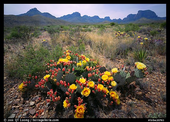
That looks awesome, o'dium! My only recommendation would be to introduce a bit more colour into the scene for contrast. I felt that your previous map is a little "brown" and I'm afraid this one will be too without some contrasting colour themes. I think it would look better with some actual green plants instead of more brown. I understand it's a desert, but even a green flowering cactus would be an improvement.
Some photo references (as you can see, deserts are not always brown):


Re: Screenshots
Posted: Sun Sep 26, 2010 6:38 am
by Theftbot
I think odium kept it muted brown, because overdose takes place in a post apocalyptic time, puts a sense of gloom in.
Re: Screenshots
Posted: Sun Sep 26, 2010 7:59 am
by o'dium
Its all part of the same level, actually
So yeah, its supposed to be brown because its in a level full of rust, sand, dirt etc. It won't be chock full of green. There were be smaller sections of colour, but don't expect Mario levels of burning retinas. Thats pretty much the exact look I wanted to go for. I know it doesn't float some peoples boats, but there are other levels in progress, like ones set in a totally destroyed shopping mall, thats got a lot of colour and water, quite a lot of green in that one.
So, give it chance
Re: Screenshots
Posted: Sun Sep 26, 2010 9:30 pm
by Silicone_Milk
Any reds? You could get away with it for iron-rich areas, o'dium and it'll break up the brown.
Re: Screenshots
Posted: Sun Sep 26, 2010 10:31 pm
by Hipshot
I just don't like that ground, it looks like it did in Q4 or Doom 3 - wrinkled paper kinda...
Re: Screenshots
Posted: Sun Sep 26, 2010 10:52 pm
by fKd
i agree, it does look like paper, sand does not act like that. but it could just be the lighting?
Re: Screenshots
Posted: Mon Sep 27, 2010 7:33 am
by o'dium
If you ignore the over excessive bloom and the path texture which was just testing, heres an overhead shot of the sand. If you think it needs reworking that much, I'll try again :s
http://www.team-blur-games.com/odium/terrain_sand.jpg
Re: Screenshots
Posted: Mon Sep 27, 2010 7:59 am
by fKd
hmmm maybe look at some desert ref pics, it does look wrong imo sand looks like water but made of sand... wind being the major influencing force.
like this

but the rocks and plant life look great

Re: Screenshots
Posted: Mon Sep 27, 2010 8:17 am
by o'dium
Thats sand from an EXTREME height though. Its also not working with tiling, which nature doesnt do last time I checked
I am gonna take another look at it mind you, its bugging me now you guys saying that. But theres only so much you can do with a tiling texture before it becomes more obvious it tiles.
Re: Screenshots
Posted: Mon Sep 27, 2010 10:11 am
by Plan B
Looks sweet, o'dium

But yeah, if you make the sand creases a bit smoother, and use less of them, it would look better.
Don't really agree with adding colour; because "reality" aside, there's nothing wrong with exaggerating the look of certain environments in a game, quite the contrary.
And that terrain + sky pretty much nail the desolate dessert vibe.
Re: Screenshots
Posted: Mon Sep 27, 2010 4:04 pm
by dichtfux
Here are some screenshots of the 2 maps I made for the 2010 Quake II mapping contest at the Quake 2 Café. They are finished and they were published a few days ago but I guess they don't need their own threads here at q3w.
spirit2dm5 -- Oceans apart
(oblivionq2 texure set by unknown author, skybox by hipshot)
MH/RL area
CG/YA, central area
 spirit2dm6 -- Totality
(Q2 stock textures by id software, skybox by hipshot)
central area
Re: Screenshots
Posted: Tue Sep 28, 2010 10:50 am
by jal_
obsidian wrote:That looks awesome, o'dium! My only recommendation would be to introduce a bit more colour into the scene for contrast. I felt that your previous map is a little "brown" and I'm afraid this one will be too without some contrasting colour themes. I think it would look better with some actual green plants instead of more brown. I understand it's a desert, but even a green flowering cactus would be an improvement.
It's not just the desert. All shots odium has shown are brown tinted. I understand this has a stylistic/ambiental reason, but I also think (and I've commented before) he should try to use more color variation in his pallete. I don't mean using a lot of different colors, but inside the neutral warm range you can use greenish-brown, redish-brown, yellowish brown, etc, etc (ocre tones, in short). It looks almost like tinted grayscale right now.
It's not that it's bad, anyway. Just that I think it could be better by expanding the color range a little.
Re: Screenshots
Posted: Tue Sep 28, 2010 11:55 pm
by obsidian
Vectors in Illustrator...

...overlaid with brass texture in Photoshop (and some other details).

Re: Screenshots
Posted: Wed Sep 29, 2010 12:22 am
by fKd
great work as always
Re: Screenshots
Posted: Fri Oct 01, 2010 7:50 am
by Kaz
I agree with the "great work" sentiment for both obs and odium. I'll also agree with the "more color" sentiment, however, as you say, splashes would probably be the best route.
Doing a little work here and there on kazdm4 when I find time, it will be finished one day........
How do the barrels look? Any suggestions?
Teaser Images:
[lvlshot]http://student.cs.appstate.edu/freemancw/wp-content/uploads/2010/10/dm4_2.jpg[/lvlshot]
[lvlshot]http://student.cs.appstate.edu/freemancw/wp-content/uploads/2010/10/dm4_5.jpg[/lvlshot]
Link to full post (more hits FTW):
http://student.cs.appstate.edu/freemancw/archives/182
Re: Screenshots
Posted: Fri Oct 01, 2010 1:20 pm
by fKd
nasty seam on that curved doorway in the second shot. but fully solid
Re: Screenshots
Posted: Fri Oct 01, 2010 4:52 pm
by Plan B
Barrels look fine, although there's not much you can comment on with such a simplistic object, except the texture looks sufficiently weathered
Might be nice to have two models; one with the lid on, and one with the lid off, lying nearby. Barrel (liquid) content optional.
Second shot looks sweet. Very Bioshocky
Yeah, bit harsh seam on those curves (and worse: abnormal shadow inducing

)
Wouldn't fuck about with extending the curve down, though. You wouldn't get the neighboring faces to perfectly match up with the patch texture anyway, because that's stretched.
Rather, just move the curve from the wall a bit, comme ca =>

I have to admit that might be getting a bit too anal, particularly since you're mapping a realistic, "real-life" scene, where shit just isn't
supposed to be too perfect.
I find myself frequently hindered in mapping progress, exactly by this obsessive perfectionism, btw.
So maybe just let it slide, hehe.
Re: Screenshots
Posted: Sat Oct 02, 2010 5:20 pm
by seremtan
it's weird, but the rocks/foliage in the first pic look really tiny, like they're part of a rock garden. i assume they're supposed to be taller than the player in-game
maybe it's just a lighting or POV thing

Re: Screenshots
Posted: Sat Oct 02, 2010 5:22 pm
by seremtan
dichtfux wrote:central area
you owe me new retinas, sir
Re: Screenshots
Posted: Sat Oct 02, 2010 6:44 pm
by dichtfux
No, hipshot does. He made the sky, I just (ab)used it.

Re: Screenshots
Posted: Sat Oct 02, 2010 11:28 pm
by obsidian
seremtan wrote:you owe me new retinas, sir
That's just you being old.
Re: Screenshots
Posted: Sun Oct 03, 2010 9:54 pm
by monaster
Kaz wrote: kazdm4 teaser images
It's alive! And that's good to hear/see.

@dichtux posting pics of his
award-winning maps: Stunning pictures, if only I had the right Quake to play them.

Re: Screenshots
Posted: Fri Oct 15, 2010 12:43 pm
by dichtfux
Some screenshots of
spirit1dm3 -- Zeal & Fury for Quake.
MH area
[lvlshot]http://maps.rcmd.org/quake1/spirit1dm3/screenshots/spirit1dm3_shot01.jpg[/lvlshot]
RA area
[lvlshot]http://maps.rcmd.org/quake1/spirit1dm3/screenshots/spirit1dm3_shot02.jpg[/lvlshot]
LG / lower GA area
[lvlshot]http://maps.rcmd.org/quake1/spirit1dm3/screenshots/spirit1dm3_shot03.jpg[/lvlshot]
GL / YA area
[lvlshot]http://maps.rcmd.org/quake1/spirit1dm3/screenshots/spirit1dm3_shot04.jpg[/lvlshot]
Re: Screenshots
Posted: Sun Oct 17, 2010 2:40 pm
by o'dium
I was a little bored, so I made a quick promo background for you. Nothing fancy, I'm waiting for the next model to be done before I can get some nicer ones out

