Page 201 of 295
Re: Screenshots
Posted: Thu Sep 16, 2010 6:33 pm
by FRA_ChaosLegion
@Shadow_86
Feeling retro. Hell yeah. Been so long since I played Q1. I think digging it out and wiping the dust off will be in order.


Michael
ShadowZombie
Re: Screenshots
Posted: Fri Sep 17, 2010 12:26 am
by fKd
cheers everyone, really helps keep me motivated
been working away at it to get it into beta. with any luck this weekend will be very productive and ill have something for you all to play around in between all the other amazing stuff that is being made at the moment
gg
Re: Screenshots
Posted: Fri Sep 17, 2010 1:22 pm
by fKd
dont mean to spam, but well... umm one last one, ill start my own thread next time

Re: Screenshots
Posted: Fri Sep 17, 2010 1:25 pm
by dichtfux
No need for your own thread, the screenshots thread is for screenshots!

Looks great fKd. You pump out details like no other.
Re: Screenshots
Posted: Sat Sep 18, 2010 1:10 am
by nitin77
fkd,
that last screenshot is amazing.
Re: Screenshots
Posted: Sat Sep 18, 2010 5:05 am
by fKd
cheers fellas.
@dichtfux funny thing is, its all the textures, this is much lower in detail than my usual efforts. but i am happy with the compositions im getting in this latest map.
Re: Screenshots
Posted: Sat Sep 18, 2010 11:40 am
by o'dium
So y'all need to hide your kids, hide your wife, and hide your husband cause fkd being rapin' everybody out here. Fantastic looking map sir, you be shittin' all over that Q3 engine.
Re: Screenshots
Posted: Sat Sep 18, 2010 3:24 pm
by Pat Howard
haha.
Re: Screenshots
Posted: Tue Sep 21, 2010 11:21 am
by jal_
Giving Sculptris a try. I just falled in love with that program.
[lvlshot]http://www.foopics.com/showfull/a96a2cb48b89d396a1a5f6a9eb02401e[/lvlshot]
Re: Screenshots
Posted: Tue Sep 21, 2010 1:14 pm
by fKd
woo im getting a mass effect vibe, good stuff so far sir
Re: Screenshots
Posted: Tue Sep 21, 2010 11:05 pm
by seremtan
fKd wrote:dont mean to spam, but well... umm one last one, ill start my own thread next time
that's quite sextastic
Re: Screenshots
Posted: Wed Sep 22, 2010 7:38 am
by Noruen
fKd wrote:dont mean to spam, but well... umm one last one, ill start my own thread next time
That's not spamming. That's great graphic. It looks like textures are bumpmapped. Great work in Quake 3 engine!

Re: Screenshots
Posted: Wed Sep 22, 2010 5:59 pm
by Noruen
These days I'm experimenting with other uses of texture blending used often for terrains. But now on some other objects than terain. I think it is great technology


Re: Screenshots
Posted: Thu Sep 23, 2010 12:04 am
by fKd
cool! apart from some of those seams that looks like a really good way to add extra textural detail. good stuff man
Re: Screenshots
Posted: Sat Sep 25, 2010 6:14 pm
by o'dium
Obvious errors are obvious

But just trying to get a theme for the outdoor of the Stockpile map terrain:

Re: Screenshots
Posted: Sat Sep 25, 2010 6:59 pm
by Noruen
OuDium - I thought it is photo first

Looks really good. I like that stylization into bright brown.
Re: Screenshots
Posted: Sat Sep 25, 2010 8:20 pm
by corsair
fancy atmosphere; the ground is folding like it's rough piece of cloth though, there's a weird polygonal pattern to height/normal map. Could be a less obvious error, related to not normalizing the normal map to the shape of the terrain. What software did you use to create this?
Nice to see such a 'still life' which aims high in realism. But as far as the foliage is concerned, I'd remove the reeds and add a more apparent default wind direction by removing the plants on one end, and adding (or simply keeping) the plants on another the other side. They're near the rocks for cover, but it cant be that there's cover all around the rocks; they wouldn't need em otherwise.
Re: Screenshots
Posted: Sat Sep 25, 2010 8:25 pm
by o'dium
The ground is using a larger sand sculpted texture, so it will have odd triangle style folds. The rocky texture under the actual large rock is a wip, with a higher res better version in progress. The textures should all be correct and normalized, doubt nicolas would miss such an obvious thing but I will ask when hes online.
Whole host of programs used, max, photoshop, zBrush, Mudbox, crazy bump etc.
Re: Screenshots
Posted: Sat Sep 25, 2010 8:34 pm
by corsair
in that case, consider using a (procedural) terrain generator such as WorldMachine or GeoControl for adding realistic visual appeal to the ground texture. You can't achieve proper realism with sculpting alone.
I wouldn't mind if you could prove me wrong though; looking forward to the next update :]
Re: Screenshots
Posted: Sat Sep 25, 2010 8:40 pm
by o'dium
corsair wrote:in that case, consider using a (procedural) terrain generator such as WorldMachine or GeoControl for adding realistic visual appeal to the ground texture. You can't achieve proper realism with sculpting alone.
I wouldn't mind if you could prove me wrong though; looking forward to the next update :]
Its a 2048x2048 tiling hand crafted texture that was sculpted into the same shape as a sand dune, the actual end result isn't seen here as POM is off, but even still I dunno if using WM would make a huge difference :S
Re: Screenshots
Posted: Sat Sep 25, 2010 8:49 pm
by o'dium
corsair wrote:Nice to see such a 'still life' which aims high in realism. But as far as the foliage is concerned, I'd remove the reeds and add a more apparent default wind direction by removing the plants on one end, and adding (or simply keeping) the plants on another the other side. They're near the rocks for cover, but it cant be that there's cover all around the rocks; they wouldn't need em otherwise.
Wait a cotton picking second there chief lol, now you are getting waaaay too deep into nature
You don't even know what direction the wind is blowing in this pic
If I was to get into THAT level of detail, it would never get released, period. This is just for a visual style to the terrain, its not for David Bellamy to have a fan wank over
Re: Screenshots
Posted: Sun Sep 26, 2010 12:46 am
by obsidian
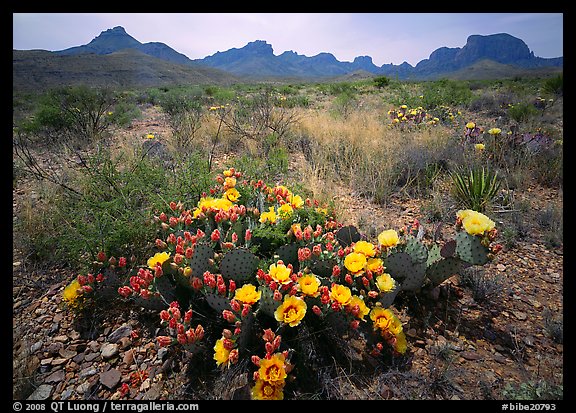
That looks awesome, o'dium! My only recommendation would be to introduce a bit more colour into the scene for contrast. I felt that your previous map is a little "brown" and I'm afraid this one will be too without some contrasting colour themes. I think it would look better with some actual green plants instead of more brown. I understand it's a desert, but even a green flowering cactus would be an improvement.
Some photo references (as you can see, deserts are not always brown):


Re: Screenshots
Posted: Sun Sep 26, 2010 6:38 am
by Theftbot
I think odium kept it muted brown, because overdose takes place in a post apocalyptic time, puts a sense of gloom in.
Re: Screenshots
Posted: Sun Sep 26, 2010 7:59 am
by o'dium
Its all part of the same level, actually
So yeah, its supposed to be brown because its in a level full of rust, sand, dirt etc. It won't be chock full of green. There were be smaller sections of colour, but don't expect Mario levels of burning retinas. Thats pretty much the exact look I wanted to go for. I know it doesn't float some peoples boats, but there are other levels in progress, like ones set in a totally destroyed shopping mall, thats got a lot of colour and water, quite a lot of green in that one.
So, give it chance
Re: Screenshots
Posted: Sun Sep 26, 2010 9:30 pm
by Silicone_Milk
Any reds? You could get away with it for iron-rich areas, o'dium and it'll break up the brown.

