No, no. It's a modification of q3map2 itself where I'm adding this new switch, and the plan is to send the code patch to netradiant q3map2, making it the default for -game qfusion and a switch for the rest.
EDIT: You can probably achieve a similar (just a bit worse) result in stock q3map2 by setting _anglescale 0.75 in the light entity. Unfortunately, it doesn't work for suns (neither shader nor _sun), and the sun is where the improvement is more important.
Screenshots
Re: Screenshots
Oh, that's what I had asked initially, but I guess there was a misunderstanding.
[size=85][url=http://gtkradiant.com]GtkRadiant[/url] | [url=http://q3map2.robotrenegade.com]Q3Map2[/url] | [url=http://q3map2.robotrenegade.com/docs/shader_manual/]Shader Manual[/url][/size]
Re: Screenshots
Hmm... ye. I understood you were asking if it required changes in the map shaders.
Re: Screenshots
@sumatra: do it! have you made anything since "the hot place"?
Some interior design woo!
[lvlshot]http://student.cs.appstate.edu/freemancw/junk/shot0124.jpg[/lvlshot]
Some interior design woo!
[lvlshot]http://student.cs.appstate.edu/freemancw/junk/shot0124.jpg[/lvlshot]
Re: Screenshots
that fucking rocks kaz, just like all the prevoius screens from this map. that rug looks great
Re: Screenshots
Hey Kaz, ye, I did two maps after that. But far different style, more minimalistic.
Here you go:
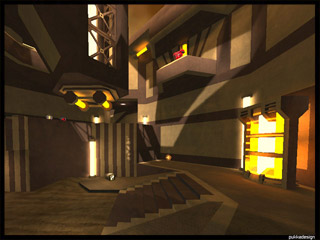
pukka3tourney5
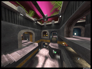
pukka3tourney6
Second one was more of a project to test my ability to create my own textures for the whole map..
After that I started with a CTF map, but it's heavy to get decent feedback for this mode.
Here the thread if you're interested: [Alpha] CTF Layout - Thougts
Maybe I can go on working on this layout soon.
When do we see a betaof your map already?!
Here you go:
pukka3tourney5
pukka3tourney6
Second one was more of a project to test my ability to create my own textures for the whole map..
After that I started with a CTF map, but it's heavy to get decent feedback for this mode.
Here the thread if you're interested: [Alpha] CTF Layout - Thougts
Maybe I can go on working on this layout soon.
When do we see a betaof your map already?!
[url=http://www.pukkadesign.com][color=#41c0eb]..::pukkadesign.com[/color][/url]
Re: Screenshots
@sumatra, I think pukka5 is your best work for style and layout. It is just amazing to play and gorgeous to wander around and look at. pukka6 was strange with the teleporters connecting deadends and I felt you just painted the textures on an alpha brushwork layout. The textures did not accent any detail and the gameplay layout dominated the visual style, which is wrong IMHO. Considering the quality of your past work I was disappointed.
@Kaz, you need to organize the wall like in real life. You need small wooden/plaster trim borders top and bottom (not huge bricks and concrete) and the wallpaper needs an edge, try rotating the pattern 90 degree's so it will line up with the arches better. If you want to keep the brick and concrete, hint that they exist behind with broken sections with the wallpaper and trims on top.
You also have way too many horizontal lines going on in the image (maybe because of the huge brick/concrete trims), break up the wall space, indent the picture into an alcove with a spot light on the lip above shining down onto the picture. Make the plant holders smaller vertically so the plant looks correct compared to the holder. Make the doors taller and compress the amount of wood frame between the top of the door and the windows above.
@Jal, I don't like the first set of pictures you posted showing the new light effect you are working on. They are glowing bright white, hurt my eyes. The second set with the crate style textures are much better, I especially like the shafts of light on the vertical walls. It seems to work alot better for indoor or shaded maps than in the wide open areas.
Well he was evil, but he did build alot of roads. - Gogglor
My [url=http://www.simonoc.com/]Website[/url] & [url=http://twitter.com/SimsOCallaghan]Twitter[/url]
My [url=http://www.simonoc.com/]Website[/url] & [url=http://twitter.com/SimsOCallaghan]Twitter[/url]
Re: Screenshots
@ sock: I'm happy you like that map. But IMO pukka3tourney2 is look- and layoutwise much better implemented.
And you're definately right, tourney6 was really only dominated by the floorplan and some texture testing.
Didn't want to add more detail. But I'm also not very satisfied with the result.
And you're definately right, tourney6 was really only dominated by the floorplan and some texture testing.
Didn't want to add more detail. But I'm also not very satisfied with the result.
[url=http://www.pukkadesign.com][color=#41c0eb]..::pukkadesign.com[/color][/url]
-
Silicone_Milk
- Posts: 2237
- Joined: Sat Mar 12, 2005 10:49 pm
Re: Screenshots
I actually wish the walls of my house looked like the ones in Kaz's shots.
Re: Screenshots
Thanks for the suggestions Sock, I think it looks much better now. Unfortunately I happen to be Photoshop-less on my home computer ATM, hopefully I can rectify that soon! 
dubz: thanks mang!
sumatra: I'll have to check the alpha out, and now that I see the screenshots I remember seeing those other maps at one point, the abstract one looks amazing!
[lvlshot]http://student.cs.appstate.edu/freemancw/junk/shot0126.jpg[/lvlshot]
dubz: thanks mang!
sumatra: I'll have to check the alpha out, and now that I see the screenshots I remember seeing those other maps at one point, the abstract one looks amazing!
[lvlshot]http://student.cs.appstate.edu/freemancw/junk/shot0126.jpg[/lvlshot]
Re: Screenshots
Kaz, your map looked very industrial, I'm not sure if the carpet and painting exactly fits the theme. It's doable, but you'll need a lot more textures and assets to make it that industrial loft kind of look.
[size=85][url=http://gtkradiant.com]GtkRadiant[/url] | [url=http://q3map2.robotrenegade.com]Q3Map2[/url] | [url=http://q3map2.robotrenegade.com/docs/shader_manual/]Shader Manual[/url][/size]
Re: Screenshots
Yeah, this is definitely true, I'm kind of wondering if I should even bother, because it's already entailing alot of work... Fortunately I've only converted a smallish section.obsidian wrote:Kaz, your map looked very industrial, I'm not sure if the carpet and painting exactly fits the theme. It's doable, but you'll need a lot more textures and assets to make it that industrial loft kind of look.
Re: Screenshots
Or if there is a specific atrium or focal point that needs a little something, it might work out okay. Play around with it and see how it works with the existing stuff. Or save it for your next map.
[size=85][url=http://gtkradiant.com]GtkRadiant[/url] | [url=http://q3map2.robotrenegade.com]Q3Map2[/url] | [url=http://q3map2.robotrenegade.com/docs/shader_manual/]Shader Manual[/url][/size]
Re: Screenshots
Could be the office of the industrial hall/factory's boss, probably. Somehow reminds me of Kingpin with its dark colors and atmosphere, great work, Kaz!
If you are caught on a golf course during a storm and are afraid of lightning, hold up a 1-iron. Not even God can hit a 1-iron.
-Lee Trevino, golfer who actually has been struck by lightning.
-Lee Trevino, golfer who actually has been struck by lightning.
Re: Screenshots
Another map I'm retexturing & lighting
[lvlshot]http://www.foopics.com/showfull/60bd6c3895b06cca788e0f3f0a6bd9f1[/lvlshot]
[lvlshot]http://www.foopics.com/showfull/38f93ed6475b0ed2426845a3dca75c50[/lvlshot]
[lvlshot]http://www.foopics.com/showfull/2c2aeb4fc456faac6b41e03c8be3cb1c[/lvlshot]
[lvlshot]http://www.foopics.com/showfull/0b5072a4f0b0a7e0f774e214c852ff82[/lvlshot]
Re: Screenshots
@jal_: Has this map ever been published? The very last shot looks somehow familiar to me.
If you are caught on a golf course during a storm and are afraid of lightning, hold up a 1-iron. Not even God can hit a 1-iron.
-Lee Trevino, golfer who actually has been struck by lightning.
-Lee Trevino, golfer who actually has been struck by lightning.
Re: Screenshots
It's a Warsow map. You probably find it familiar cause I already posted some shots of it some time ago.
BTW: Does anyone know if there is some kind of known q3map2 issue with surface lights and the grid and/or vertex? I have the impression they aren't lighting the grip properly, but I'm not sure if it's just me being paranoid or there is really a issue there.
BTW: Does anyone know if there is some kind of known q3map2 issue with surface lights and the grid and/or vertex? I have the impression they aren't lighting the grip properly, but I'm not sure if it's just me being paranoid or there is really a issue there.
Re: Screenshots
Not that I know of. It's quite possible to light an entire map with just surface lights and the lightgrid will still work.
[size=85][url=http://gtkradiant.com]GtkRadiant[/url] | [url=http://q3map2.robotrenegade.com]Q3Map2[/url] | [url=http://q3map2.robotrenegade.com/docs/shader_manual/]Shader Manual[/url][/size]
-
Silicone_Milk
- Posts: 2237
- Joined: Sat Mar 12, 2005 10:49 pm
Re: Screenshots
It's a shame only Germans and some Japanese play Warsow. I can never find a U.S. server online.
Re: Screenshots
Hey guys. Some screenies , it's from my new/old map which I would like to finish now. I have started it maybe 5 or 6 years ago. It was dumped, and about 2 years ago I played with it a little again. Now it's time finish it at last . This are very early shots (but anyway I like how map looks right now), there's almost no lightning, only some basic stuff to run the map at all.
[lvlshot]http://shadowsdomain.files.wordpress.com/2010/02/rs_a1_01.jpg[/lvlshot]
[lvlshot]http://shadowsdomain.files.wordpress.com/2010/02/rs_a1_02.jpg[/lvlshot]
[lvlshot]http://shadowsdomain.files.wordpress.com/2010/02/rs_a1_03.jpg[/lvlshot]
[lvlshot]http://shadowsdomain.files.wordpress.com/2010/02/rs_a1_04.jpg[/lvlshot]
Last edited by AEon on Sat Feb 27, 2010 10:27 am, edited 1 time in total.
Reason: lvlshot'ed those images as well.
Reason: lvlshot'ed those images as well.
[url]http://shadowsdomain.wordpress.com/[/url]
Re: Screenshots
That thar's a beaut.
Re: Screenshots
That's pretty impresive. And I don't miss the lighting, tbh.
Re: Screenshots
oh hells yeah! good stuff man