Page 134 of 295
Re: Screenshots
Posted: Sat Jan 03, 2009 5:35 pm
by pjw
sock wrote:cool stuff
That's looking nice. I'll try to give it a look soon. (You know, you could make a thread, rather than tucking this away in the screenshots thread, which some people may not check regularly?)
o'dium wrote:if its an eye sore
It's not. At least not in my opinion.
To me, this is sort of like the wiring thing. Some people seem to have a sort of virtual set of measuring tools in their head, and low tolerance for anything that doesn't seem to fit those measurements. Not sayin' this is necessarily good or bad...just that it is.
My "that's not right" alarm isn't sounding at all, in this case. For one thing, there are a huge variety of brick sizes, above and beyond your standard brick, but more importantly, the scene just
looks good. It looks right. If the brick texture were scaled up or down to the extent that you could see the difference in pixel density, then that would probably do it, but barring that...nah, looks good to me.
Just my $0.02.
Re: Screenshots
Posted: Sat Jan 03, 2009 6:01 pm
by Lunaran
You can't measure this stuff precisely - making everything to exact scale in a game with 90° FOV and linear perspective comes out looking all wrong. Doors look cramped and halls are tiny and ceilings are low and details are all microscopic and busy, because we should be seeing those things with nearly twice the FOV (seriously, hold your hands out and wiggle them, and see how far apart you can hold them while staring straight ahead without losing sight of them).
So, we have big bricks and high ceilings and really thick wires and characters with little heads and big feet. If it looks right, leave it.
Re: Screenshots
Posted: Sat Jan 03, 2009 6:21 pm
by Scourge
o'dium wrote:Wow, are you guys really on about the bricks in my shots? Ok... erm, if its an eye sore I can change it, just give me a final scale?
It doesn't bother me. I was just giving info.
Re: Screenshots
Posted: Sun Jan 04, 2009 2:18 am
by +JuggerNaut+
i think the bricks look good and overall that entire area looks nice odium. the conduit stick out a little but only because of its color, imo.
Re: Screenshots
Posted: Sun Jan 04, 2009 2:37 am
by obsidian
I think the overall shot looks good o'dium, move on and work on the rest of the map, tweak the details later if need be.
Re: Screenshots
Posted: Tue Jan 06, 2009 11:06 pm
by o'dium
Well Happy New Year All!
I bring gifts of pic's, gives of sound and gifts of... Well that's it really. But come on, a gift is a gift! First of all, I want to introduce you to the new hand/arm models. Feast your year 2009 eyes on these puppies:


Well, why the change? A few of you had a few nasty things to say about our old hands. That we copied CS:S's style, they wasn't original etc etc... Well yeah, ok, that's true. Many people thought they were fine, but a few really didn't like them and wanted something original. So we went back to the drawing board and came up with these. Now these ARE WIP, I'm sure you understand, so don't take them as final just yet...
Re: Screenshots
Posted: Tue Jan 06, 2009 11:13 pm
by fKd
me like. the vains on the forearms look a little off.. but thats just nit picking, the gloves look wicked, like how the trigger finger is exposed. your new modeler looks to be very skilled indeed.
Re: Screenshots
Posted: Wed Jan 07, 2009 12:33 am
by obsidian
What software was used to create those arms/gloves? Care to share a quick overview of the workflow to create those high poly models?
Re: Screenshots
Posted: Wed Jan 07, 2009 1:16 am
by o'dium
Well, base mesh was done in Max, of course, and then rendered with a lot of subdivision inside of zBrush. A lot of the detail was done by hand (if you excuse the pun), with custmer filters and masks.
Re: Screenshots
Posted: Wed Jan 07, 2009 6:31 am
by ^misantropia^
fKd wrote:the vains on the forearms look a little off
Looks natural to me, as does the musculature. Good work, o'dium.
Re: Screenshots
Posted: Wed Jan 07, 2009 7:07 am
by fKd
oh ffs
Re: Screenshots
Posted: Wed Jan 07, 2009 12:05 pm
by o'dium
lol, dont worry chap. We had some comments on finger length and all sorts. It all depends on YOUR hand what YOU think

Re: Screenshots
Posted: Wed Jan 07, 2009 2:14 pm
by MKJ
haha, i hadnt noticed but now that you mention it, the ring and pinky look a tad too short

edit: nm, i was looking at the middle shot and didnt take into account that the fingers are bent slightly

Re: Screenshots
Posted: Wed Jan 07, 2009 2:45 pm
by axbaby
looks good.
palms , especially bottom of the hand seem to be a bit too thick for those fingers?
Re: Screenshots
Posted: Thu Jan 08, 2009 4:35 am
by Silicone_Milk
I've been crawling lvlworld for inspiration trying to come up with something to break up the repetition here.
This wall isn't quite what I'm envisioning but maybe some quake vets can help me out here.
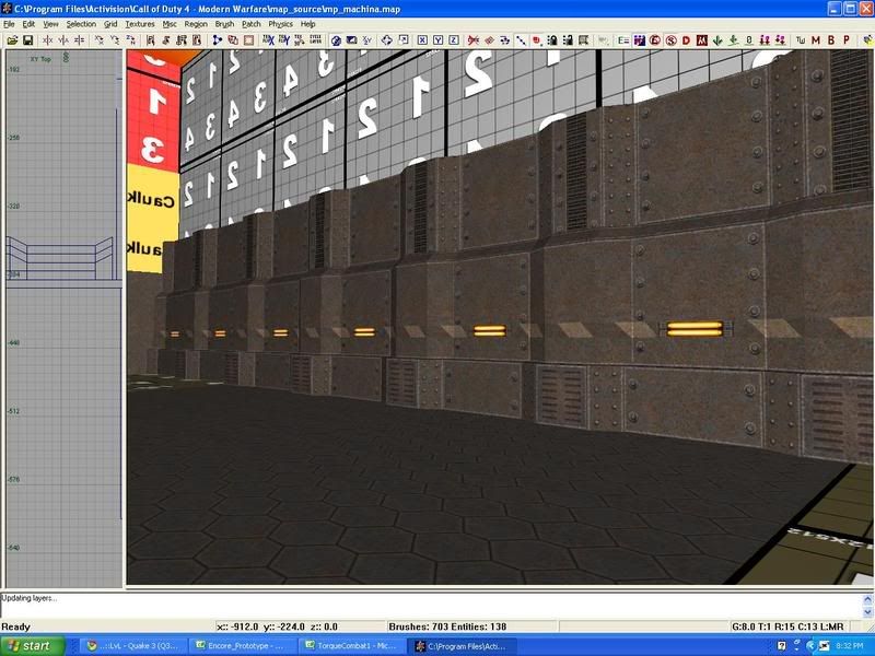
As you may or may not know, this is a map for Call of Duty 4 and I'm trying to get a Quake 2 chunky gritty feel going on. I can't for the life of me come up with a way to break up this repetition in a way that looks good to me.
Thoughts?
EDIT: Came back later and came up with this.
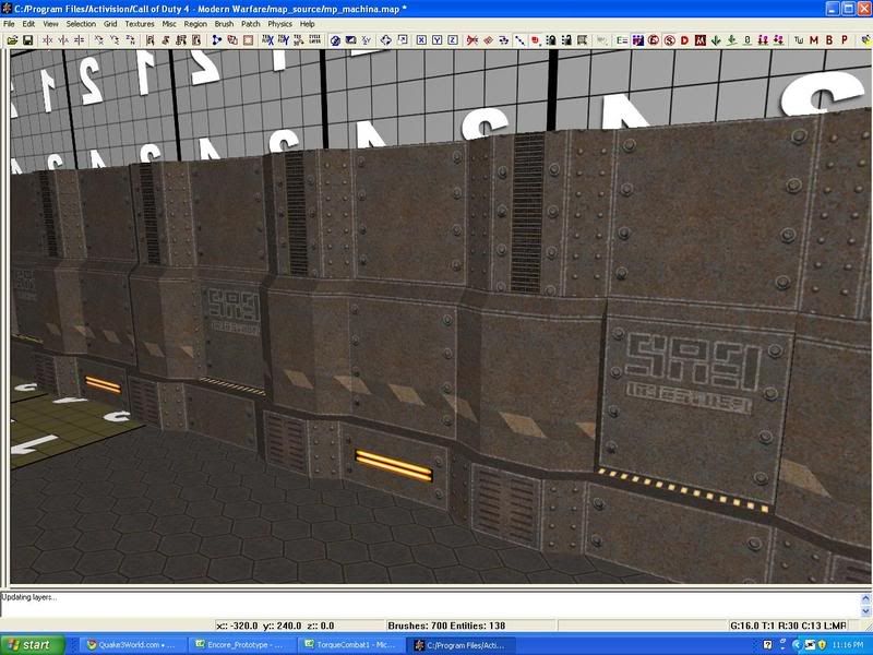
Still looking for suggestions though.
Re: Screenshots
Posted: Thu Jan 08, 2009 7:22 am
by axbaby
can you make some of the wall look damaged
Re: Screenshots
Posted: Thu Jan 08, 2009 8:43 am
by Silicone_Milk
yeah I can slap some decals on and rough it up in places a bit.
I'm thinking maybe have some wires hanging from the top and a blood splatter or two on the mid part of the wall.
Maybe a few rust decals and a grungy dirt to put over a couple lights to make them look dirtier than other lights.
Re: Screenshots
Posted: Thu Jan 08, 2009 9:53 am
by o'dium
The problem I'm seeing is that you are making the level very modular, but using the pieces in a much, much to average way. That wall looks perfectly fine to my eyes... If its halved. So try and do something to break it up. Pipework, gratings, these are things Quake 2 has.
EDIT: WTF is midular lol?
Re: Screenshots
Posted: Thu Jan 08, 2009 10:05 am
by MKJ
add a grate to one tile, have a light broken in another (including lightsource). put a box or 2 before another part.
plus ambient lighting should break the tone a lot
Re: Screenshots
Posted: Thu Jan 08, 2009 3:12 pm
by obsidian
Why make it such a long solid wall? Add an alcove, or a doorway (even if it doesn't open), or a piece of machinery, or a window, or a bulkhead, or a fenced off area full of pipes and wires, or a storage area with crates, or a.... well, hopefully you get the point.
I agree with o'dium that you're being too modular and making your map look like a bunch of chunks of walls and cloning them to make bigger segments. That works on short areas, but try to add more individual, unique brushwork instead.
Re: Screenshots
Posted: Thu Jan 08, 2009 4:28 pm
by Silicone_Milk
That's exactly the type of feedback I was looking for. Thanks a ton guys

The reason things are so modular is because the CoD 4 engine loves prefabs. Instead of having redundant geometrical data, you can make a prefab, use it all over the place, and the clones will reference the original data so you only store it once.
But I agree. The pipes/crate storage/door/etc... should be added in to break it up.
Re: Screenshots
Posted: Thu Jan 08, 2009 9:33 pm
by fKd
hay are you making bumpmaps for ya q2 textures?
Re: Screenshots
Posted: Thu Jan 08, 2009 9:57 pm
by Silicone_Milk
no. I seriously suck ass at using photo editing software.
It would really help things stand out though for those people who like to turn on frivolous effects like normal mapping and specular mapping.
Personally I find extra effects like those to be distracting when trying to snipe.
From an artistic viewpoint, I think normal maps and specular maps should be made for these textures and the resolutions should be bumped up. But I can't bother evil to change these as he's been kind enough to give me permission to port these over to CoD 4.
Re: Screenshots
Posted: Thu Jan 08, 2009 11:55 pm
by Silicone_Milk
So something along the lines of this (with better brushwork/texturing of course)
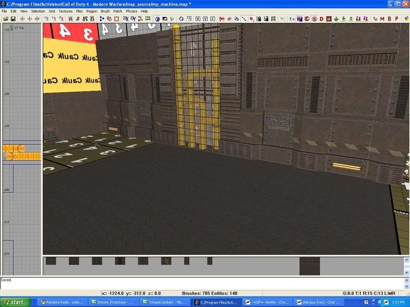
I tried a door but it felt out of place because this is kind of like the back of the facility so there shouldn't be a ton of doors.
Re: Screenshots
Posted: Fri Jan 09, 2009 10:26 am
by MKJ
if it's the back, maybe a huge garagedoor - that wont open, ofcourse - used for loading.
(unloading would be in the white zone)


