I'm working on a new project for Q4 CTF

-
Silicone_Milk
- Posts: 2237
- Joined: Sat Mar 12, 2005 10:49 pm
lookin' a lot better in the latest screenshot. I'm really diggin' it so far.
If things continue this way I might fork over some dough and get my hands on Q4.
Again, lookin' good o'dium only two things I would suggest are when fine-tuning textures...
1.) Add a little bit of grime on the wood textures. Maybe a bit of rust marks along the point where iron meets wood and I think maybe some tiny gaps between boards to make it look a little older.
2.) Stones still a little wavy. Making them straight again and adding chinks to the edges + maybe a touch of water streaks/slime near the top of the ceiling
(I'm assuming the curve in where the two walls meet is just temporary while you're testing textures?)
1) This will be done, I may do that now after I finish on steps textures.Silicone_Milk wrote:lookin' a lot better in the latest screenshot. I'm really diggin' it so far.
If things continue this way I might fork over some dough and get my hands on Q4.
Again, lookin' good o'dium only two things I would suggest are when fine-tuning textures...
1.) Add a little bit of grime on the wood textures. Maybe a bit of rust marks along the point where iron meets wood and I think maybe some tiny gaps between boards to make it look a little older.
2.) Stones still a little wavy. Making them straight again and adding chinks to the edges + maybe a touch of water streaks/slime near the top of the ceiling
(I'm assuming the curve in where the two walls meet is just temporary while you're testing textures?)
2) Stones are staying for the time being, I'll go back at the end and fix those up. For the moment they are giving me the genreal look/feel/colour so they can stay put for now
2b) The curve is supposed to be there, I do know it looks a tad strange with the ceiling texture, but if you have a 90degree join, the map feels very boxey due to the harsh lighting in this area. In other words, it creats a visible seam to the world and stands out, when I want it flush. So for the moment, the curve stays unless I can think of something else.
-
Silicone_Milk
- Posts: 2237
- Joined: Sat Mar 12, 2005 10:49 pm
You can try making the 90 degree angle then covering it up with a curved pillar such as this in my masterwork of an artpiece (top-down view)o'dium wrote:
2b) The curve is supposed to be there, I do know it looks a tad strange with the ceiling texture, but if you have a 90degree join, the map feels very boxey due to the harsh lighting in this area. In other words, it creats a visible seam to the world and stands out, when I want it flush. So for the moment, the curve stays unless I can think of something else.
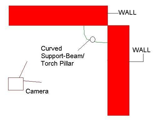
The curved pillar can be used as detail, a support, or you could probably stick a torch on it.
Just a thought =).

Nice tele. I wouldn't stick with that floor texture though (assuming you recreated the Q3 version), it's too obvious.
The scale of torch handle/flame seems off too. Flame seems too small in comparison to the stalk, like it's being gas powered or something
Though... add tiny red and blue pipes somewhere inconspicuous going into the wall on the back of them and it'd be right
The scale of torch handle/flame seems off too. Flame seems too small in comparison to the stalk, like it's being gas powered or something
Though... add tiny red and blue pipes somewhere inconspicuous going into the wall on the back of them and it'd be right
"Maybe you have some bird ideas. Maybe that’s the best you can do."
― Terry A. Davis
― Terry A. Davis
Sorry, wasn't clear. I meant the pentagram grate.
Regarding the torch, it's always hard to get it right because in reality torch flames usually lick well over the edge of the flame guard. But to convey that in-game you're put in the position where you have to overlap the effect on the edge of the torch guard, which adds that ugly anti-aliasing edge where it meets. So I dunno, play around
Regarding the torch, it's always hard to get it right because in reality torch flames usually lick well over the edge of the flame guard. But to convey that in-game you're put in the position where you have to overlap the effect on the edge of the torch guard, which adds that ugly anti-aliasing edge where it meets. So I dunno, play around
-
Silicone_Milk
- Posts: 2237
- Joined: Sat Mar 12, 2005 10:49 pm
o'dium wrote:Then your adding detail that breaks up the visual side of things again, even more so in fact, and also has nto one, but TWO 90 degree angles where harsh lighting can hit
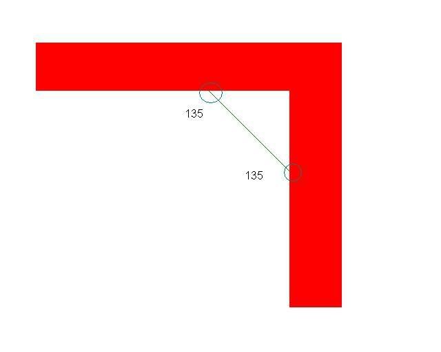
Yes yes, I came back to correct myself after doing a little math after I made that post. Turns out the edges of the curve will form 2 90 degree angles where they meet each wall resulting in even more harsh lighting.
I thought about it and decided if 90 degree angles form the harsh lighting, why not add 45 degrees? You could change the structure so instead of forming one 90 degree angle you have to fix with a curve, make two 135 degree angles like so:
Clicky
But, having not played with the D3/Q4 engine I'm not sure if that would entirely fix the lighting issue like the curve does.
Well, made a few changes. New Tele effect (This looks better upclose, and the reason it looks slightly checker board ish here is because it has a few stages to it, and material animation wasn't on in this shot), changed the wood slightly to appear a bit more grained, erm, changed the grate texture setup so its still Quake 3 ish but more better looking now (IMO anyway), changed the light to a custom one so it matches the scene a bit better...

TODO: Still gotta reword the scales on those lamps. Also gotta redo that gothic_block texture like you all want. Decal the place up a bit, add sounds/items (At the end)... I think I'll continue with the outside bit now.
TODO: Still gotta reword the scales on those lamps. Also gotta redo that gothic_block texture like you all want. Decal the place up a bit, add sounds/items (At the end)... I think I'll continue with the outside bit now.


I think it's a good idea, there should be more gothic maps - missed them all the time, since the release of doom3...o'dium wrote:*tease*
lol even got a Q3 style scrolling clouds skybox to make it really like Q3:
Map is looking very good so far. Just make shure you don't use too much ambient on the way to final. :icon25:
jj


Love the teleporter.o'dium wrote:Well, made a few changes. New Tele effect (This looks better upclose, and the reason it looks slightly checker board ish here is because it has a few stages to it, and material animation wasn't on in this shot), changed the wood slightly to appear a bit more grained, erm, changed the grate texture setup so its still Quake 3 ish but more better looking now (IMO anyway), changed the light to a custom one so it matches the scene a bit better...
TODO: Still gotta reword the scales on those lamps. Also gotta redo that gothic_block texture like you all want. Decal the place up a bit, add sounds/items (At the end)... I think I'll continue with the outside bit now.
|-----|