Screenshots

Discussion for Level editing, modeling, programming, or any of the other technical aspects of Quake
o'dium
Posts: 11712
Joined: Sun Mar 25, 2001 8:00 am

Post by o'dium »

wattro wrote:
g0th- wrote:Image
nice =)

i dont know anything about Q4, but i'm curious as to what the height of those hand rails are compared to someone standing beside them
Quake 4 is not Quake 3. In Quake 3, the actual player model Vs view height was insane, you were a midget. In Quake 4, you are much taller, so sometimes things look off.

But I'm also thinking that, they may be a tad high :p Compared to the scale of the stairs.
BJA
Posts: 50
Joined: Thu May 17, 2007 8:15 am

Post by BJA »

g0th- wrote:Image

Q4 sp map I am working on
btw anyone know if ai_tether_radius is broken in 1.4.1?
My only critique would be that it looks a bit too much like a multiplayer map, if you know what I mean. I would add some more crates, pipes, cables on the floor or stuff like that so it looks more like a machine room or something else. Right now it's hard to say what kind of room it is or what function it has, I think for a sp map it's always good to give your rooms and areas some sense.
You could also make some of those lights on the floor or the ceiling make broken to avoid that repetitive look.

I'm not sure about those railings, but I would look at some map that come with quake4. Most of the time they have the same height and thickness.
wattro
Posts: 375
Joined: Mon Feb 20, 2006 1:12 am

Post by wattro »

i agree with both the repetition statement and the purpose of rooms.

sometimes it's cool just to have arenas to fight in, but also when you have a realistic look then you should have a purpose for the room in mind. no pressure, it's purely your choice. the aforementioned ideas can also expand on playability providing cover, cool jumps, and/or gameplay opportunity. it'll help break up the obvious repetition

and, for some reason, i think that part in the corner on the upper level should lead somewhere, maybe to an attached control room or to a higher tier or to a another part of the arena
g0th-
Posts: 262
Joined: Sat May 19, 2007 7:57 pm

Post by g0th- »

BJA wrote:
My only critique would be that it looks a bit too much like a multiplayer map, if you know what I mean. I would add some more crates, pipes, cables on the floor or stuff like that so it looks more like a machine room or something else. Right now it's hard to say what kind of room it is or what function it has, I think for a sp map it's always good to give your rooms and areas some sense.
You could also make some of those lights on the floor or the ceiling make broken to avoid that repetitive look.

I'm not sure about those railings, but I would look at some map that come with quake4. Most of the time they have the same height and thickness.
That is some great critique, thanks a lot. Its funny you should mention multiplayer, after all I only done multiplayer maps in the past. I do get what you mean by it though and I agree with it.

The room in the screen is intended to be something in the middle of the map that works as a connection point to some of the more important rooms. I am going to fill this area out a little better with some creates, barrels and so on but I feel that those kind of things are better to place when I know were my monsters are going to be. So far the sketch of the layout isn't done yet, I am going to take some time and make decisions tomorrow regarding the layout sketch and the planing of the storyline. Again great critique.

wattro wrote: and, for some reason, i think that part in the corner on the upper level should lead somewhere, maybe to an attached control room or to a higher tier or to a another part of the arena


There is actually an elevator to the left of that corner that leads up to a security/control centre.
Last edited by g0th- on Mon May 21, 2007 12:39 am, edited 1 time in total.
g0th-
Posts: 262
Joined: Sat May 19, 2007 7:57 pm

Post by g0th- »

BJA wrote:
My only critique would be that it looks a bit too much like a multiplayer map, if you know what I mean. I would add some more crates, pipes, cables on the floor or stuff like that so it looks more like a machine room or something else. Right now it's hard to say what kind of room it is or what function it has, I think for a sp map it's always good to give your rooms and areas some sense.
You could also make some of those lights on the floor or the ceiling make broken to avoid that repetitive look.

I'm not sure about those railings, but I would look at some map that come with quake4. Most of the time they have the same height and thickness.
That is some great critique, thanks a lot. Its funny you should mention multiplayer, after all I only done multiplayer maps in the past. I do get what you mean by it though and I agree with it.

The room in the screen is intended to be something in the middle of the map that works as a connection point to some of the more important rooms. I am going to fill this area out a little better with some creates, barrels and so on but I feel that those kind of things are better to place when I know were my monsters are going to be. So far the sketch of the layout isn't done yet, I am going to take some time and make decisions tomorrow regarding the layout sketch and the planing of the storyline. Again great critique
wattro wrote: and, for some reason, i think that part in the corner on the upper level should lead somewhere, maybe to an attached control room or to a higher tier or to a another part of the arena


There is actually a door to an elevator in the left corner that leads up to a security/control centre.
dnky
Posts: 188
Joined: Thu Nov 24, 2005 3:49 pm

Post by dnky »

Work of art maybe not yet, but it will be ;)
Developing that same area:
Image
Whatever....
Amphetamine
Posts: 76
Joined: Fri Feb 23, 2007 5:15 am

Post by Amphetamine »

dkny: The current combination of textures looks a little mish-mash. Industrial girders, farm-house exterior walls, plaster, loose dirt floors and tech-lights arn't really hitting me as a cohesive theme I'm afraid.

Brushwork is nice, but looks more like it would go better with a strogg-base theme.
dnky
Posts: 188
Joined: Thu Nov 24, 2005 3:49 pm

Post by dnky »

Ok, understood. They are more of a test for my local map creation, so to a certain extent placeholders. Will bare that in mind as I continue to develop. Funny you should spot the barn floor image, because that is exactly what the original phot source was :)
Whatever....
wviperw
Posts: 334
Joined: Sat Mar 17, 2001 8:00 am

Post by wviperw »

dnky wrote:Another bit, as I extend the texture set. The colouring reminds me of UT I thought.
Image
I like this shot quite a bit!
[url=http://www.goodstuffmaynard.com]Good Stuff, Maynard![/url]
obsidian
Posts: 10970
Joined: Mon Feb 04, 2002 8:00 am

Post by obsidian »

@wvw: Where have you've been? Ever lurking?

Indeed... lighting looks better. Second one is brighter but shadows are a little washed out.

Donkey: the chainlink fence, are those texture projection shadows or alphashadows?
[size=85][url=http://gtkradiant.com]GtkRadiant[/url] | [url=http://q3map2.robotrenegade.com]Q3Map2[/url] | [url=http://q3map2.robotrenegade.com/docs/shader_manual/]Shader Manual[/url][/size]
dnky
Posts: 188
Joined: Thu Nov 24, 2005 3:49 pm

Post by dnky »

TY wviperw.
Obsidian, that's projected. I dont know whether I'm getting carried away with using lighting effects for the sake of it, but I'm sure it'll all pan out in the end.
Whatever....
broar
Posts: 52
Joined: Sun Jan 21, 2007 4:44 pm

Post by broar »

Image
Image
:dork:
User avatar
seremtan
Posts: 36013
Joined: Wed Nov 19, 2003 8:00 am

Post by seremtan »

hm nice clean lines
broar
Posts: 52
Joined: Sun Jan 21, 2007 4:44 pm

Post by broar »

thx
it´s an old unfinished draft for defrag.
Infernis
Posts: 613
Joined: Thu Feb 17, 2005 12:00 pm

Post by Infernis »

I know I shouldn't, but I simply can't resist!

Come on O'dium. What was that about? I read dnky his post a couple of times, but I really don't see where he took a swing at you. Even if you took it as criticism, you could have simply asked for clarification instead of being rude. That post says more about you then about him.

Instead of learning from the reactions you decide to take a swing at Kat as well. I can only say that I'm disappointed by this kind of behavior. Especially from someone who's work I admire. I think an apology is in order. But who am I to judge.

I just hope we can all get a long here. I enjoy looking at everyone their wip shots. Sure, some appeal to me and some don't. Taste differs, you can't question that. But let's respect one another and post constructive criticism instead of this childish flaming. Were all mature enough aren't we?

If you feel like replying to this, please do this in private. No need to bother other people with this since I already dropped some oil on the fire.

I apologise for going offtopic and perhaps fueling this again. But I needed to get this of my chest.
Inf - Leaving in it's torturous wake nothing but vicious, cannabalistic, mutated, radiated and horribly disfigured hordes of satanic killers!
User avatar
Foo
Posts: 13840
Joined: Thu Aug 03, 2000 7:00 am
Location: New Zealand

Post by Foo »

PMs eh
Infernis
Posts: 613
Joined: Thu Feb 17, 2005 12:00 pm

Post by Infernis »

I know Foo, I know. But I wanted to say this publically.
Inf - Leaving in it's torturous wake nothing but vicious, cannabalistic, mutated, radiated and horribly disfigured hordes of satanic killers!
Norlan
Posts: 31
Joined: Sun Mar 06, 2005 8:44 pm

Post by Norlan »

Strahlemann wrote:A map that i built for the upcoming Nexuiz 2.3 release.

I always liked the layout of the map "Slime Pit" that has been a part of Nexuiz ever since but the visuals were really bugging me, so i started this experiment and impoved the visuals without changing the layout too much. I'm quite satisfied how it turned out.

It's called "Slimepit Revisited" aka "reslimed" :icon31:

Image Image Image Image Image Image Image Image
I'd go blind if I played your map
Lunaran
Posts: 34
Joined: Fri Dec 31, 1999 8:00 am

Post by Lunaran »

I miss the Quake3 engine hard.

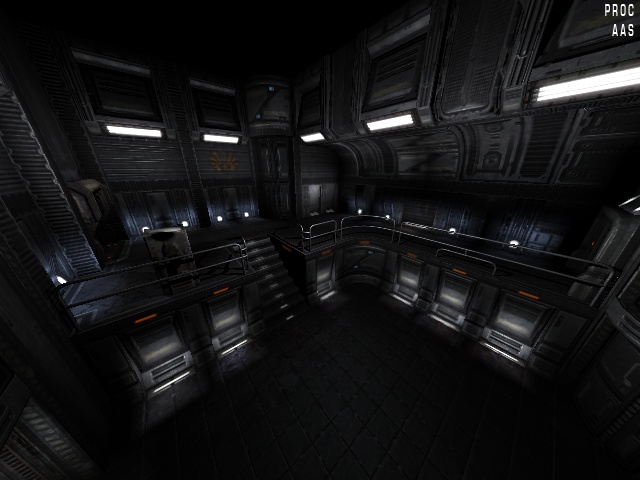
[lvlshot]http://www.lunaran.com/pics/lun3dm5_wip2.jpg[/lvlshot]


(I wanted to just toss that in and sneak away but there's been some neat looking stuff I wanna comment on.

Strahlemann, this is a bit late but very nicely done, but, that green is seriously overpowering, to the point where someone using a green skin could probably break the map. :/

dnky: I'd mention that not having darkness in corners makes a lot of the similarly-textured planes kind of run together and sap all the depth, but I know it's rather impossible not to have that happen in that engine. That flat style of texturing with the brushes doing the work is great with lightmaps, but in d3/q4 it really doesn't work. You're better off with more detailed textures that'll highlight all the edges and corners themselves - it's not for lack of imagination that everything in d3 and q4 looks the way it does. :/

g0th: Nicely polished. I wouldn't give much credence to the "looks too much like an MP map" criticism, because that's probably largely due to you having posted a shot of a straightforward atrium. Once the map grows linearly it'll probably take on a more SP character without you having to do anything to the theme, which I think is working pretty well. Are there custom textures in there, or is that all Hub? If it's hub textures, then I tip my cap sir.

broar: People keep doing neat things with the q3base textures, and I'm not entirely sure how, but keep it up :)

Method: garbage. I don't know how your parents can look at you.

... the rest of you need blood pressure meds.)
Last edited by AEon on Mon Jan 18, 2010 6:25 pm, edited 1 time in total.
Reason: lvlshot'ed that image.
Kaz
Posts: 1077
Joined: Wed Mar 08, 2006 3:43 am

Post by Kaz »

Lun: not shabby in the least, pretty cool even. :P

Not really exciting, but once I get around to super detailing everything it'll come together, in a year or so.

[lvlshot]http://kaz.quakedev.com/junk/ssowyd2.jpg[/lvlshot]

:)

edit: planning on buildings outside, yes.
dnky
Posts: 188
Joined: Thu Nov 24, 2005 3:49 pm

Post by dnky »

TY Lun. You have actually just brought about one of those rare moments of mapping clarity for me. Looking at the default Q4 textures I notice early on that they dont tile in the same way as for previous games (ie seamlessly running into themselves), more often than not they are in the form of panels. In my mind I made the assumption that this was because the majority of normals were rendered out from meshes, and to make a mesh tilable or even to edit the rendered normal so it would be tilable would be a tough job.
I had realised that an edge or lip in a normal map works well on brush edges; I have made trim textures in the past that look like the flat surface has a beveled edge using that idea.
What I hadnt done is put these ideas together and realise that most of the textures are in the form of panels for that reason.
That would also expalin much of the blockiness of the Q4 geometry, seeing as it is so dependant on the normal maps for its lighting.
God I'm slow sometimes:)
Whatever....
Grudge
Posts: 8587
Joined: Mon Jan 28, 2002 8:00 am

Post by Grudge »

Hey, nice screenshot, Lunaran. It looks like a bastard child of Q3 (indented half cylinder for jumppad path?) and HL2 (sunny lighting and that rusty/verdigris texture). Very simple, still very inspiring.
Pext
Posts: 4257
Joined: Thu Aug 28, 2003 7:00 am

Post by Pext »

awesome texture, lunaran!
dubz
Posts: 513
Joined: Tue Sep 27, 2005 3:07 am

Post by dubz »

is that q4 lunaran=?
Strahlemann
Posts: 35
Joined: Fri Jan 13, 2006 6:45 pm

Post by Strahlemann »

I'd go blind if I played your map
Hehe, well it's acid slime... ;)

Here are some other screenshots where i turned off the parallax mapping and the real-time-lights.
This is how most players will see the map, because the other effects make the game unplayably slow (10-20 fps on my rig).

That's one problem when working with the darkplaces engine: mixing lightmaps and real-time lights. If you want the map to look as you wish with real-time lights you have to think about that when lighting your lightmapped environment. But because most people won't have rtlights enabled (the impact on fps is too heavy) i'm aiming for oldschool lightmapped lighting to be the standard. If you then add rtlights you have to brighten up everything to get a visible effect. You've seen that in the shots i posted before.
Here are some "standard-looking" shots for you:
Image Image Image Image Image Image

Note how i made shots from angles where you can't see that much slime anyways :icon25: .

@Hipshot: Hehe, now as you mention it, it really does look like the XBox colors. Din't realize that before :dork:

@broar: some defrag action eh? Looking good.

@Lunaran: i can somehow feel the heat coming from the bricks and i even can hear a helicopter flying somewhere out there. But when i turn my head and look out my window it's raining. how do you do that ;) I wanna see more.
Post Reply