Screenshots
-
voodoochopstiks
- Posts: 248
- Joined: Tue Jun 08, 2004 7:00 am
-
+JuggerNaut+
- Posts: 22175
- Joined: Sun Oct 14, 2001 7:00 am
Now that's more like it... none of this normal flat wall shoebox stuff we see too much off! Keep up with this approach.
As an aside, try and do a similar 'walkway' affair on the other tower you posted, that previous platform area look to symetrical when the main building was the opposite, this new platform fits the building and general feel better.
(these remind me of that 3D illusion guy's drawings, can't remember his name)
escher is the guy you're thinking of
hm reminds me i need to put a door on that windmill building. i like the white/red stripey building. reminds me of the cat in the hat
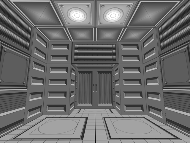
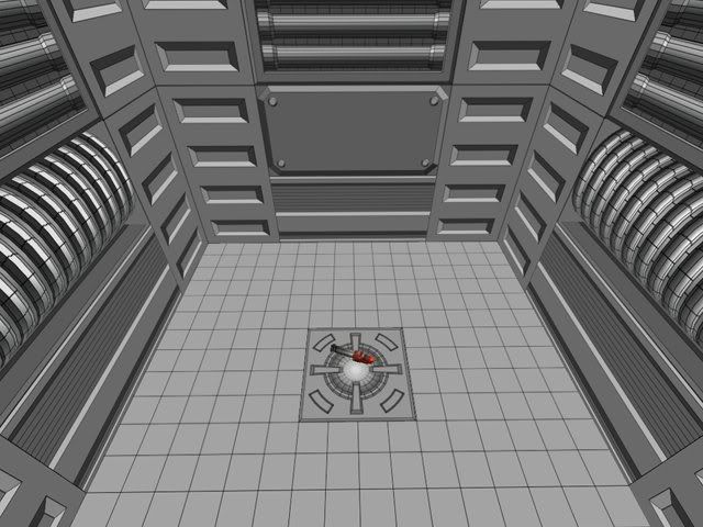
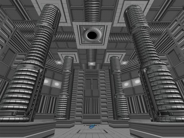
meanwhile, here's one i made earlier
[lvlshot]http://img210.imageshack.us/img210/1008/shootertest00045ty.jpg[/lvlshot]
the light goes round and round and everything
edit: the square thing bottom right isn't part of the lighthouse...
hm reminds me i need to put a door on that windmill building. i like the white/red stripey building. reminds me of the cat in the hat
meanwhile, here's one i made earlier
[lvlshot]http://img210.imageshack.us/img210/1008/shootertest00045ty.jpg[/lvlshot]
the light goes round and round and everything
edit: the square thing bottom right isn't part of the lighthouse...
printed out a screencapture of radiant, so that I could draw onto the XY top view... I was kinda lost as to how I should continue on my map, which pre-determined layout has been modified, demolished, and whatnot for quite some times.
I achieved to get some order in the chaos, and I know how to continue again.. took me some braincells and an hour or three..;
small....V. and less small..V


I achieved to get some order in the chaos, and I know how to continue again.. took me some braincells and an hour or three..;
small....V. and less small..V


-
voodoochopstiks
- Posts: 248
- Joined: Tue Jun 08, 2004 7:00 am
@Seremtan, I suggest you put some supports for keeping the hangout walls up, I know you're not trying to build realistic, and I think it looks very cool, but it looks rather boring there on the sides, some wooden girders to keep the whole thing staying up would make for some interesting detail and more fun style. Also, if you're planning on changing the lighthouse, I'd make it a little thinner in the middle(more hourglassy shape) to make it look a bit weirder, I don't feel it fits with the strangeness of the other buildings you've made
[i][color=#408080]Give someone a program, frustrate them for a day. Teach someone to program, frustrate them for a lifetime.[/color][/i]


-
Strahlemann
- Posts: 35
- Joined: Fri Jan 13, 2006 6:45 pm


Drum beats
Working on some new jumppad drums for my Quake 4 map. Also working on an excelleration pad.
Hopefully I'll release a full set red, blue, orange, green once the map is released (I've got the 'blue' one sort of done already).

Hopefully I'll release a full set red, blue, orange, green once the map is released (I've got the 'blue' one sort of done already).
Yeah I noticed that when doing the scrolling graphic for these, I *think* it's partly down to an optical illusion as well as being a technical one. The original design I was using just had the arrows on it and when they played the graphic looked really rough compared to the original jump pads, so I added the circles and that made them much smoother.
Very odd phenomena.
Very odd phenomena.
-
d3mol!t!on
- Posts: 284
- Joined: Thu Feb 16, 2006 3:48 pm