Screenshots
-
megatog615
- Posts: 13
- Joined: Fri Nov 16, 2007 12:30 am
Re: Screenshots
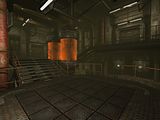
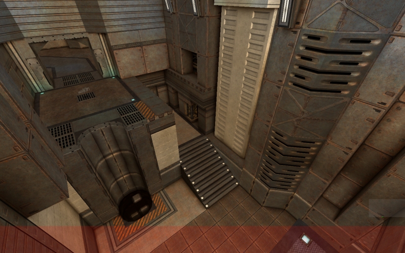
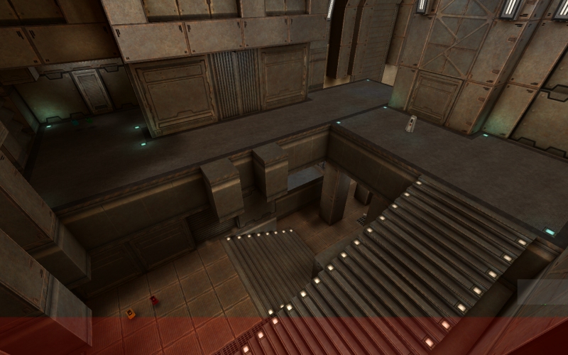
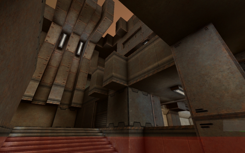
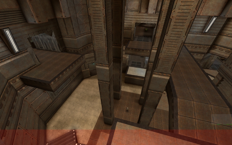
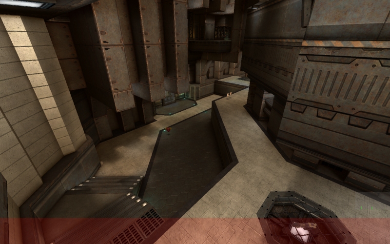
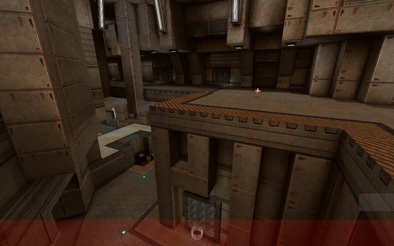
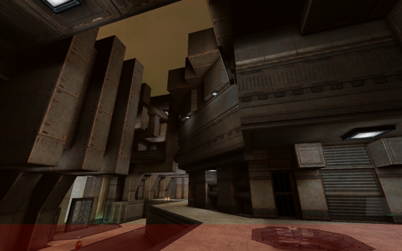
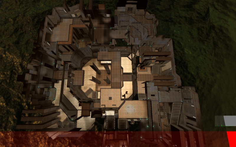
Here's a (direct) port of Ingar's "Gaelish" to the XreaL engine using the eX texture set:
[lvlshot]http://odin.mercenariesguild.net/xreal/base/screenshots/xreal-20090315-202145-000.png[/lvlshot]
[lvlshot]http://odin.mercenariesguild.net/xreal/base/screenshots/xreal-20090315-202157-000.png[/lvlshot]
[lvlshot]http://odin.mercenariesguild.net/xreal/base/screenshots/xreal-20090315-202216-000.png[/lvlshot]
[lvlshot]http://odin.mercenariesguild.net/xreal/base/screenshots/xreal-20090315-202245-000.png[/lvlshot]
[lvlshot]http://odin.mercenariesguild.net/xreal/base/screenshots/xreal-20090315-202334-000.png[/lvlshot]
[lvlshot]http://odin.mercenariesguild.net/xreal/base/screenshots/xreal-20090315-202403-000.png[/lvlshot]
[lvlshot]http://odin.mercenariesguild.net/xreal/base/screenshots/xreal-20090315-202430-000.png[/lvlshot]
I didn't do any of the brush work(that credit goes to Ingar, of course). I merely retextured the map post-conversion(texcoords got lost) and added some jump pads, as well as quad up on the light fixture in the center(reached by jump pads).
Re: Screenshots
Compress damnit!
These images takes over 10MB together!
These images takes over 10MB together!
Q3Map2 2516 -> http://www.zfight.com/misc/files/q3/q3map_2.5.16_win32_x86.zip
Q3Map2 FS_20g -> http://www.zfight.com/misc/files/q3/q3map2_fs_20g.rar
GtkRadiant 140 -> http://www.zfight.com/misc/files/q3/GtkRadiantSetup-1.4.0-Q3RTCWET.exe
Q3Map2 FS_20g -> http://www.zfight.com/misc/files/q3/q3map2_fs_20g.rar
GtkRadiant 140 -> http://www.zfight.com/misc/files/q3/GtkRadiantSetup-1.4.0-Q3RTCWET.exe
-
megatog615
- Posts: 13
- Joined: Fri Nov 16, 2007 12:30 am
Re: Screenshots
That's why they're PNG, lol. They don't take long to load for me and I have a pretty slow DSL line...
Re: Screenshots
They didn't take long for me either. I'm thinking of others... and, well... PNG isn't really a good compressor choice here... =)
Q3Map2 2516 -> http://www.zfight.com/misc/files/q3/q3map_2.5.16_win32_x86.zip
Q3Map2 FS_20g -> http://www.zfight.com/misc/files/q3/q3map2_fs_20g.rar
GtkRadiant 140 -> http://www.zfight.com/misc/files/q3/GtkRadiantSetup-1.4.0-Q3RTCWET.exe
Q3Map2 FS_20g -> http://www.zfight.com/misc/files/q3/q3map2_fs_20g.rar
GtkRadiant 140 -> http://www.zfight.com/misc/files/q3/GtkRadiantSetup-1.4.0-Q3RTCWET.exe
Re: Screenshots
Use jpgs. Link out to larger shots.. doesn't take much effort to do.megatog615 wrote:That's why they're PNG, lol. They don't take long to load for me and I have a pretty slow DSL line...
[url=https://www.katsbits.com/tutorials#q3w]Tutorials, tools and resources[/url]
Re: Screenshots
That looks good but I'd question the gameplay of excessively deeply indented walls like that. It's really bad for rockets, grenades and judging knockback. It also tends to mean giant invisible clips that prevent you fitting into gaps you should be able to, further worsening the problems I listed.
Re: Screenshots
A little scene for UT3. Everything, except for the water shader and fire particles is custom content.
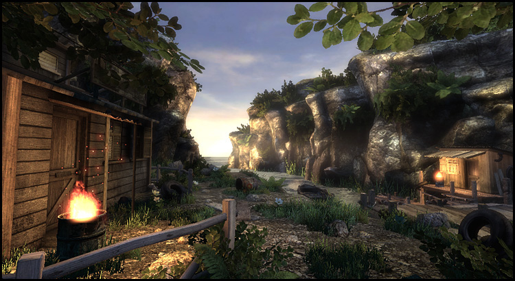
Bigger screen:
http://www.bja-design.de/intothesun/bja_scene_big.jpg
And some of the props:
http://www.bja-design.de/intothesun/intothesun_03.jpg
http://www.bja-design.de/intothesun/intothesun_05.jpg

Bigger screen:
http://www.bja-design.de/intothesun/bja_scene_big.jpg
And some of the props:
http://www.bja-design.de/intothesun/intothesun_03.jpg
http://www.bja-design.de/intothesun/intothesun_05.jpg
Re: Screenshots
Are you making it for something special or is it just a scene?
Q3Map2 2516 -> http://www.zfight.com/misc/files/q3/q3map_2.5.16_win32_x86.zip
Q3Map2 FS_20g -> http://www.zfight.com/misc/files/q3/q3map2_fs_20g.rar
GtkRadiant 140 -> http://www.zfight.com/misc/files/q3/GtkRadiantSetup-1.4.0-Q3RTCWET.exe
Q3Map2 FS_20g -> http://www.zfight.com/misc/files/q3/q3map2_fs_20g.rar
GtkRadiant 140 -> http://www.zfight.com/misc/files/q3/GtkRadiantSetup-1.4.0-Q3RTCWET.exe
-
Captain a13n
- Posts: 51
- Joined: Thu Mar 19, 2009 12:02 am
Re: Screenshots
It doesn't look like a place for slaughter.
Nazism consists of Xtrem Bureaucracy & Xtrem Dystopia, which is equivalent to moden capitalism. - Hannah Arendt(Captain a13n edit)
Re: Screenshots
Nothing special like a playable level or something else, just a little scene to get familiar with the ut3 editor and unreal tech in general.
Re: Screenshots
[url]http://shadowsdomain.wordpress.com/[/url]
Re: Screenshots
That looks good Shadow!
Looks very big too...
The teleport looks kinda bland... I guess it's just a temp texture or something?
Looks very big too...
The teleport looks kinda bland... I guess it's just a temp texture or something?
Q3Map2 2516 -> http://www.zfight.com/misc/files/q3/q3map_2.5.16_win32_x86.zip
Q3Map2 FS_20g -> http://www.zfight.com/misc/files/q3/q3map2_fs_20g.rar
GtkRadiant 140 -> http://www.zfight.com/misc/files/q3/GtkRadiantSetup-1.4.0-Q3RTCWET.exe
Q3Map2 FS_20g -> http://www.zfight.com/misc/files/q3/q3map2_fs_20g.rar
GtkRadiant 140 -> http://www.zfight.com/misc/files/q3/GtkRadiantSetup-1.4.0-Q3RTCWET.exe
Re: Screenshots
Yes, it's still beta, and almost everything can be changed, so this tele is just because there must be something  . I'll try to find something more fitting.
[url]http://shadowsdomain.wordpress.com/[/url]
Re: Screenshots
quake2world? isn't it the project that is trying to reinvent qfusion or quake2xp.
Re: Screenshots
It doesn't really seem appropriate to have lockers and shelving in a defensive bunker right next to the beach... maybe gun racks, extra ammo for the turrets... stuff like that. Also, that sort of floor damage is kinda goofy (this can be getting into the realism vs "whatever it looks fine it's a video game" thing), trying to make it look like a couple grenades went off inside might look better. This is all assuming it's still a Beach Invasion scenario.
$.02
$.02
-
^misantropia^
- Posts: 4022
- Joined: Sat Mar 12, 2005 6:24 pm
Re: Screenshots
People store stuff. I think the shelves are fine. The lockers are a bit shiney yet bland, though. They don't really seem to fit in.
Re: Screenshots
I hope you have a physics engine... I don't like static objects
-
Dark Metal
- Posts: 5496
- Joined: Sun Feb 20, 2000 8:00 am
